Uber's design system is called Base, the in-house framework behind every Uber product. It leans on a near black-and-white palette with a single Uber blue accent (#276EF1), the custom Uber Move typeface, and a modular type scale that starts at 14px and steps by 1.125. The philosophy is "go big" on legibility and "less is more" on choices, so screens feel calm, high-contrast, and instantly readable. Here is the full breakdown, with a copyable DESIGN.md.
This is a teardown that teaches the taste, not a token dump that lists swatches. We annotate the real Uber app, mark which values are public versus inferred, and end with two things to take: a paste-ready DESIGN.md and a one-line prompt that recreates the Uber look on the Superdesign canvas. For the format itself, see what is DESIGN.md.
What is Uber's design system called?
It is called Base, Uber's in-house design system. Atlassian and Apple publish theirs openly; Uber's is two layers, and you should know both. First, Base is the design language documented at base.uber.com: typography, color, grid, motion, and content. Second, Base Web is the public, open-source React component library on GitHub, described in its own words as:
A React Component library implementing the Base design language
(Source: uber/baseweb.)
That open-source repo is how you can actually read real token values. Set expectations honestly: Uber's full color guidelines page on base.uber.com is SSO-gated and private, so every exact hex we cite comes from the open-source Base Web repo or the live app, never invented. That honesty is the point. A token dump can not tell you what is public versus guessed; this teardown does.
What does the Uber app actually look like?
Here is the live Uber rider web app. Five things make it feel like Uber, each with a one-line reason it works:
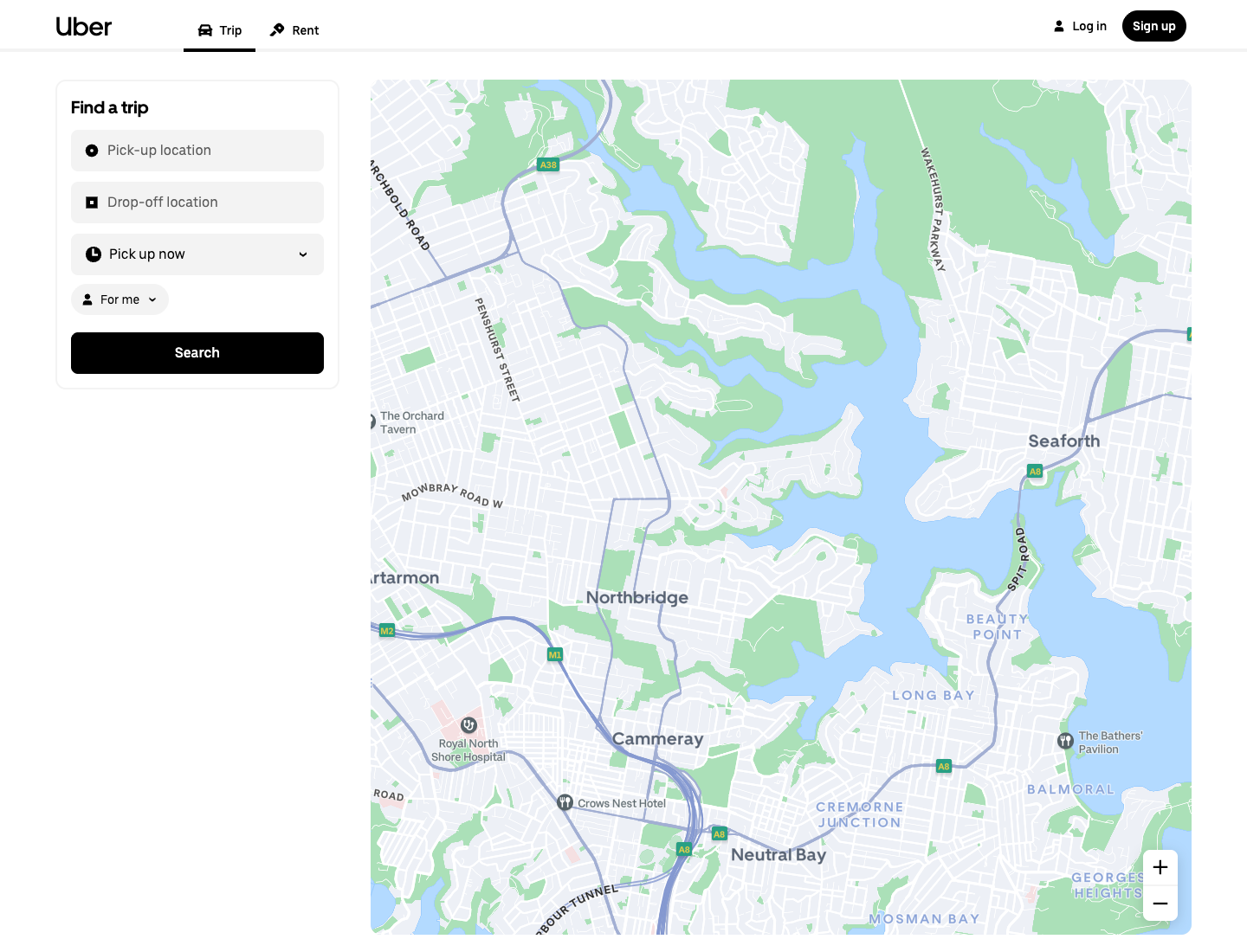
- Solid black Search button on white. Maximum contrast, one unmistakable next action. Why it works: zero ambiguity about what to tap.
- Near black-and-white canvas, the map does the color work. Why it works: the UI recedes, content leads.
- Uber Move headings set large. Why it works: legibility first, the "go big" principle made visible.
- Pill-shaped input rows with generous padding. Why it works: touch-friendly, calm rhythm.
- Uber blue reserved for a single accent moment, not sprinkled. Why it works: scarcity makes the accent mean something.
This is the section no token dump has: taste taught against a real screen, not a swatch grid.
What colors does Uber use?
Uber's palette is deliberately tight, dominated by black and white with one blue accent. These are the real values from the open-source Base Web light theme foundation tokens, attributed as such:
Public source: open-source Base Web tokens (uber/baseweb, src/themes/light-theme/color-foundation-tokens.ts). Uber's internal brand color page on base.uber.com is private (SSO-gated), so treat these as the published reference, not a leaked brand spec.
Why it works: high-contrast black and white maximizes legibility, which is Uber's stated priority, and a single saturated blue carries every moment of brand and assurance. When everything else is neutral, #276EF1 is the only thing that says "this matters."
What font does Uber use?
Uber uses its own custom typeface, Uber Move, with three cuts. From Uber's own typography page:
The default font family that Uber uses is our very own Uber Move. It comes with three distinct typefaces – Display, Text, and Mono.
(Source: Uber Base, Typography. The en-dash above is Uber's own punctuation in the source quote.)
The history checks out: Uber Move was designed by Jeremy Mickel of MCKL with Uber's internal design team and Wolff Olins for the 2018 rebrand. The honest caveat: Uber Move is proprietary and not licensed for public use, so for your own "Uber-style" work you reach for a close free substitute. A geometric grotesque like Inter or a system-ui stack gets you most of the way; just know it is a look-alike, not the real font. Why the bespoke face works: a custom geometric sans makes the brand instantly recognizable and reads cleanly from a moving car at small sizes.
How is Uber's typography scale built?
This is the most copyable, taste-teaching part, and it comes straight from Uber's public typography page. Four rules you can rebuild tonight.
Roles. Four type roles:
Type styles are defined based on four roles – Display, Heading, Label, and Paragraph.
Scale. A modular scale:
It starts with a base font size of 14 and scales by multiplying 1.125 at each interval.
That 1.125 ratio is a major-second musical interval (8:9), which is why the steps feel harmonic.
Line height.
Proper line height is achieved by multiplying the type size by 1.45 and rounding to the nearest interval of 4.
(All three quotes source: Uber Base, Typography. The en-dashes are Uber's own punctuation.)
Worked example so you see the rhythm: 14, then 15.75, then 17.7, then 19.9, and so on, each line height the type size times 1.45 rounded to the nearest 4, so everything snaps to a 4px baseline grid.
| Role | Computed size (example) | Line height (1.45, rounded to 4) |
|---|---|---|
| Paragraph (base) | 14 | 20 |
| Label | ~16 | 24 |
| Heading | ~18 | 28 |
| Display | ~28 | 40 |
This table is the formula (14 times 1.125 to the n, with the 1.45 line-height rule) plus a computed example, not Uber's exact per-token published sizes. Uber publishes the rules, not a full per-token pixel table, so we show the rules and say so. Why it works: one ratio plus one baseline grid gives you effortless vertical harmony, the thing junior designers fake and never quite nail.
What are Uber's design principles?
Uber states three typography principles publicly, and they generalize to the whole system. Each quote, then the takeaway.
Go big.
We prioritize larger font sizes because the Uber experience values legibility and accessibility.
Takeaway: default to bigger type than feels comfortable.
Less is more.
We optimize for fewer style options, so there's no decision paralysis when choosing the right type of style.
Takeaway: constrain your scale to a handful of sizes.
(Both quotes source: Uber Base, Typography.)
A third, Simple semantics, names styles by role rather than pixel value. Every choice in the Uber app is downstream of these three lines: the big black button, the tight palette, the role-named type.
Can I get a copyable DESIGN.md for the Uber look?
Yes. Here is the take-home asset, built only from verified facts: black and white plus the #276EF1 accent, the Base error/warning/positive tokens, Uber Move with a free substitute stack, the 14px times 1.125 modular scale, the 1.45 line-height rule, the 4px baseline grid, and the three principles as do's and don'ts. Paste it into your repo and your agent designs Uber-flavored UI by default.
---
name: "Uber (Base-inspired)"
colors:
primary: "#000000"      # black, primary text + primary buttons
background: "#FFFFFF"    # white app surface
accent: "#276EF1"       # Uber blue, single accent, use sparingly
error: "#E11900"
warning: "#FFC043"
success: "#048848"
surface_alt: "#F6F6F6"  # mono ramp for cards/borders
border: "#E2E2E2"
# public source: open-source Base Web tokens (uber/baseweb)
typography:
font_family: "'Uber Move', system-ui, 'Inter', sans-serif"  # Uber Move is proprietary; substitute for non-Uber work
base_size: 14
scale_ratio: 1.125       # modular scale, multiply per step
line_height_rule: "size * 1.45, rounded to nearest 4"
roles: [Display, Heading, Label, Paragraph]
numbers: "monospaced (Uber Move Mono style) for money/figures"
layout:
baseline_grid: 4         # all spacing snaps to 4px
principles:
- "Go big: prioritize large, legible type."
- "Less is more: few style options, no decision paralysis."
- "Simple semantics: name styles by role, not pixel value."
---

# Notes
# Black/white does the work; reserve the blue accent for one moment per screen.
# One bold solid-black primary button per view.
Every value above traces to a verified source (Base Web tokens or base.uber.com typography). The font line is flagged as a substitute because Uber Move is not publicly licensed.
How do I design an Uber-style UI in seconds?
Tokens get you the look; the taste you just learned gets you the feel. Paste the DESIGN.md above as context, then run this one-line prompt:
Design a ride-booking dashboard in the Uber style: a black-and-white base with
a single #276EF1 blue accent, large legible headings in a geometric grotesque
(Uber Move look-alike), pill-shaped inputs with generous padding, one bold
solid-black primary button, and a calm 4px-grid spacing rhythm.
Two paths: run it in the web app, or run it from Claude Code or Cursor via the Superdesign skill so it reads your codebase first. Try it, tweak the accent, and if the agent drifts off-brand, ping us and we will tune the prompt together.
Uber's UI is textbook minimalist, so the minimalist web design style page is good supporting reading. For generating full UIs, see the best AI UI generator, and browse the community prompt library for tested starting prompts. Want the same teardown on another company? See how Atlassian, Airbnb, and Apple build their UI.
FAQ
We keep this section short on purpose. The answers also power the FAQ schema below.