The Atlassian Design System (ADS) is Atlassian's open, public system behind Jira, Confluence, Trello, and Bitbucket, documented at atlassian.design. It is built on an 8px spacing grid, a token-based color model (semantic tokens like color.background.brand.bold for the brand blue), the Atlassian Sans and Atlassian Mono typefaces, and a heading/body/metric type scale that runs from 12px to 32px. Its signature is calm, dense, status-driven UI: Lozenges, Flags, and Banners that make state legible at a glance.
This is a teardown, not a token dump. We walk the real ADS, annotate why each choice works, and hand you two things to take with you: a copyable DESIGN.md you can paste into your coding agent, and a one-line prompt that generates an Atlassian-style dashboard on the Superdesign canvas. If you want the format itself explained first, see what is DESIGN.md; this post is the applied example.
What is the Atlassian Design System?
The Atlassian Design System is the public, documented design language at atlassian.design that powers Jira, Confluence, Trello, and Bitbucket. It is what "enterprise-grade, dense, status-heavy product UI" looks like when it is fully systematized: hundreds of components, a token-based color model, and tight type and spacing scales, all published openly. Unlike a lot of companies, Atlassian ships its components as open-source npm packages under the @atlaskit scope (Apache-2.0 licensed), so you can read the real values instead of guessing.
Three pillars carry the whole look, and they are what we tear down below: a token-based color model, an 8px spacing grid, and the Atlassian Sans type system. By the end you get a copyable DESIGN.md and a one-line prompt that generates this style.
What colors does Atlassian use?
Atlassian's color model is semantic, not literal. Instead of telling you "use this hex," ADS gives you named, adaptive tokens in the format color.[property].[role].[emphasis].[state], for example color.background.brand.bold or color.background.danger.bold.hovered. The tokens carry dedicated neutrals for both light and dark mode, so dark mode and status states come for free once you design to roles instead of raw hex.
The signature is the brand blue, reserved for the single primary action on a screen. Here is the honest part: the long-documented Atlassian brand blue is #0052CC (the legacy AUI value, verified across Atlassian's own older color docs). The refreshed ADS resolves color.background.brand.bold to its Blue700 palette step, which is #1868DB on the live palette page (captured below). Both are real; they are just from different eras of the system, so we label them rather than conflate them.
Blue700 #1868DB read from the live atlassian.design color palette on 2026-06-14. #0052CC is the legacy documented brand blue. Pull the current token hex from the live palette before shipping, Atlassian renders the exact swatches interactively.
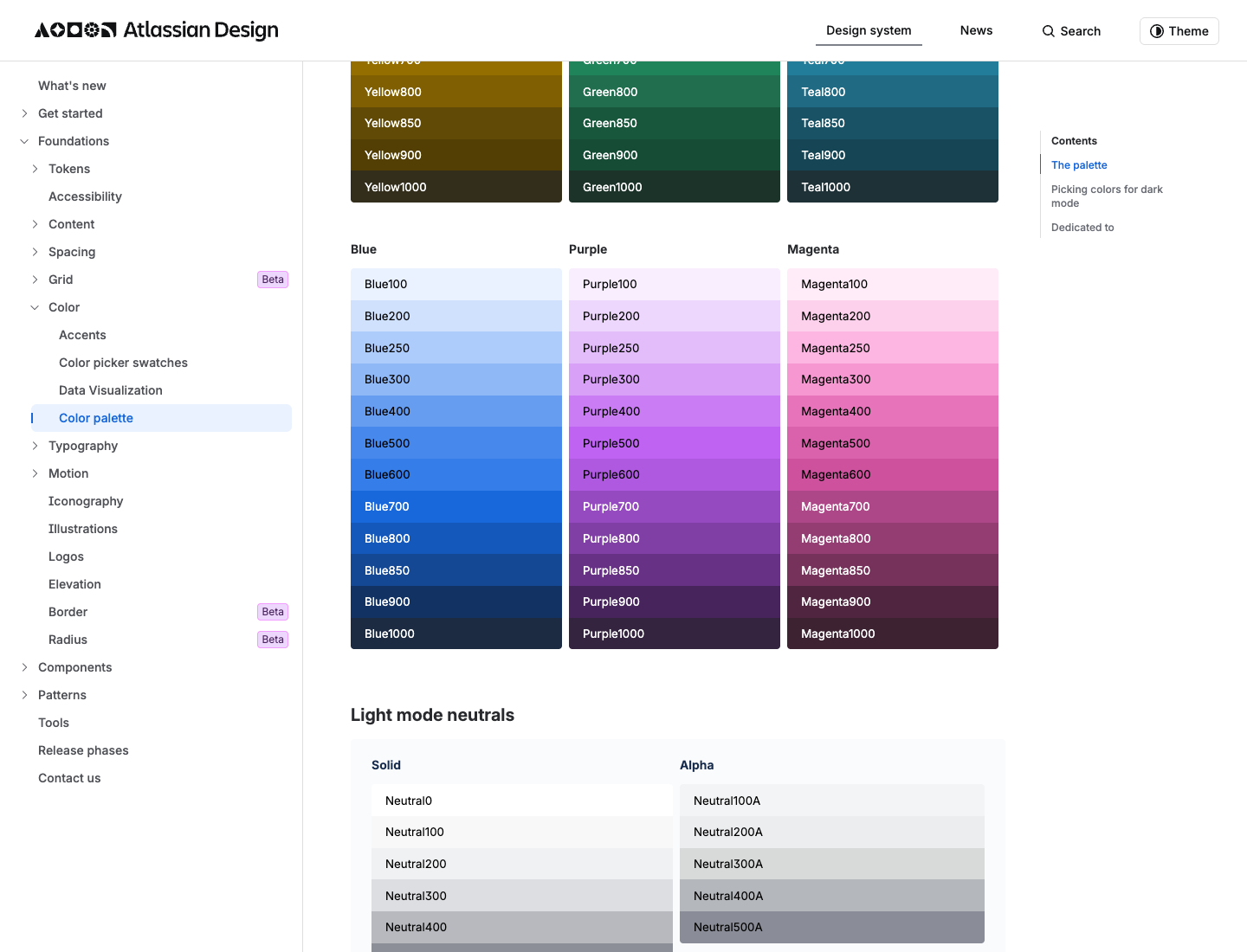
The accent palette (gray, red, green, blue, yellow, orange, teal, purple, magenta, lime) is decorative with no fixed meaning, which is why a single reserved brand blue is what keeps the dense Atlassian UI calm: one color means "do this," everything else is near-neutral ink and surface.
What fonts and type scale does Atlassian use?
Atlassian's product typefaces are Atlassian Sans and Atlassian Mono. Atlassian describes them as a pair:
refreshed system fonts Atlassian Sans and Atlassian Mono, a perfect pair that shares the same baseline, similar stroke width and a similar x-height
(Source: Atlassian Design, Typography and iconography updates.)
A separate typeface, Charlie Sans, is Atlassian's brand and marketing face (named after the original "Charlie" logo, introduced with the 2023 to 2024 Pentagram-developed brand refresh that debuted at Team '24). Charlie Sans is gated behind authenticated brand-asset access, so it is not the font you reach for in product UI, and it is not publicly downloadable. One more honesty note: we could not verify that Atlassian Sans is open source, so we do not claim it is.
The full verified type scale, captured live from the ADS typography page:
| Token | Size | Weight |
|---|---|---|
font.heading.xxlarge | 32px / 36 line | Bold |
font.heading.xlarge | 28px / 32 | Bold |
font.heading.large | 24px / 28 | Bold |
font.heading.medium | 20px / 24 | Bold |
font.heading.small | 16px / 20 | Bold |
font.heading.xsmall | 14px / 20 | Bold |
font.heading.xxsmall | 12px / 16 | Bold |
font.body.large | 16px / 24 | Regular |
font.body | 14px / 20 | Regular |
font.body.small | 12px / 16 | Regular |
font.metric.large | 28px / 32 | Bold |
font.metric.medium | 24px / 28 | Bold |
font.metric.small | 16px / 20 | Bold |
font.code | 12px / 20 | Regular |
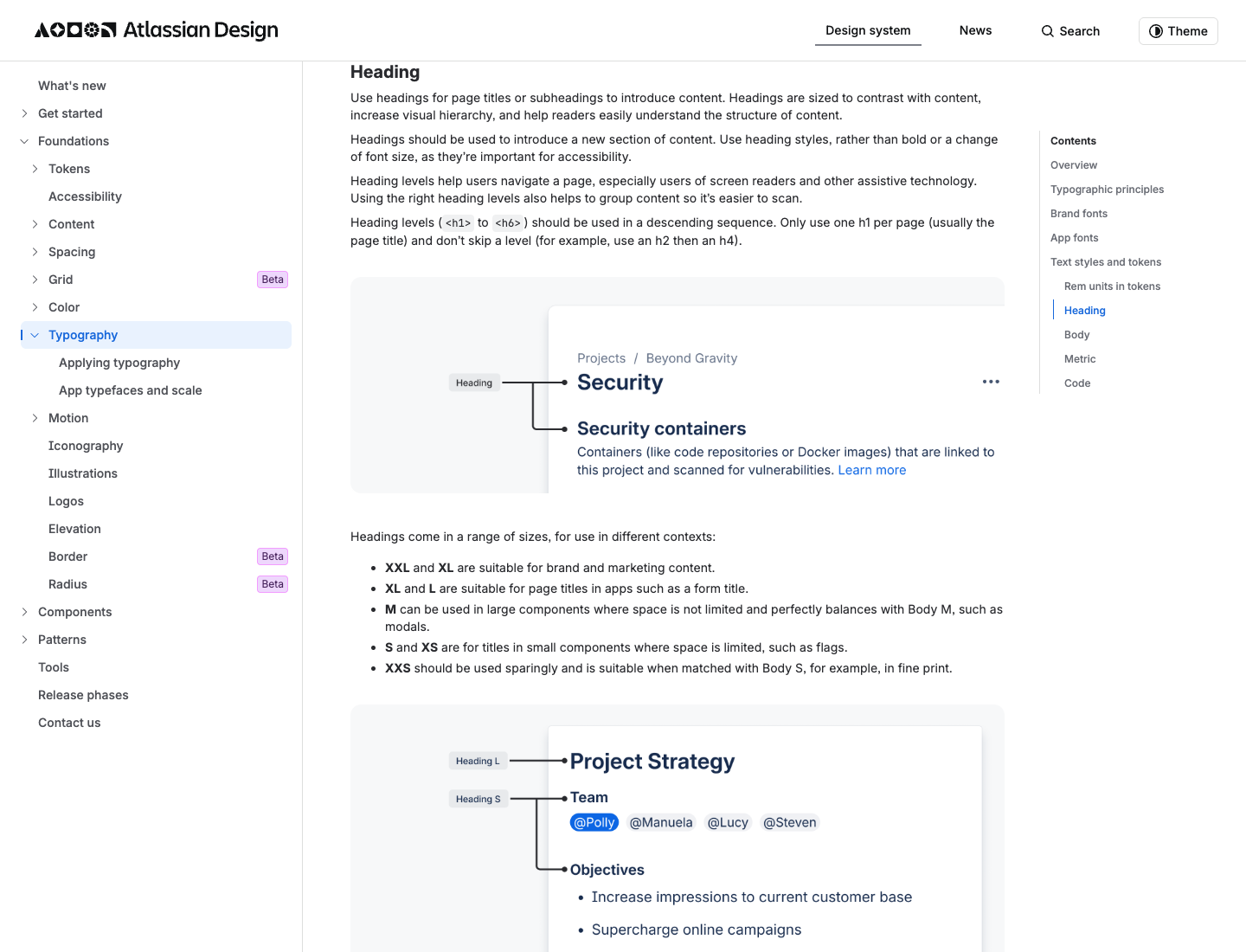
Why it works: the dedicated Metric scale (font.metric.*) is the tell of a dashboard-first company. Atlassian gives big numbers their own bold scale, separate from headings, so a count of open issues reads as a metric and not a heading. That is a detail most systems skip.
How does Atlassian handle spacing and layout?
ADS spacing is built on an 8px base unit, and the token names are self-documenting: each token is named as a percentage of the base, so space.100 is 8px (100% of the base) and space.200 is 16px (200%). The full scale, verified live:
| Token | Pixels |
|---|---|
space.025 | 2px |
space.050 | 4px |
space.075 | 6px |
space.100 | 8px |
space.150 | 12px |
space.200 | 16px |
space.250 | 20px |
space.300 | 24px |
space.400 | 32px |
space.500 | 40px |
space.600 | 48px |
space.800 | 64px |
space.1000 | 80px |
Negative tokens exist too, from space.negative.025 (-2px) to space.negative.400 (-32px), for breaking out of a container's padding or overlapping elements.
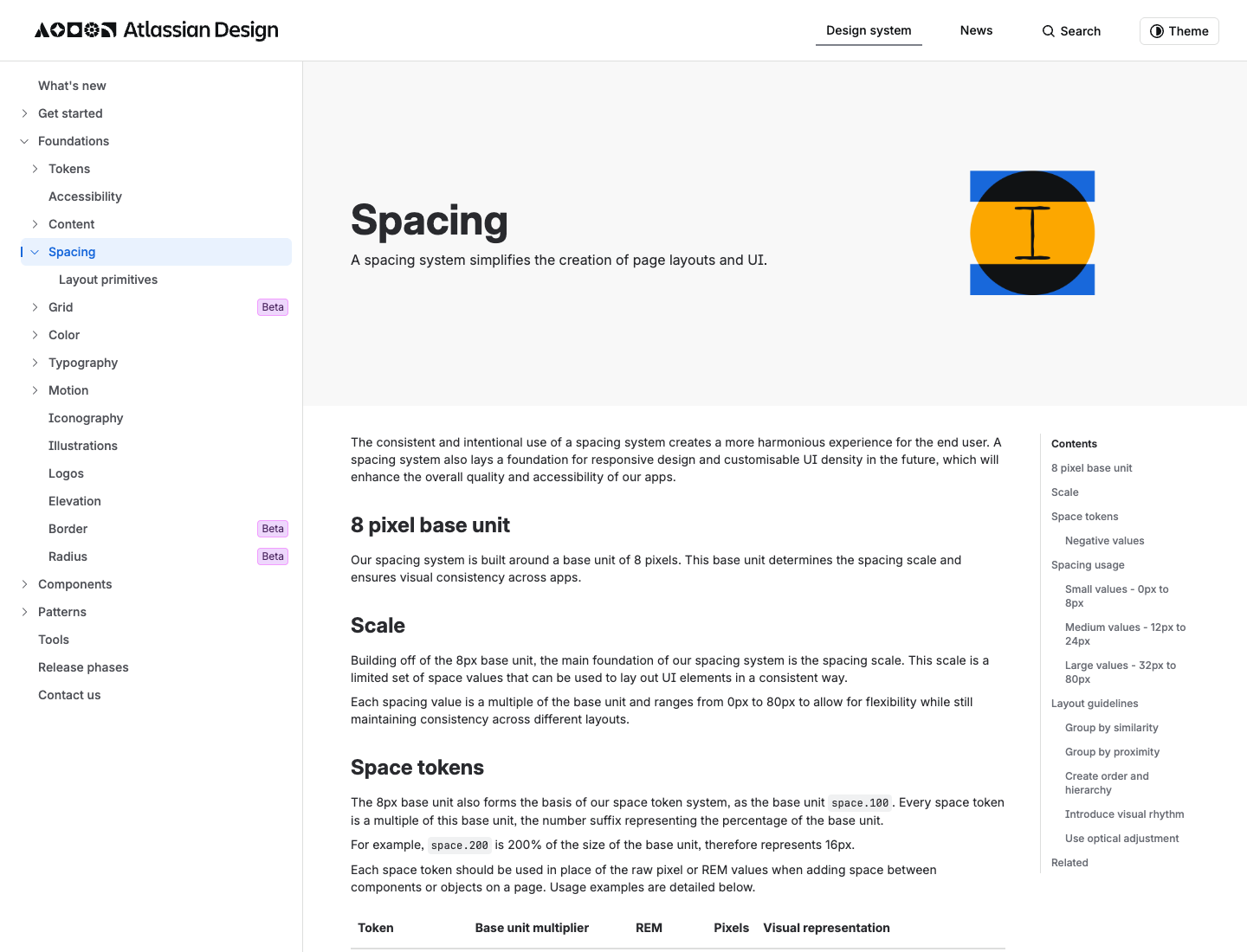
Why it works: the percentage-of-base naming survives into an agent prompt. space.200 literally reads as twice the base, so the spacing intent is legible even after you paste it into a tool that has never seen Atlassian's Figma. This is the single most copy-pasteable part of the whole system.
What are Atlassian's signature UI components?
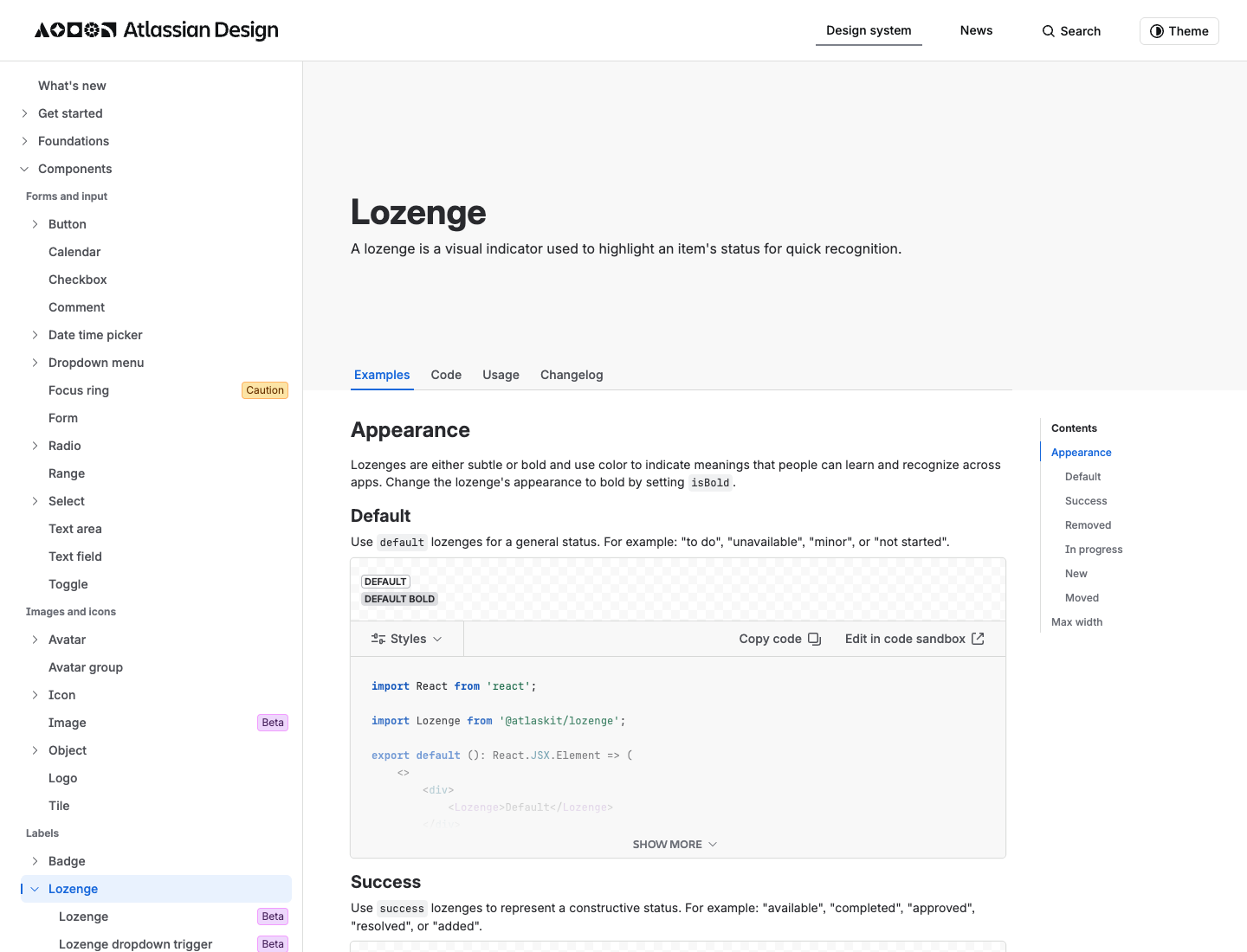
This is the taste section: the components that make a screen feel like Jira. The atomic unit is the Lozenge. Atlassian's live definition:
A lozenge is a visual indicator used to highlight an item's status for quick recognition.
(Source: Atlassian Design, Lozenge.)
Those are the IN PROGRESS, DONE, and TO DO pills you see all over Jira. Alongside it:
- Flag: confirmations, alerts, and acknowledgments that need minimal interaction, often shown as a flag group.
- Banner: a prominent message pinned at the top of the screen.
- Badge: a visual indicator for numeric values like tallies and scores.
ADS also publishes a five-level elevation model: Sunken (Kanban columns), Default, Raised (movable cards), and Overlay (modals and dropdowns), plus an Overflow shadow for scrolled content. The tokens are elevation.surface.* and elevation.shadow.*. Atlassian does not publish numeric shadow or radius values on that page, so treat elevation as a visual model, not a copyable pixel spec.
Why it works: Atlassian's entire UI is about making state legible. The Lozenge is the atomic unit of that, which is why a board full of them reads at a glance even when it is dense.
Atlassian DESIGN.md you can copy
Here is the take-home asset: an agent-ready DESIGN.md built from the verified values above, in the canonical section order (Overview, Colors, Typography, Layout, Components, Do's and Don'ts). Paste it into your repo and your coding agent designs Atlassian-flavored UI by default.
---
name: "Atlassian (ADS-inspired)"
colors:
brand_blue: "#1868DB"   # Blue700, the live color.background.brand.bold token; reserve for the single primary action
brand_blue_legacy: "#0052CC"  # documented/legacy Atlassian brand blue (AUI era)
# semantic token NAMES (exact new hexes are interactive on the ADS palette page):
tokens:
  - color.text
  - color.background.brand.bold
  - color.background.danger.bold
  - color.icon.accent.green
typography:
font_family: "Atlassian Sans, system-ui, sans-serif"
mono: "Atlassian Mono, ui-monospace, monospace"
heading: { xxl: 32, xl: 28, l: 24, m: 20, s: 16, xs: 14, xxs: 12 }  # all Bold
body: { l: 16, m: 14, s: 12 }     # Regular
metric: { l: 28, m: 24, s: 16 }   # Bold, for dashboard numbers
code: 12
weights: { heading: "Bold", body: "Regular", emphasis: "Medium" }
spacing:
base: 8
scale: [2, 4, 6, 8, 12, 16, 20, 24, 32, 40, 48, 64, 80]  # named space.025 .. space.1000
elevation:
levels: [sunken, default, raised, overlay]  # no numeric shadow values published by ADS
---

## Overview
Calm, dense, status-driven enterprise UI. Make state legible at a glance.

## Colors
One reserved brand blue keeps the density calm; everything else is near-neutral
ink and surface. Semantic tokens give dark mode and status states for free.

## Typography
A dedicated Metric scale for dashboard numbers is the tell. Big numbers get their
own bold scale, separate from headings.

## Layout
Stick to the 8px grid. Token names read as a percentage of the base, so
space.200 is twice the base (16px).

## Components
Lozenges for status, Flags for low-interaction confirmations, Banners for
top-of-screen messages, Badges for numeric tallies.

## Do's and Don'ts
- Do: stick to the 8px spacing grid for every gap and padding value.
- Do: reserve the brand blue for the single primary action; use Lozenges for status.
- Don't: invent colors outside the token set.
- Don't: claim Atlassian Sans is open source; that is not confirmed.
How do you generate an Atlassian-style UI with AI?
Tokens get you the look; taste gets you the feel. You just got both. The fastest way to ship an Atlassian-style screen is to paste the DESIGN.md above as context, then prompt for the screen, then fork variants on the canvas. Here is the one-line prompt to feature:
Design an Atlassian-style project dashboard: 8px spacing grid, Atlassian Sans
typography, one calm brand-blue accent, status Lozenges (To Do / In Progress /
Done), a metrics row using the bold Metric scale, a left sidebar nav, and
Raised cards on a Sunken board background.
Run it two ways: prompt it in the web app, or drive it from Claude Code or Cursor with the Superdesign skill so it reads your repo first. Paste the DESIGN.md, prompt for the screen, then fan out variants side by side on the canvas and pick the one that feels most like Jira. Tweak the accent and make it yours, and if the agent drifts off-brand, ping us and we will tune the prompt together.
For the bigger picture, see how company design systems fit a real workflow in the 2026 AI design stack, and how the codebase-aware approach compares in our guide to the best AI UI generator for developers. For more visual languages, browse the design styles encyclopedia. And if you want to apply this same teardown to another company, see how Uber, Airbnb, and Apple build their UI.
FAQ
We keep this section short on purpose. The answers also power the FAQ schema below.