What makes a website feel minimalist?
Not emptiness: a budget. The sites that read as effortlessly minimal all enforce the same four constraints, and every one of them is a token you can copy. A palette budget (two neutrals, one ink, one muted ink, one accent). A modular type scale, so size does the hierarchy work that color and boxes would otherwise do. A spacing scale on an 8px base, applied without exceptions. And a readable measure, body text capped around 65 characters.
That is why this page's recipe is a token sheet rather than a component. Wireframes are minimalism by necessity, which makes them the natural starting point: sketch the structure with an AI wireframe generator first, then apply the tokens and stop.
What does a minimalist starter token set look like?
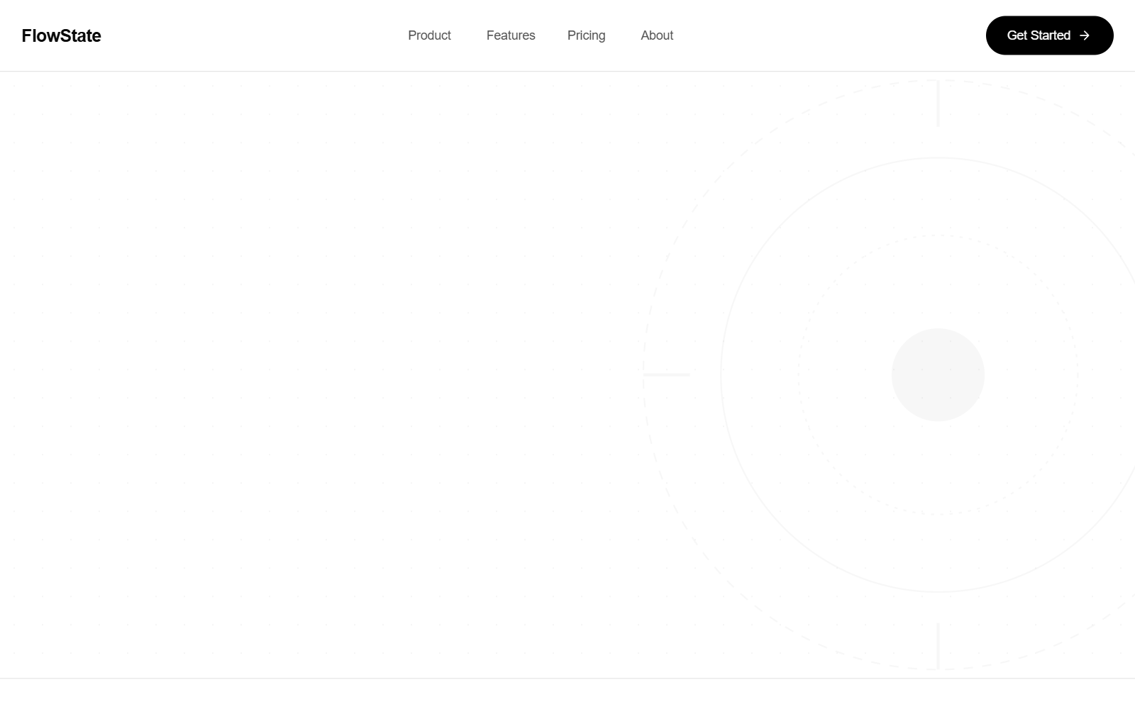
One idea per screen
Body copy in muted ink at 7.4:1 contrast, capped at a readable measure. No borders, no shadows: the air does the separating.
The single call to action/* via superdesign.dev/styles/minimalist-web-design */
:root {
/* Palette budget: 2 neutrals + ink + muted ink + ONE accent. That's all you get. */
--color-bg: #fafaf9; /* warm off-white; pure #fff reads clinical */
--color-surface: #f0efec; /* one step down, for the rare card */
--color-ink: #1c1917; /* near-black; #000 on #fff is harsher than it needs to be */
--color-ink-muted: #57534e; /* secondary text; still 7.4:1 on the bg, AAA */
--color-accent: #2563eb; /* links and the primary CTA only, nothing else */
/* Type scale: 1.25 ratio (major third). Size jumps create hierarchy
so color and decoration don't have to. */
--text-sm: 0.8rem;
--text-base: 1rem; /* 16px floor; never smaller for body copy */
--text-lg: 1.25rem;
--text-xl: 1.563rem;
--text-2xl: 1.953rem;
--text-3xl: 2.441rem;
--text-4xl: 3.052rem; /* hero only; one big moment per page */
/* Spacing scale: 8px base. Whitespace IS the design system. */
--space-1: 0.5rem;
--space-2: 1rem;
--space-3: 1.5rem;
--space-4: 2rem;
--space-6: 3rem;
--space-8: 4rem;
--space-12: 6rem; /* between sections; resist the urge to shrink it */
--measure: 65ch; /* readable line length for body text */
}
body {
background: var(--color-bg);
color: var(--color-ink);
font-family: "Inter", system-ui, -apple-system, "Segoe UI", sans-serif;
font-size: var(--text-base);
line-height: 1.6;
-webkit-font-smoothing: antialiased;
}
h1, h2, h3 {
font-weight: 600; /* semibold, not black; contrast comes from size */
line-height: 1.15;
letter-spacing: -0.02em; /* tighten display sizes; skip below 1.25rem */
max-width: 30ch;
}
h1 { font-size: var(--text-4xl); }
h2 { font-size: var(--text-2xl); margin-top: var(--space-8); }
p {
max-width: var(--measure);
color: var(--color-ink-muted);
}
.section { padding-top: var(--space-12); padding-bottom: var(--space-12); }
a {
color: var(--color-accent);
text-decoration-thickness: 1px;
text-underline-offset: 0.2em; /* airier underline, still obviously a link */
}
/* Restraint as CSS: separate with space, not borders */
.card {
background: var(--color-surface);
border: none;
border-radius: 8px;
padding: var(--space-4);
/* no box-shadow: if you need a shadow to see the card, add whitespace instead */
}Why these exact numbers
- The type scale values are 1.25 to the power n of 1rem, rounded to 3 decimals: each heading is exactly a major third bigger than the last, which is why the hierarchy feels inevitable rather than styled.
- The contrast claims are computed, not vibes: #57534e on #fafaf9 is about 7.4:1 (AAA for body text), #1c1917 on #fafaf9 is about 15.9:1.
- Tailwind mapping: max-w-prose = the 65ch measure, tracking-tight = -0.025em (close enough to our -0.02em), the stone palette = the warm neutral family, py-24 = the 6rem section air.
- The card has no box-shadow on purpose: if you need a shadow to see the card, the fix is more whitespace, not more decoration.
Browser support: CSS custom properties work in every modern browser (Chrome, Edge, Firefox, Safari, all since 2016 to 2017). text-underline-offset works everywhere modern (Safari 12.1+). Nothing here needs a polyfill unless you still ship to IE11, in which case run it through PostCSS custom-properties.
What are the best minimalist website examples?
Each one was verified live, and each demonstrates a different way to spend the saved budget. Want to recreate one you admire? Screenshot-to-code rebuilds the structure so you can re-skin it with your tokens.
iALive site
The body text is the interface: one typeface, one column, generous air. The writing-app maker proves its own thesis by making legibility do all the selling.
Stripe PressLive site
Black on white with a strict vertical rhythm; every book gets the identical modular block, so restraint itself becomes the brand.
Teenage EngineeringLive site
Product photos floating in whitespace with tiny lowercase labels; the grid does the selling, not the copy.
Rauno FreibergLive site
Almost no color anywhere; hierarchy comes purely from size, weight, and space, which is the entire thesis of this page in one portfolio.
Architectural Type System StyleSuperdesign library
Swiss modernism with a hairline grid, massive display type, and exactly one indigo accent: minimalism with an engineering accent.
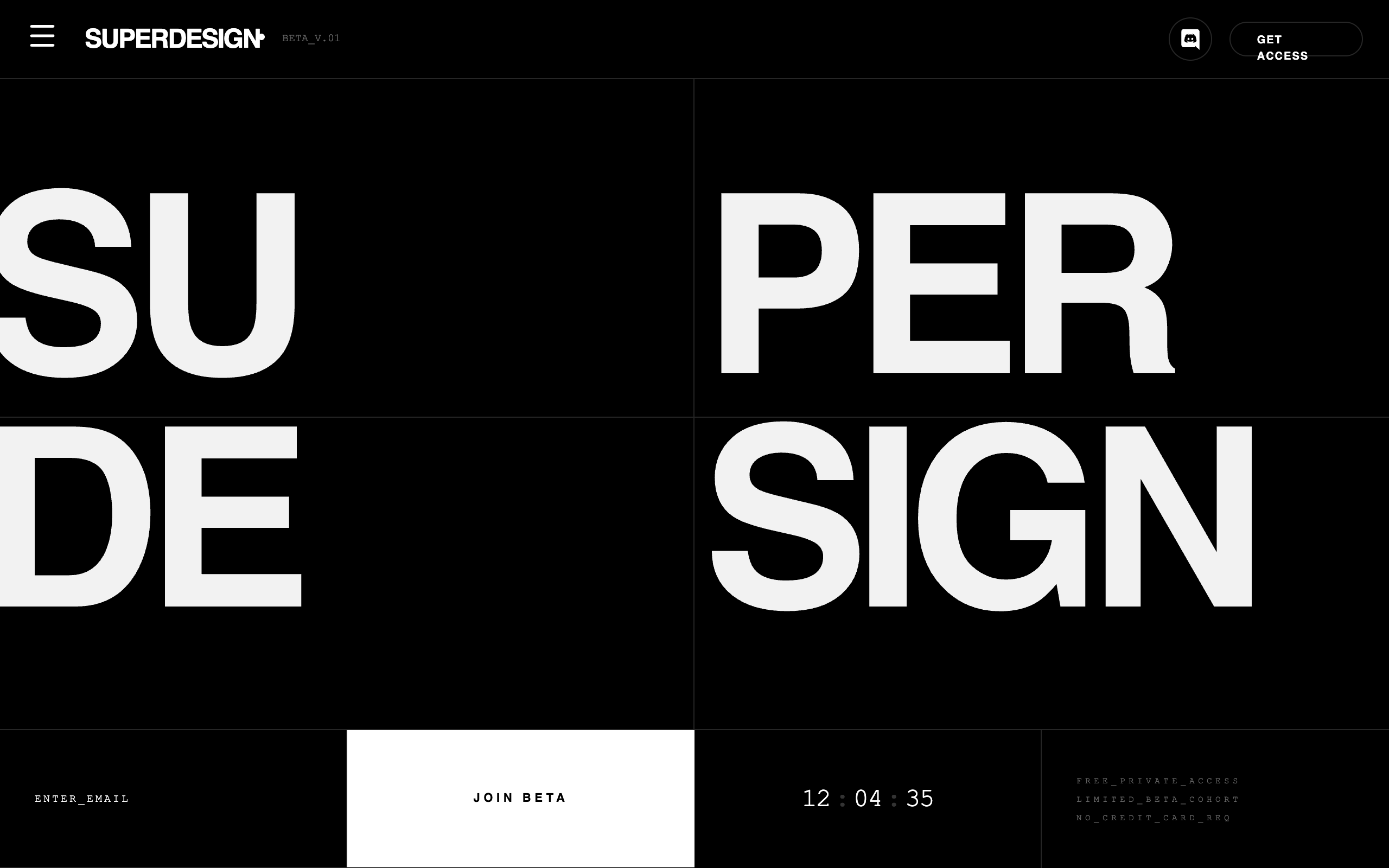
Minimalist Beta CaptureSuperdesign library
Proof minimal works in dark mode: a #080808-to-white monochrome where a serif display and a mono face carry all the hierarchy.
How popular is minimalist design, really?
It is not a trend, it is the baseline: across 208,000+ real generations on Superdesign, minimalist is the single most-requested style, every month, all year.
Minimalist is the most-requested style on Superdesign, holding 9-12% of generations all year across 12,204 projects (21,823 prompt mentions).
*June is month to date. Share of all Superdesign generations whose prompt mentions the style. 12,204 distinct projects, 21,823 prompt mentions total.
Methodology
How we count: numbers come from the prompts of 208,000+ real design generations on Superdesign, January to June 2026. A generation counts as mentioning a style when its prompt contains the style term or a close synonym as a whole word (for example glassmorphic or frosted glass for glassmorphism; the dark mode group counts explicit dark mode and dark theme requests, not every mention of the word dark). One generation counts once even if the term repeats. Distinct projects is the conservative figure: one project can produce many generations. June is month to date, so we show it but do not compare it against closed months. Counts are live and drift slightly day to day.
When should you not use minimalist design?
The gray-on-white contrast trap
Invisible affordances
Thin type at small sizes
Data-dense products
Hiding navigation to look clean
Brands that run on energy
The disappearing CTA
Generate a minimalist web design UI
Generate it on Superdesign
This prompt is tuned to the exact tokens in the recipe above. Copy it, paste it into the prompt box, and you get a full UI in this style on an infinite canvas. Free to start.
Design a minimalist landing page for my product: warm off-white background (#fafaf9), near-black Inter typography on a 1.25 type scale, an 8px spacing scale with 6rem section padding, one blue accent (#2563eb) used only for links and a single CTA. No gradients, no shadows, no decorative icons. Hierarchy comes from type size and whitespace only.
Copies the prompt and opens Superdesign in a new tab.
Using the Superdesign skill from Claude Code or Cursor?
Paste this tuned style prompt into your coding agent. It carries the same tokens as the recipe, so what the agent builds matches what this page teaches.
Apply a minimalist web design system to this UI.

Tokens:
- Background #fafaf9, surface #f0efec, ink #1c1917, muted ink #57534e,
  single accent #2563eb (links and primary CTA only)
- Type: Inter (fallback system-ui), 1.25 modular scale from 16px base,
  headings font-weight 600 with letter-spacing -0.02em, body line-height 1.6
- Spacing: 8px base scale (8/16/24/32/48/64/96px), 96px between page sections
- Body text max-width 65ch, headings max-width 30ch

Restraint rules:
- One typeface family, one accent color, one CTA per screen
- Separate elements with whitespace, not borders or shadows
- No gradients, no decorative icons, no stock illustrations
- Keep link underlines and visible input borders (affordances stay)
- Body text contrast must stay at or above 4.5:1, target 7:1

Strip anything that does not serve the content, then stop. Do not
compensate for emptiness by adding texture or animation.

/* via superdesign.dev/styles/minimalist-web-design */
Frequently asked questions
What is minimalist website design?
How many colors should a minimalist website use?
What fonts work best for minimalist websites?
What is the difference between minimalist and flat design?
Is minimalist design good for conversion?
How do I make a minimalist website that isn't boring?
Related styles
Bento grid →
Minimalism's commercial layout: one idea per cell, Apple-gray restraint at feature-section scale.
Brutalism →
Minimalism with the politeness removed: same restraint, harsher materials.
Dark mode UI →
Quiet dark systems (think Resend) are minimalism wearing the inverted palette.
Skeuomorphism →
The opposite philosophy: texture and material everywhere. Useful as the contrast case.
Swiss design
Minimalism with a grid fetish: the typographic ancestor. Dedicated page coming soon.
Flat design
Minimalism's rendering style: no shadows, no depth. Dedicated page coming soon.
Browse every style in the design styles encyclopedia, or steal a ready-made starting point from the prompt library.