Airbnb's design system, internally the Design Language System (DLS), is built on restraint: one custom typeface (Airbnb Cereal), a signature coral-red called Rausch, soft rounded corners on nearly every element, and depth that comes from photography and whitespace instead of heavy shadows. There is no official public DLS site, so the token values below are observed from the live product and community references, not published by Airbnb. Here is the annotated breakdown, plus a copyable DESIGN.md.
This is a teardown that teaches the taste, not a token dump that lists swatches. Where the incumbents imply official precision they can not have, we mark exactly what is observed versus official. For the format itself, see what is DESIGN.md; this post is the applied example.
What is the Airbnb design system?
Airbnb's design system is internally called the Design Language System (DLS), introduced publicly by designer Karri Saarinen in 2016 and built around restraint: one typeface, a tight palette, soft shapes, photo-led depth. Saarinen's framing of the goal is worth quoting:
A unified design language should not just be a set of static rules and individual atoms, but an evolving ecosystem.
(Source: Karri Saarinen, Airbnb Design.)
Here is the critical honesty callout: Airbnb does not maintain an official public design-system website. What exists publicly is Airbnb Design's own Medium writeups by Saarinen, the live product itself, and community references (Figma community files, GitHub DESIGN.md repos). So every token value in this post is observed from the rendered product or community reconstructions, not an Airbnb-published spec. That matters: token-dump pages imply an official precision they can not actually have.
The DLS rests on four principles Saarinen named, each quoted verbatim:
- Unified: "Each piece is part of a greater whole and should contribute positively to the system at scale."
- Universal: "Our products and visual language should be welcoming and accessible."
- Iconic and Conversational round out the set, focusing on bold, clear work and motion that communicates.
What are Airbnb's brand colors (and which red is real)?
This is the most useful, most-confused fact in the niche: two reds exist and people cite the wrong one. The original Rausch is #FF5A5F (the 2014-era brand red, named after 19 Rausch Street in San Francisco where the founders hosted their first guests). The current live-UI primary is #FF385C, a more vibrant reddish-pink the product shipped in a later refresh. That is what the Book and Reserve buttons actually use today, confirmed in community DESIGN.md reconstructions as "Rausch #ff385c."
Community-observed, not Airbnb-published. Rausch current #FF385C and the active/disabled steps come from community DESIGN.md reconstructions; the Rausch/Babu/Arches/Hof/Foggy set comes from usbrandcolors.com. Airbnb maintains no official public DLS palette.
Why it works: a single high-chroma accent, reserved only for primary actions, reads as confidence. Everything else is near-neutral ink and warm greys, so the one red always means "do this."
What font does Airbnb use?
Airbnb uses Airbnb Cereal, a bespoke geometric-humanist sans commissioned from London type foundry Dalton Maag, launched 15 May 2018 in six weights (Light, Book, Medium, Bold, Extra Bold, Black). It replaced a mix of system fonts. Saarinen is direct about why:
human, friendly, welcoming, and creative professionalism
(Those were the directional keywords for the type. The previous typeface, he wrote, was hard to read especially at small sizes. Source: Karri Saarinen, Working Type, Airbnb Design.)
Cereal's design DNA is a tall x-height and slightly slanted open apertures (look at the lowercase e and a), which is what makes it legible on screen. Why it works editorially: the whole hierarchy runs on one family at different weights, no second display font, which is why Airbnb feels calm and unified.
Honest caveat: Cereal is proprietary and not free to license, so the DESIGN.md and prompt below fall back to a close free stand-in (Inter or a geometric-humanist system stack). It is a substitute, not Cereal itself.
How does Airbnb handle shape, spacing, and depth?
The signature feel breaks into three takeable rules. All radii and spacing values here are community-observed, not official.
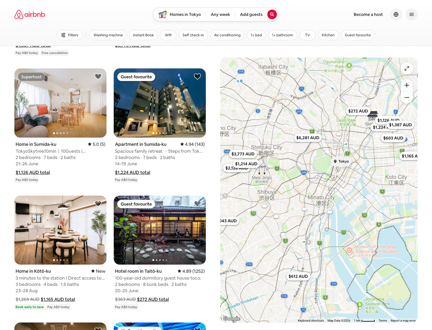
Shape. Soft rounded corners nearly everywhere, with hard corners essentially only on the body image grid. Community-observed radii: roughly 8px buttons, 12px to 20px cards, a fully pill-shaped search bar, and roughly 50% circular nav controls. Why it works: rounded everything reads as friendly and tactile, which suits a consumer marketplace rather than enterprise.
Spacing. Community DESIGN.md docs reconstruct a 4px base grid, denser than a typical SaaS marketing site because marketplace listing pages need high card density per scroll. This is a reconstruction, not an Airbnb spec.
Depth. Airbnb leans on photography, white-on-white surface separation, and rounded-corner image clipping rather than heavy drop shadows, typically one subtle elevation tier. Why it works: the listing photo is the hero, so the chrome stays quiet.
What are the signature Airbnb components?
Annotated mini-teardowns of the instantly recognizable components, each with a one-line reason it works:
- The pill search bar: segmented Where / Check in / Check out / Who, with a circular Rausch search button. Why it works: it compresses a complex query into one calm, tappable shape.
- The listing card: rounded photo, heart save toggle, price and rating, no card border or shadow. Why it works: the photo carries the card, so chrome is unnecessary.
- The primary Reserve CTA: solid Rausch. Why it works: the one red on the screen is the one thing to do.
- The category icon strip: icons with an active underline. Why it works: a quiet, scannable filter that never competes with the photos below it.
This is where the visual editorial beats the token dump: we show the component, not just list a button token.
Airbnb DESIGN.md: copy this into your agent
The take-away artifact. Values are observed from the live product, Cereal is substituted with a free geometric-humanist fallback, and it is a starting brief to tune, not an official Airbnb file.
---
name: "Airbnb (observed)"
colors:
primary: "#FF385C"          # Rausch, current live-UI primary; primary action only
primary_active: "#E00B41"   # community-observed
primary_disabled: "#FFD1DA" # community-observed
secondary: "#00A699"        # Babu
accent: "#FC642D"           # Arches
ink: "#222222"              # primary text
body: "#3F3F3F"
muted: "#767676"            # Foggy
canvas: "#FFFFFF"
surface_soft: "#F7F7F7"
# all values community-observed, not Airbnb-published
typography:
font_family: "Airbnb Cereal (proprietary); fallback: 'Inter', system-ui, sans-serif"
weights: [Light, Book/400, Medium/500, Bold/700, Extra Bold, Black]
note: "one family, weight-only hierarchy"
spacing:
base: 4                     # community-observed; denser than typical SaaS
scale: [4, 8, 12, 16, 24, 32, 48, 64]
radius:                       # community-observed
button: 8
card: "12-20"
search: 999                 # pill
control: "50% circle"
elevation:
tiers: 1                    # depth from photography + whitespace, not shadows
---

## Overview
Restraint and warmth. One typeface, one accent, soft shapes, photo-led depth.

## Colors
Reserve the red for the single primary action. Everything else is near-neutral
ink and warm grey.

## Typography
One family, weight-only hierarchy. No second display font.

## Layout
Soft corners everywhere except the image grid. Lean on photography for depth.

## Do's and Don'ts
- Do: reserve the red for the single primary action.
- Do: lean on photography and whitespace for depth.
- Don't: add a second display font.
- Don't: ship Cereal itself; it is licensed.
Generate an Airbnb-style screen in one prompt
The values pin the look; a good prompt drives the layout and feel. Paste the DESIGN.md above as context, then run this:
Use the Airbnb DESIGN.md above. Design an Airbnb-style listings dashboard: a top
pill search bar (Where / Check in / Check out / Who) with a circular coral search
button, a horizontal category icon strip with an active underline, and a
responsive grid of property cards (rounded photo, heart save toggle, location,
price, star rating, no border or shadow). One accent color (#FF385C) reserved for
the primary action only, generous whitespace, soft 12-20px corners, Cereal-style
geometric-humanist type via an Inter fallback. Output React + Tailwind.
Paste the DESIGN.md and this prompt into the Superdesign skill from your coding agent, and it generates the screen on the canvas and hands back React and Tailwind. Or run it in the web app. Remix it, and ping us if it drifts off-brand and we will tune it together.
For the format behind the file, see what is DESIGN.md. For generating full UIs, see the best AI UI generator, browse the design styles encyclopedia, and grab tested starting prompts from the community prompt library. Want the same teardown on another company? See how Atlassian, Uber, and Apple build their UI.
FAQ
We keep this section short on purpose. The answers also power the FAQ schema below.