Apple's design system is the Human Interface Guidelines (HIG), built on three principles Apple has long stated as Clarity, Deference, and Depth. In practice that means one neutral system typeface (SF Pro), a Dynamic Type scale where Body is 17pt and Large Title is 34pt, semantic system colors (like systemBlue) that auto-adapt to light and dark mode, generous spacing, a 44x44pt minimum tap target, and, since 2025, the translucent Liquid Glass material.
This is a teardown that teaches the taste, not a token dump that lists hexes Apple never published. The most honest fact in the niche: Apple does not ship guaranteed hex values, because its colors are adaptive by design. We explain the logic, hand you a copyable DESIGN.md, and end with a one-line prompt that generates an Apple-style screen. For the format itself, see what is DESIGN.md.
What is Apple's design system, in one paragraph?
Apple does not ship a "design system" as a token repo the way Material Design or Polaris do. Its system is the Human Interface Guidelines (HIG) at developer.apple.com/design, plus downloadable Figma and Sketch UI kits and the SF fonts. The three long-stated principles are Clarity (legible, precise, easy to understand), Deference (the UI serves the content and never competes with it), and Depth (layers and motion convey hierarchy), with Consistency as the connective tissue.
Set the honest frame early: Apple publishes guidance and named tokens (semantic color names, Dynamic Type styles) but not a public hex spec, because its colors are adaptive by design. That is the differentiator from token-dump pages: we explain the system's logic, not a frozen value list.
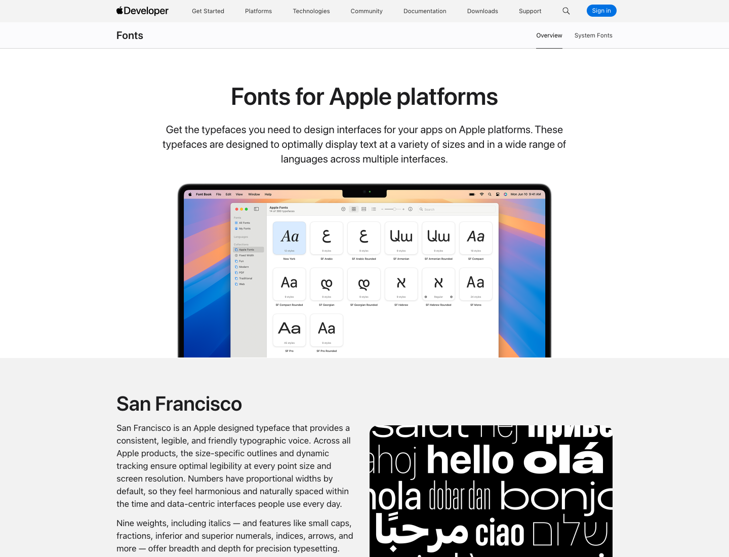
What font does Apple use, and what is the type scale?
Apple uses San Francisco (SF Pro), its own neutral sans-serif system typeface, with New York as the companion serif and SF Mono for code. Apple's own one-liners:
This neutral, flexible, sans-serif typeface is the system font for Apple platforms.
A companion to San Francisco, this serif typeface is based on essential aspects of historical type styles.
(Source: Apple, Fonts.)
Here is the iOS Dynamic Type scale at the default (Large) size, confirmed live against Apple's HIG typography specifications. Present these as Apple's reference metrics, not fixed pixel law, since they rescale with Dynamic Type:
| Style | Size (pt) | Weight |
|---|---|---|
| Large Title | 34 | Regular (Bold emphasized) |
| Title 1 | 28 | Regular (Bold) |
| Title 2 | 22 | Regular (Bold) |
| Title 3 | 20 | Regular (Semibold) |
| Headline | 17 | Semibold |
| Body | 17 | Regular |
| Callout | 16 | Regular |
| Subhead | 15 | Regular |
| Footnote | 13 | Regular |
| Caption 1 | 12 | Regular |
| Caption 2 | 11 | Regular |
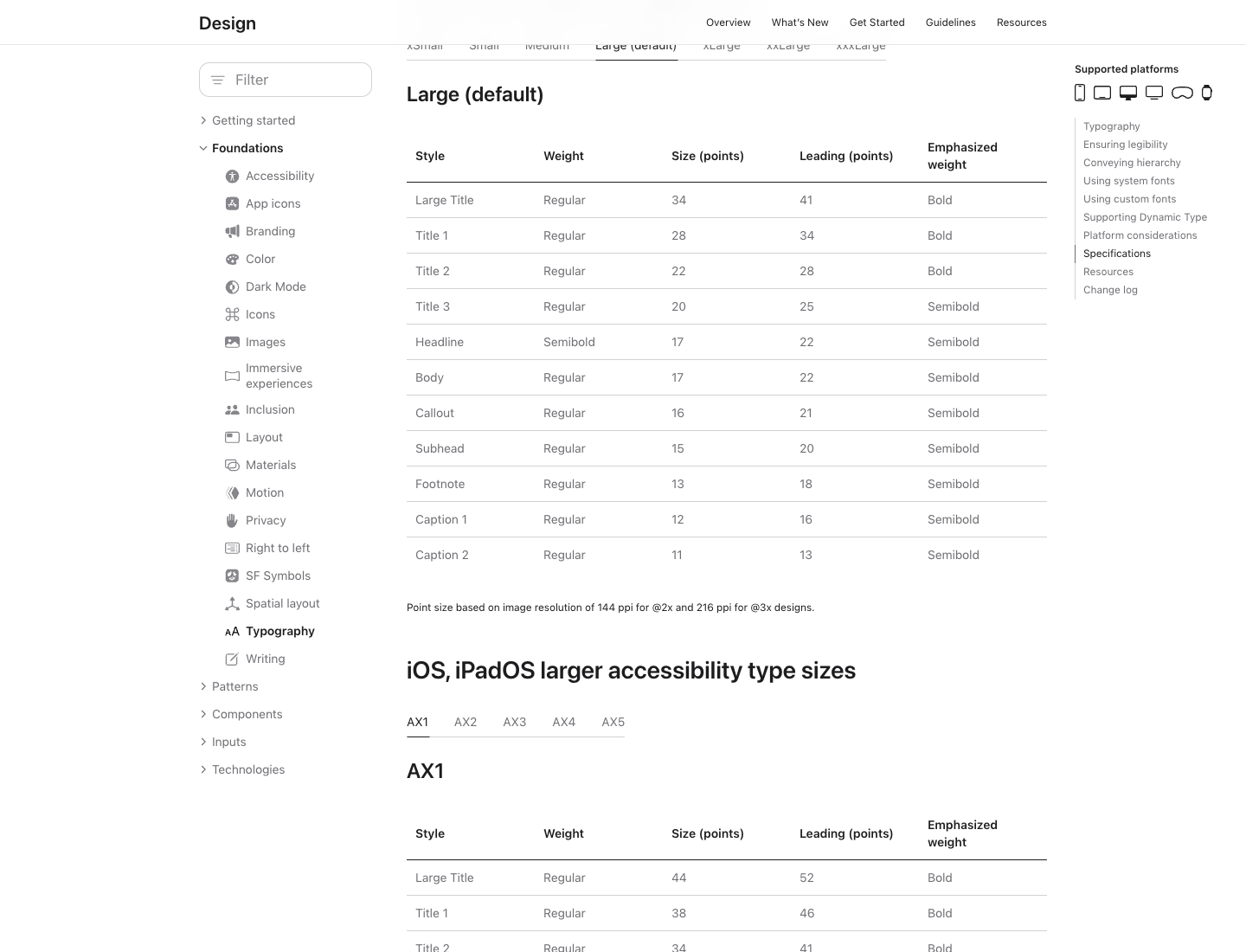
Why it works: 17pt Body is the legibility floor for arm's-length reading, and the deliberate jumps create hierarchy without shouting. Dynamic Type lets users rescale the whole system for accessibility, which is exactly why the scale is defined as named styles instead of fixed pixels.
How does Apple use color, and why are there no official hex codes?
Apple's color system is semantic, not literal. Instead of "use #007AFF," Apple gives you named, adaptive tokens like systemBlue, systemRed, systemGreen, label, secondaryLabel, and systemBackground that automatically shift for light mode, dark mode, increased contrast, and vibrancy. The named system colors are systemRed, systemOrange, systemYellow, systemGreen, systemTeal, systemBlue, systemIndigo, systemPurple, and systemPink, plus a systemGray through systemGray6 ramp.
This is the key honesty section of the whole post: Apple deliberately does not publish guaranteed hex values, because the rendered color depends on the trait environment. Apple's own docs describe systemBlue as a color that automatically adapts to the current trait environment. The widely circulated #007AFF is community-measured, not an Apple spec, and it can differ between OS versions.
Why it works, and the one idea to copy: design to semantic roles, not raw hex. That is the single most portable lesson here, and it is exactly what a DESIGN.md should encode. Token-dump pages hand you a hex Apple never promised; we hand you the mental model.
How does Apple handle spacing, layout, and tap targets?
Apple's layout discipline is built on generous breathing room, alignment to safe areas, and a hard minimum 44x44pt tap target for any interactive control. The 44pt rule has been Apple's guidance since the original iPhone HIG.
On the grid, be honest. Designers commonly reverse-engineer Apple's UI to an 8pt grid with 4pt subdivisions, and it is a genuinely useful working model, but Apple's HIG does not brand or mandate "the 8pt grid" the way Material Design explicitly does. So treat 8pt and 4pt as a reliable convention that matches Apple's output, not an Apple rule.
Why it works: 44pt protects fat-finger reliability, consistent multiples make spacing decisions automatic, and deference means whitespace does the hierarchy work so chrome can recede.
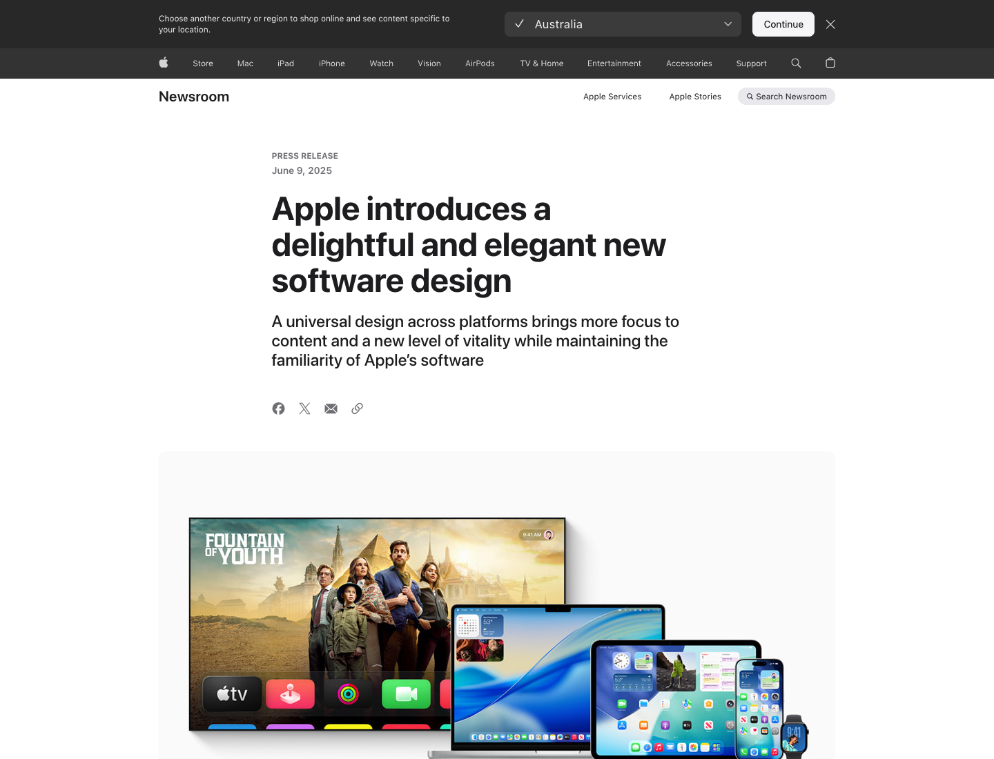
What changed in 2025? Meet Liquid Glass
In June 2025 at WWDC25, Apple shipped its biggest visual redesign in years: Liquid Glass, a translucent material. Apple's exact wording:
This translucent material reflects and refracts its surroundings, while dynamically transforming to help bring greater focus to content
(Source: Apple Newsroom.)
It spans iOS 26, iPadOS 26, macOS Tahoe 26, watchOS 26, and tvOS 26. The design logic: controls become a distinct functional layer that floats above content and gives way to it, which is Deference and Depth taken to their conclusion.
This is essentially glassmorphism at the OS level, so if you want the standalone style, see our glassmorphism page. Why it matters for you: if you are designing Apple-style UI in 2026, translucency and layering are now table stakes, and the prompt below bakes them in.
What does SF Symbols add?
Apple ships SF Symbols, a library of thousands of configurable icons that align optically with SF Pro across every weight and size and inherit the same Dynamic Type and color adaptation. Why it works: icon and type are one system, so an Apple-style UI never has mismatched icon weights. That coherence is the whole thesis of the HIG in one feature.
Your copyable Apple-style DESIGN.md
The take-home asset, in the canonical section order. Every hex is commented as approximate and community-measured, because Apple ships adaptive system colors, never as Apple-official.
---
name: "Apple (HIG-inspired)"
colors:
# All hex values approximate, community-measured. Apple ships ADAPTIVE
# system colors (systemBlue etc.), not fixed hex. Design to the role names.
primary: "#007AFF"        # ~systemBlue (community-measured, not Apple-official)
label: "#000000"          # text role; adapts in dark mode
secondary_label: "#3C3C43"
background: "#FFFFFF"      # ~systemBackground; adapts in dark mode
success: "#34C759"        # ~systemGreen (approximate)
danger: "#FF3B30"         # ~systemRed (approximate)
roles: [systemBlue, label, secondaryLabel, systemBackground, systemGray..systemGray6]
typography:
font_family: "'SF Pro', system-ui, -apple-system, sans-serif"
mono: "'SF Mono', ui-monospace, monospace"
scale: { large_title: 34, title1: 28, title2: 22, title3: 20, headline: 17, body: 17, callout: 16, subhead: 15, footnote: 13, caption1: 12, caption2: 11 }
note: "Apple reference metrics (iOS, Large size). Dynamic Type rescales these."
layout:
spacing_convention: 8     # 8pt grid with 4pt subdivisions; convention, not an Apple mandate
min_tap_target: 44        # 44x44pt, Apple HIG rule
material:
liquid_glass: "translucent layer that floats above and gives way to content (2025)"
principles:
- "Clarity: legible, precise, easy to understand."
- "Deference: the UI serves the content, never competes with it."
- "Depth: layers and motion convey hierarchy."
---

## Overview
Calm, content-first product UI. Chrome recedes; content leads.

## Colors
Design to semantic roles (systemBlue, label, systemBackground), not raw hex,
so light/dark and contrast modes come for free.

## Typography
One system family, weight for hierarchy. 17pt body is the legibility floor.

## Layout
8pt-multiple spacing (convention), 44pt minimum tap targets.

## Components
Translucent Liquid Glass surfaces layered over content; SF Symbols icons that
match the type weight.

## Do's and Don'ts
- Do: reach for systemBlue as the single primary accent.
- Do: keep 44pt minimum tap targets.
- Don't: hardcode a "system color" hex as if Apple published it; it is adaptive.
- Don't: add a second display font; SF carries the hierarchy.
Design an Apple-style UI in one prompt
The values pin the look; the prompt drives the layout and feel. Paste the DESIGN.md above as context, then run this:
Design an Apple-style analytics dashboard: SF Pro / system sans typography with a
17pt body and 34pt page title, semantic system colors (a systemBlue primary that
works in light and dark), generous 8pt-multiple spacing, 44pt minimum tap targets,
translucent Liquid Glass cards layered over content, and SF Symbols-style line
icons. Follow Clarity, Deference, Depth.
Run it in the web app, or drive it from Claude Code or Cursor via the Superdesign skill so it reads your repo first. Copy the file, paste the prompt, and you have an Apple-flavored dashboard in about a minute. Ping us if it drifts and we will tune the file together.
For the format behind the file, see what is DESIGN.md, and for designing by feel with AI, what is vibe design. Browse more visual languages in the design styles encyclopedia, and grab tested prompts from the community prompt library. Want the same teardown on another company? See how Atlassian, Uber, and Airbnb build their UI.
FAQ
We keep this section short on purpose. The answers also power the FAQ schema below.