Where did skeuomorphism come from, and why did it die?
The word predates screens: it is a 19th-century term for objects that imitate the materials of their ancestors, like pottery molded with fake metal rivets (say it "SKYOO-oh-morf-iz-um", from Greek skeuos, container or tool, plus morphe, shape). In software, the peak was the early iPhone era, 2007 to 2012: Steve Jobs pushed real-object metaphors hard, so Notes got a yellow legal pad, Game Center got casino felt, iBooks got a wooden shelf, and the Camera app wore a photorealistic lens.
Then iOS 7 happened. In 2013 Jony Ive flattened the entire OS, and skeuomorphism became a slur almost overnight. The honest reason flat won was not fashion: as NN/g's analysis frames it, textures cost screen space and rendering budget, dated quickly, and stopped being necessary once users no longer needed physical metaphors to understand touchscreens.
Is skeuomorphism coming back in 2026?
Yes, in a new material. Apple announced Liquid Glass at WWDC 2025 and shipped it across iOS 26 and macOS Tahoe: refraction, specular highlights, materials that run "ultraclear to fully tinted". The iOS 26 Photos icon mimics layered stained glass, and the Camera app brought back the high-resolution lens illustration last seen in iOS 6. TechRadar called it the move that "puts the spotlight on skeuomorphism for the first time since iOS 6".
The through-line: same instinct, new material. Skeuomorphism made pixels behave like leather and brushed steel; glassmorphism and Liquid Glass make them behave like glass. Realism via light physics instead of stitching.
How do you build skeuomorphism in CSS?
/* via superdesign.dev/styles/skeuomorphism */

.skeuo-button {
  /* Material gradient: light hits from the top, so lightest stop first */
  background: linear-gradient(to bottom, #f7f2ea 0%, #e8e0d2 45%, #d9cfbc 100%);
  border: 1px solid #b8a98e;        /* real border = survives forced-colors mode */
  border-radius: 10px;              /* physical objects have soft corners, 8-12px */
  padding: 14px 28px;
  color: #4a3f2d;
  font-weight: 600;
  /* Embossed label: dark text with a light edge below it, like letterpress */
  text-shadow: 0 1px 0 rgba(255, 255, 255, 0.7);
  /* The depth stack, outside-in: contact shadow, ambient shadow,
     top bevel highlight, bottom inner shade */
  box-shadow:
    0 1px 2px rgba(0, 0, 0, 0.25),
    0 4px 10px rgba(0, 0, 0, 0.18),
    inset 0 1px 0 rgba(255, 255, 255, 0.8),
    inset 0 -2px 3px rgba(0, 0, 0, 0.12);
  cursor: pointer;
  transition: box-shadow 0.12s ease, transform 0.12s ease;
}

/* The signature move: the button physically depresses */
.skeuo-button:active {
  transform: translateY(1px);
  background: linear-gradient(to bottom, #e2d8c6 0%, #d4c8b1 100%);
  box-shadow:
    inset 0 2px 5px rgba(0, 0, 0, 0.25),
    inset 0 1px 1px rgba(0, 0, 0, 0.2);
}

/* Surface texture: SVG noise, zero network requests */
.skeuo-surface {
  background-color: #ece4d4;
  background-image: url("data:image/svg+xml,%3Csvg xmlns='http://www.w3.org/2000/svg' width='160' height='160'%3E%3Cfilter id='n'%3E%3CfeTurbulence type='fractalNoise' baseFrequency='0.9' numOctaves='2'/%3E%3C/filter%3E%3Crect width='100%25' height='100%25' filter='url(%23n)' opacity='0.05'/%3E%3C/svg%3E");
}
The five moves that make anything read as physical
- Light source: always top, never mixed. Every highlight is inset 0 1px, every shade sits at the bottom.
- Shadow stack: 2 outer (contact + ambient) and 2 inset (bevel + shade). One shadow looks flat; four look machined.
- Gradient: 3 stops, about 15% luminance spread, lightest on top.
- Emboss: dark text + a 0 1px 0 white-ish text-shadow. Invert it (light text, dark shadow above) for debossed.
- Palette and texture: warm material tones (tan, leather brown, brushed-steel grays), never pure #fff or #000; SVG fractalNoise at opacity 0.04 to 0.06, anything above 0.1 reads as dirt.
Browser support: Everything here (multi-layer box-shadow, inset shadows, linear-gradient, text-shadow, SVG data-URI backgrounds) has been universally supported since roughly 2012; no prefixes, no fallbacks needed. The one real caveat: Windows High Contrast (forced-colors: active) strips box-shadows and gradients entirely, which is why the recipe keeps a real 1px border so the button still reads as a button.
Who is using skeuomorphism in 2026?
All five are live today, and none of them use realism as nostalgia wallpaper: in each case the physical metaphor does functional work. The fun side quest: feed an iOS 6 screenshot to screenshot-to-code and rebuild the era in modern CSS.
Not Boring SoftwareLive site
Skeuomorphism as the business model: Weather, Habits, and Calculator as physical toys, with paid cosmetic skins the way people once paid for watch faces. Proof realism sells as a premium differentiator.
Halide by LuxLive site
Skeuomorphism as ergonomics, not decoration: gestures modeled on physical camera dials, typography based on etched type on camera bodies. The metaphor maps straight onto a photographer's muscle memory.
Apple iOS (Liquid Glass)Live site
Material realism at OS scale: light actually refracts through controls. The revival anchor, and the bridge to glassmorphism.
PoolsuiteLive site
A full retro Mac OS desktop metaphor, windows and cassette player included. The OS metaphor does real work: you instantly know how to operate a music app you have never seen.
Arturia V CollectionLive site
Photoreal recreations of vintage synths, wood panels, knobs and VU meters. 1:1 hardware fidelity means a musician who knows the original instrument has zero learning curve.
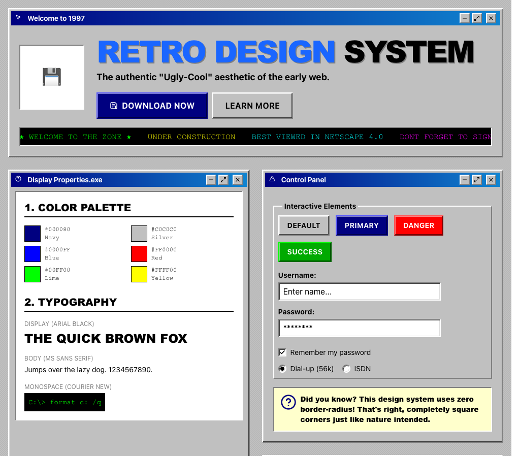
Win98 (related library style)Superdesign library
The OS-metaphor sibling in our library: retro-OS realism with bevels and chrome, a one-prompt starting point for the genre.
What does real demand for skeuomorphism look like?
Honest answer: the revival is critical buzz, not yet builder behavior. Across 208,000+ real generations on Superdesign, here is what builders actually prompt for.
Skeuomorphism stayed rare all year, never topping 0.1% of generations, used in just 71 projects (113 prompt mentions).
*June is month to date. Share of all Superdesign generations whose prompt mentions the style. 71 distinct projects, 113 prompt mentions total.
Methodology
How we count: numbers come from the prompts of 208,000+ real design generations on Superdesign, January to June 2026. A generation counts as mentioning a style when its prompt contains the style term or a close synonym as a whole word (for example glassmorphic or frosted glass for glassmorphism; the dark mode group counts explicit dark mode and dark theme requests, not every mention of the word dark). One generation counts once even if the term repeats. Distinct projects is the conservative figure: one project can produce many generations. June is month to date, so we show it but do not compare it against closed months. Counts are live and drift slightly day to day.
When should you not use skeuomorphism?
Contrast traps are the classic failure
Forced-colors mode deletes your affordances
Dials and knobs are a motor-accessibility tax
Chrome competes with content
Dark mode breaks baked-in lighting
Weight
Where it does earn its keep: single-purpose tools with physical ancestors (cameras, synths, calculators, timers, players), onboarding and empty states, app icons, and brand moments where delight is the point. Want to style a whole product this way? Start with a styled mockup before you commit the engineering budget.
Generate a skeuomorphism UI
Generate it on Superdesign
This prompt is tuned to the exact tokens in the recipe above. Copy it, paste it into the prompt box, and you get a full UI in this style on an infinite canvas. Free to start.
Design a skeuomorphic music player app UI: brushed-metal chassis with a subtle vertical grain, stitched dark-leather header band, glossy convex play and skip buttons that look physically pressable, embossed labels, a realistic rotary volume knob with a position indicator, an analog VU meter with a cream dial face, warm tan and walnut palette, one consistent top light source, soft contact shadows under every raised element.
Copies the prompt and opens Superdesign in a new tab.
Using the Superdesign skill from Claude Code or Cursor?
Paste this tuned style prompt into your coding agent. It carries the same tokens as the recipe, so what the agent builds matches what this page teaches.
Apply a skeuomorphic visual style to this UI.

Rules:
- One light source, top. Every raised element gets: an outer contact shadow
  (0 1px 2px rgba(0,0,0,.25)), an ambient shadow (0 4px 10px rgba(0,0,0,.18)),
  an inset top highlight (inset 0 1px 0 rgba(255,255,255,.8)), and an inset
  bottom shade (inset 0 -2px 3px rgba(0,0,0,.12)).
- Surfaces use 3-stop top-lit linear gradients, lightest stop on top,
  about 15% luminance spread. Base palette: warm materials,
  #f7f2ea / #e8e0d2 / #d9cfbc for bone, #4a3f2d ink, #b8a98e borders,
  walnut #5d4a36 and brushed-steel grays as accents. No pure white or black.
- Labels are letterpress: dark text + text-shadow 0 1px 0 rgba(255,255,255,.7).
- :active states depress: translateY(1px) and swap outer shadows for
  inset 0 2px 5px rgba(0,0,0,.25).
- Add SVG feTurbulence noise at opacity .05 on large surfaces.
- Border-radius 8-12px. Keep a real 1px solid border on every interactive
  element (forced-colors fallback). Maintain WCAG 4.5:1 on all text.
- No flat fills, no borderless ghost buttons, no neon.

/* via superdesign.dev/styles/skeuomorphism */
Frequently asked questions
What is the difference between skeuomorphism and neumorphism?
Why did Apple abandon skeuomorphism?
Is skeuomorphism coming back in 2026?
What are examples of skeuomorphism in UI today?
Is glassmorphism a type of skeuomorphism?
How do you pronounce skeuomorphism?
Related styles
Glassmorphism →
The direct descendant: material realism rebuilt in frosted glass. Strongest link in the family tree.
Minimalist web design →
The antagonist: the element-budget discipline that killed skeuomorphism in 2013.
Brutalism →
The opposite bet: expose the raw material of the web itself instead of imitating physical ones.
Neumorphism →
The minimalist descendant: dual-shadow soft extrusion, no textures, famously low contrast.
Claymorphism →
The soft 3D cousin: inflated clay-like shapes with pastel fills.
Browse every style in the design styles encyclopedia, or steal a ready-made starting point from the prompt library.