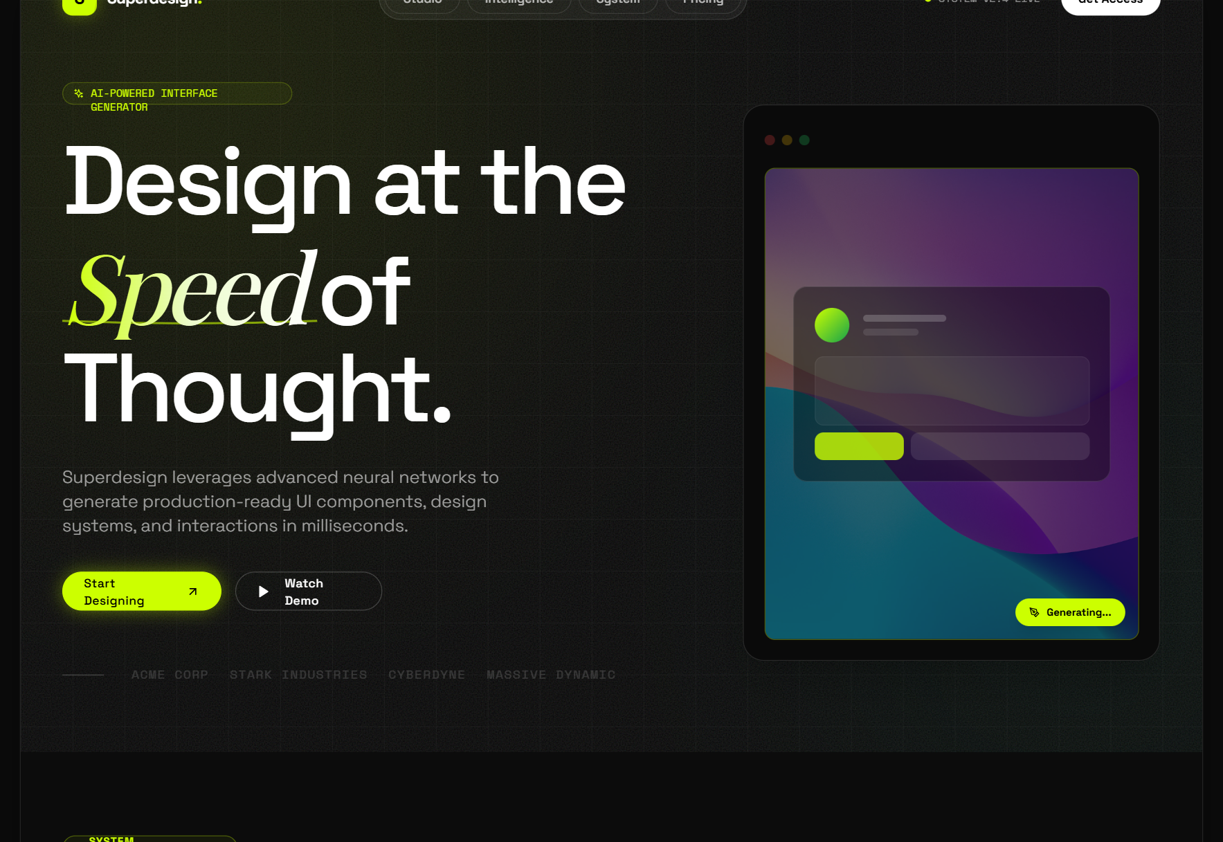
Why is glassmorphism everywhere again?
Two things changed since Michal Malewicz coined the term in 2020. First, Apple made material realism the headline again: Liquid Glass, announced at WWDC in June 2025 and shipped across iOS 26 and macOS Tahoe, is glassmorphism evolved with refraction and motion, and it put "liquid glass vs glassmorphism" into real search demand. Second, the browser story quietly resolved: Safari 18 finally shipped backdrop-filter unprefixed in September 2024, so most older articles describe support constraints that no longer exist.
The style itself never left product chrome. Apple's global nav, Framer's header, and half the dark-mode SaaS landing pages of the last two years all run on the same four CSS properties below.
How do you make glassmorphism in CSS?
This card is the recipe, live
rgba(255,255,255,0.12) fill, blur(12px) saturate(160%), 1px light border, 16px radius, one soft shadow.
/* via superdesign.dev/styles/glassmorphism */
.glass {
  /* the fill: white at 10-15% alpha reads as frost, not fog */
  background: rgba(255, 255, 255, 0.12);
  /* the glass: blur melts the backdrop, saturate keeps colors from going gray */
  backdrop-filter: blur(12px) saturate(160%);
  -webkit-backdrop-filter: blur(12px) saturate(160%); /* Safari before 18 */
  /* the edge: a 1px light border sells the pane and survives forced-colors mode */
  border: 1px solid rgba(255, 255, 255, 0.25);
  border-radius: 16px;
  /* the lift: large soft shadow separates glass from backdrop */
  box-shadow: 0 8px 32px rgba(0, 0, 0, 0.25);
}

/* dark glass variant */
.glass-dark {
  background: rgba(17, 25, 40, 0.55);
  border-color: rgba(255, 255, 255, 0.12);
}

/* fallback: no backdrop-filter, go nearly opaque so text stays readable */
@supports not ((backdrop-filter: blur(1px)) or (-webkit-backdrop-filter: blur(1px))) {
  .glass { background: rgba(255, 255, 255, 0.85); }
  .glass-dark { background: rgba(17, 25, 40, 0.92); }
}
Three gotchas the tutorials skip
- Glass needs a busy backdrop. Over a flat single color, blur has nothing to do and the panel just looks washed out. Put a gradient or image behind it.
- backdrop-filter turns the element into a containing block: position: fixed descendants get trapped inside it. This is the classic "my modal broke" bug.
- Blur cost scales with blurred area. Never animate the blur radius, and avoid full-page glass surfaces that repaint on scroll.
Why these exact values
- The 12px default blur sits in the verified production sweet spot: Apple's nav uses 20px, Framer 10px, Reflect runs 4 to 22px, Resend 25px.
- The 1px light border is an accessibility feature, not decoration: Windows forced-colors mode strips transparency and leaves that border as the only visible edge.
- The saturate(160%) half of the filter is what keeps colors behind the pane from going gray; blur alone reads muddy.
Browser support: Baseline widely available. Chrome and Edge 76+ (2019), Firefox 103+ (2022), Safari 9+ with the -webkit- prefix and unprefixed since Safari 18 (September 2024). Keep the prefix line; it costs nothing and covers older iOS. Ship the @supports fallback anyway so unsupported engines get a readable opaque panel.
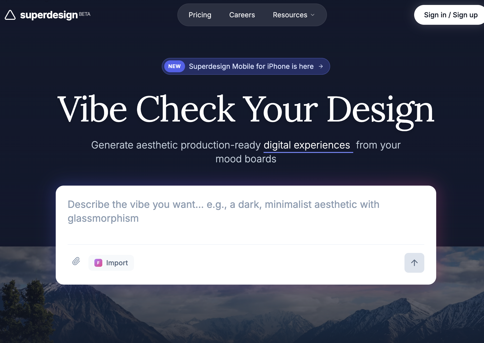
Want to tune it live? The glassmorphism generator
Drag the sliders, watch the card, copy the exact CSS or Tailwind it produces. The contrast badge checks your card text against the worst-case backdrop color, which is the check that decides whether your glass is shippable.
Controls
Backdrop
Frosted glass card
Body text over the live backdrop
The badge is the card text against the worst-case backdrop color under your current fill, checked at the WCAG 4.5:1 body-text bar. If it fails, raise fill opacity or blur, or keep body text off the glass.
/* via superdesign.dev/styles/glassmorphism */
.glass {
  background: rgba(255, 255, 255, 0.12);
  backdrop-filter: blur(12px) saturate(160%);
  -webkit-backdrop-filter: blur(12px) saturate(160%); /* Safari before 18 */
  border: 1px solid rgba(255, 255, 255, 0.25);
  border-radius: 16px;
  box-shadow: 0 8px 32px rgba(0, 0, 0, 0.25);
}

/* fallback: no backdrop-filter, go nearly opaque so text stays readable */
@supports not ((backdrop-filter: blur(1px)) or (-webkit-backdrop-filter: blur(1px))) {
  .glass {
    background: rgba(255, 255, 255, 0.82);
  }
}What are the best glassmorphism examples?
Every site below was verified live by reading its production CSS, not by eyeballing screenshots. One more worth studying: Clerk runs about 25 backdrop-filter rules, mostly 1 to 10px micro-blurs, proof that glass scales down to component level without eating readability.
Apple (global nav)Live site
Apple puts glass on chrome, not content: the nav scrim is nearly opaque with a saturate(180%) blur(20px) boost, so links pass contrast over any product image that scrolls beneath.
ReflectLive site
The canonical dark-glass landing page: 30+ backdrop-filter rules over an aurora gradient the team fully controls, so worst-case text contrast never surprises them.
Framer (nav)Live site
A brightness(150%) lift inside the filter keeps white nav text legible while colorful portfolio work slides underneath.
Resend (hero cards)Live site
A heavy 25px blur turns a busy gradient into a soft color wash, so the panel reads as material rather than noise.
Glassmorphism StyleSuperdesign library
Our flagship glass item (126.9k views, 1,463 copies): neon accents only work here because the obsidian fill is opaque enough to anchor them.
Futuristic SaaS Landing PageSuperdesign library
One frosted card over one photo: the entire style in a single move, and the cleanest starting prompt to copy.
Is glassmorphism still trending in 2026?
Yes, and we can show it rather than guess: this is what people actually ask design agents for. Across 208,000+ real generations on Superdesign, glassmorphism prompts have been climbing all spring.
Glassmorphism rose from 7.5% to 9.9% of generations between January and May 2026, used in 7,866 projects (15,725 prompt mentions).
*June is month to date. Share of all Superdesign generations whose prompt mentions the style. 7,866 distinct projects, 15,725 prompt mentions total.
Methodology
How we count: numbers come from the prompts of 208,000+ real design generations on Superdesign, January to June 2026. A generation counts as mentioning a style when its prompt contains the style term or a close synonym as a whole word (for example glassmorphic or frosted glass for glassmorphism; the dark mode group counts explicit dark mode and dark theme requests, not every mention of the word dark). One generation counts once even if the term repeats. Distinct projects is the conservative figure: one project can produce many generations. June is month to date, so we show it but do not compare it against closed months. Counts are live and drift slightly day to day.
When should you not use glassmorphism?
Text over backdrops you do not control
Data-dense screens
Flat, single-color backgrounds
Low-end devices and big surfaces
Users who opted out
Want to see a full page in the style before you commit to coding it? Prompt-to-design renders the whole layout from a sentence, glass and all.
Generate a glassmorphism UI
Generate it on Superdesign
This prompt is tuned to the exact tokens in the recipe above. Copy it, paste it into the prompt box, and you get a full UI in this style on an infinite canvas. Free to start.
Design a SaaS analytics dashboard in glassmorphism style: frosted glass panels with rgba(255,255,255,0.12) fill, 12px backdrop blur with 160% saturation, 1px rgba(255,255,255,0.25) borders, 16px corner radius, and soft 0 8px 32px shadows, floating over a deep indigo-to-violet mesh gradient. High-contrast white text on the panels, one neon mint accent for primary actions, generous spacing, sidebar plus 4 stat cards plus a line chart.
Copies the prompt and opens Superdesign in a new tab.
Using the Superdesign skill from Claude Code or Cursor?
Paste this tuned style prompt into your coding agent. It carries the same tokens as the recipe, so what the agent builds matches what this page teaches.
Use a glassmorphism design system with these tokens:
- Surface: rgba(255,255,255,0.12) fill, backdrop-filter blur(12px) saturate(160%),
  1px rgba(255,255,255,0.25) border, 16px radius, shadow 0 8px 32px rgba(0,0,0,0.25)
- Dark surface variant: rgba(17,25,40,0.55) fill, rgba(255,255,255,0.12) border
- Backdrop: mesh gradient, indigo #4f46e5 to violet #8b5cf6 to deep navy #0f172a;
  never place glass on flat single-color backgrounds
- Text: white #ffffff on dark glass, slate-900 on light glass; body text only on
  surfaces with >= 55% fill opacity so worst-case contrast stays above 4.5:1
- Accent: neon mint #34d399, used only for primary actions and live indicators
- Always pair backdrop-filter with -webkit-backdrop-filter and an @supports
  fallback that raises fill opacity to 85%
- Glass goes on chrome (navs, cards, modals, overlays), never on tables or long-form text

/* via superdesign.dev/styles/glassmorphism */
Frequently asked questions
How do you make glassmorphism in CSS?
What is the difference between glassmorphism and Apple's Liquid Glass?
What is the difference between glassmorphism and neumorphism?
Is glassmorphism accessible?
Does backdrop-filter work in all browsers?
How do I do glassmorphism in Tailwind?
Related styles
Dark mode UI →
Dark glass needs the same surface-tier thinking: elevation by lightening, worst-case contrast checks.
Skeuomorphism →
The ancestor instinct: make pixels behave like a material. Glass is just the 2020s material of choice.
Minimalist web design →
The restraint discipline that keeps glass on chrome and off the reading surface.
Neumorphism →
The soft-extrusion sibling that trades backdrops for shadow pairs, and lost the contrast fight glass won.
Claymorphism →
The other soft 3D survivor: inflated pastel clay instead of frosted panes.
Liquid glass
Apple's 2025 evolution: refraction, specular highlights, motion response. Dedicated page coming soon.
Browse every style in the design styles encyclopedia, or steal a ready-made starting point from the prompt library.