Where did claymorphism come from?
The term was coined by Michal Malewicz in 2021 (his original article named the trend, and Smashing Magazine's 2022 piece credits him with the coinage). The CSS caught up in stages: Malewicz's own first recipe used an outer shadow plus a single inset, and the now-standard two-inset stack below was popularized by Adrian Bece's clay.css library and his LogRocket walkthrough. The motivation is the interesting part: clay exists largely because neumorphism failed contrast accessibility, and inflating elements ON TOP of the page (instead of extruding them FROM it) lets you keep real contrast between element and background.
How do you make claymorphism in CSS?
Soft clay card
Light inset on top, dark inset underneath, tinted shadow below.
/* via superdesign.dev/styles/claymorphism */
.clay-card {
  /* Pastel base. Clay reads best on light, low-saturation fills */
  background-color: #f3e8ff;

  /* Large radius sells the "molded" look. Rule of thumb: ~25% of element height */
  border-radius: 32px;

  /* The clay illusion is three shadows in one declaration, order matters:
     1) outer drop shadow: floats the element off the page
     2) inset dark, offset UP from the bottom: the underside curve
     3) inset light, offset DOWN from the top: the highlight where light hits */
  box-shadow:
    0 35px 68px rgba(112, 100, 176, 0.30),
    inset 0 -8px 16px rgba(95, 70, 140, 0.22),
    inset 0 8px 16px rgba(255, 255, 255, 0.65);

  /* Generous padding keeps the inflated proportions */
  padding: 2rem;
}

/* Buttons: tighten the shadows, keep the geometry */
.clay-button {
  background-color: #c4b5fd;
  border-radius: 24px;
  border: none;
  padding: 0.875rem 2rem;
  box-shadow:
    0 12px 24px rgba(112, 100, 176, 0.35),
    inset 0 -4px 8px rgba(95, 70, 140, 0.25),
    inset 0 4px 8px rgba(255, 255, 255, 0.7);
  transition: transform 120ms ease, box-shadow 120ms ease;
}

/* Press feedback: squash, do not animate the shadows themselves */
.clay-button:active {
  transform: translateY(2px) scale(0.98);
}

/* Never let the soft look eat the focus ring */
.clay-button:focus-visible {
  outline: 3px solid #6d28d9;
  outline-offset: 3px;
}
The details that decide whether it reads as clay or as dirt
- Shadow color should be a darker, desaturated version of the background hue, not pure black. Pure black insets look like dirt on pastel.
- The dark inset uses a NEGATIVE y-offset (the shade creeps up from the bottom edge); the light inset uses a POSITIVE y-offset. Get these backwards and the lighting inverts: the element looks dented instead of inflated.
- Tint the outer shadow toward the element hue (the rgba(112,100,176,...) above) for the signature colored-glow lift.
- Press feedback squashes with transform: translateY(2px) scale(0.98). Animate transform, never box-shadow: large-blur shadows are cheap to paint once and expensive to animate.
Browser support: Everything here is multi-value box-shadow plus border-radius, supported in every browser since IE9. No fallbacks, no prefixes, no backdrop-filter gotchas (that is glassmorphism's problem). The only caveat: large-blur shadows repainted during animation are expensive, so animate transform and opacity only, exactly as the :active pattern above does.
What are the best claymorphism examples?
Three from our own library, three from the wild. The wild ones carry clay principles rather than this exact CSS: the inflated 3D depth, the chunky pressable buttons, the pastel discipline.
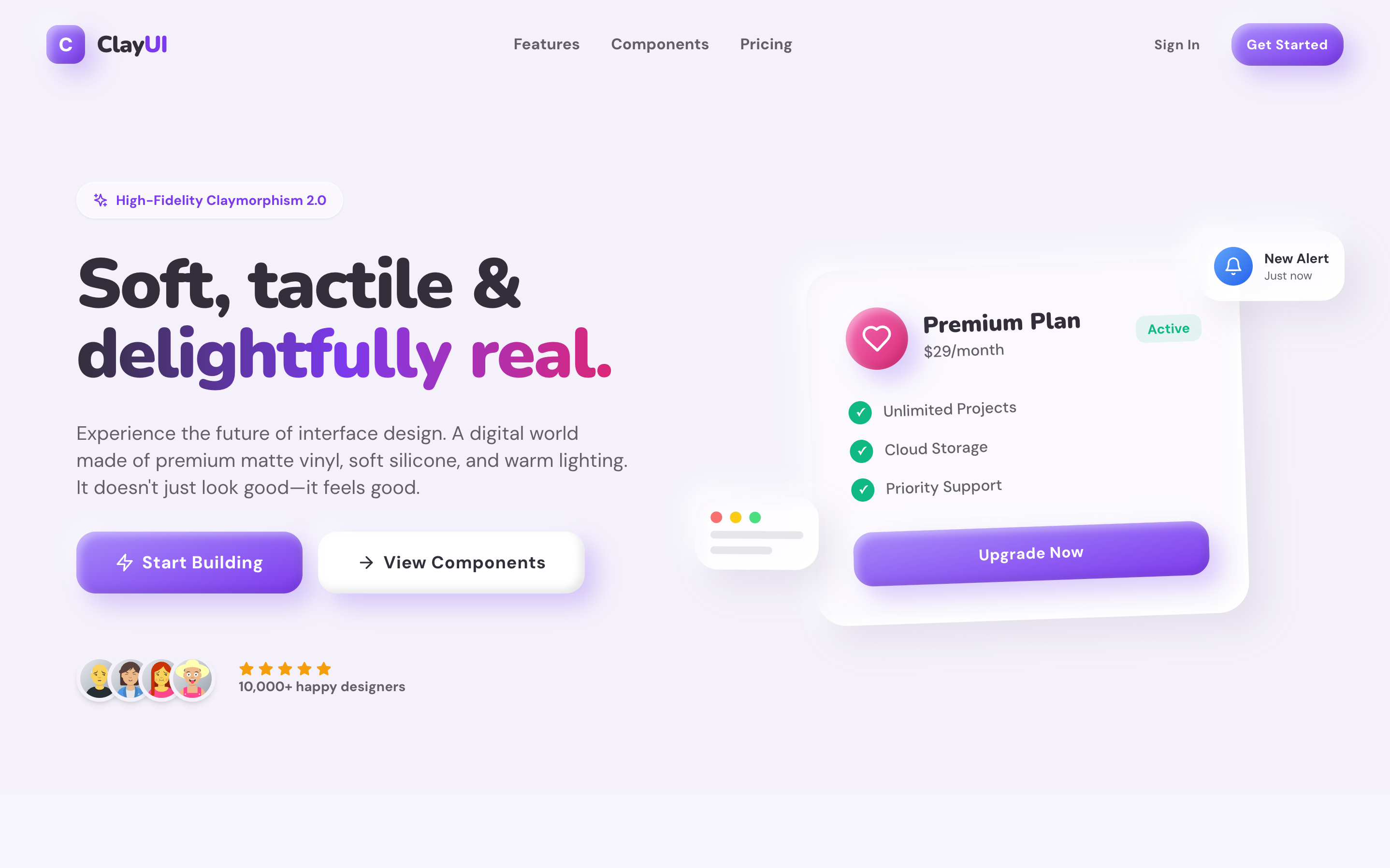
Clay UISuperdesign library
A high-fidelity clay design system: every component shares one light source, so the whole screen reads as molded from a single slab.
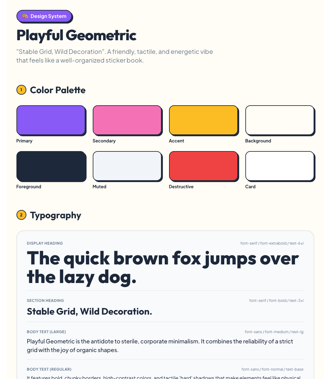
PlayfulSuperdesign library
Clay's chunky geometry without the full shadow stack: a good clay-adjacent calibration point for how far the look stretches.
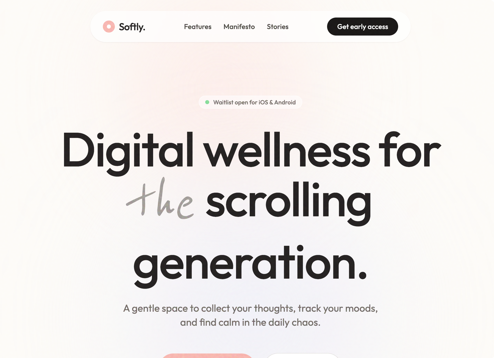
Softly: Digital Wellness AppSuperdesign library
Pastel palette discipline: the color half of the recipe, demonstrated on a Gen-Z wellness UI with floating soft shapes.
DuolingoLive site
The most-cited mainstream carrier of clay principles: the 3D extrusion on its chunky buttons is functional, the depth literally tells you what is tappable.
JoonLive site
Claymorphism matched to audience: a kids' habit app where soft inflated shapes read as safe and friendly to both kids and parents.
Fall GuysLive site
Clay as brand: the squishy physicality of the inflated bean characters carries into every rounded, saturated UI element.
Is claymorphism still popular in 2026?
It settled from the 2022 hype into a small but growing niche: across 208,000+ real generations on Superdesign, clay requests more than doubled this spring, from a tiny base, mostly for kids' products, edtech, and illustration-heavy landing pages.
Claymorphism more than doubled from 0.03% to 0.08% of generations January to May 2026, still tiny: 70 projects (108 prompt mentions).
*June is month to date. Share of all Superdesign generations whose prompt mentions the style. 70 distinct projects, 108 prompt mentions total.
Methodology
How we count: numbers come from the prompts of 208,000+ real design generations on Superdesign, January to June 2026. A generation counts as mentioning a style when its prompt contains the style term or a close synonym as a whole word (for example glassmorphic or frosted glass for glassmorphism; the dark mode group counts explicit dark mode and dark theme requests, not every mention of the word dark). One generation counts once even if the term repeats. Distinct projects is the conservative figure: one project can produce many generations. June is month to date, so we show it but do not compare it against closed months. Counts are live and drift slightly day to day.
When should you not use claymorphism?
Pastel-on-pastel text fails WCAG
The soft shadows can swallow focus indicators
Affordance collapse
Data density hates it
Dark mode needs re-derivation, not inversion
Tone mismatch is real
Performance edge case
Building a full clay landing page rather than one component? Generate the whole page or a quick clay-style mockup and pressure-test the tone before committing.
Generate a claymorphism UI
Generate it on Superdesign
This prompt is tuned to the exact tokens in the recipe above. Copy it, paste it into the prompt box, and you get a full UI in this style on an infinite canvas. Free to start.
Design a landing page for a kids' learning app in claymorphism style: pastel lavender and peach palette, cards with 32px rounded corners that look like soft inflated clay, double inset shadows (light top, dark bottom) plus a tinted outer drop shadow, chunky pressable 3D buttons, and friendly inflated blob illustrations.
Copies the prompt and opens Superdesign in a new tab.
Using the Superdesign skill from Claude Code or Cursor?
Paste this tuned style prompt into your coding agent. It carries the same tokens as the recipe, so what the agent builds matches what this page teaches.
Apply a claymorphism design system to this UI.

Style tokens:
- Surfaces: pastel fills (#f3e8ff lavender, #ffe8d9 peach, #d9f2e6 mint), never pure white
- Radius: 32px on cards, 24px on buttons, 20px on inputs (roughly 25% of element height)
- The clay shadow stack on every interactive element:
  box-shadow: 0 35px 68px rgba(112,100,176,0.30),
              inset 0 -8px 16px rgba(95,70,140,0.22),
              inset 0 8px 16px rgba(255,255,255,0.65);
  (tint the outer shadow toward each element's hue; never use pure black)
- Buttons get a tighter stack (12/24px outer, 4/8px insets) and press feedback via
  transform: translateY(2px) scale(0.98), never by animating box-shadow
- Text: deep desaturated purple (#3b2d5e) on pastel, minimum 4.5:1 contrast
- Keep a visible 3px solid :focus-visible outline, the soft shadows must not replace it
- Generous padding (2rem cards), single top-left light source across ALL elements
- Containers that are not clickable get the outer shadow only, no insets

Friendly, toy-like, tactile. No sharp corners anywhere, no gradients on surfaces, no glassmorphism blur.

/* via superdesign.dev/styles/claymorphism */
Frequently asked questions
What is the difference between claymorphism and neumorphism?
How do you make claymorphism in CSS?
Does claymorphism work with Tailwind CSS?
Is claymorphism still popular in 2026?
What colors are used in claymorphism?
Is claymorphism accessible?
Related styles
Neumorphism →
The predecessor it fixed: same softness, but extruded from the page and famously low-contrast.
Glassmorphism →
The other morphism that survived 2021: translucency and blur instead of inflation.
Skeuomorphism →
The grandparent: real materials and textures, where clay keeps only one material.
Brutalism →
The tonal opposite: hard edges and zero softness, useful as the contrast case.
Minimalist web design →
The restraint discipline clay borrows its palette budget from.
Browse every style in the design styles encyclopedia, or steal a ready-made starting point from the prompt library.