What is brutalism actually about?
The philosophy predates the look. David Bryant Copeland's manifesto reduces it to honesty of materials: content first, links look like links, the back button works, performance is design. The visual style on this page is what you get when you take that seriously and refuse to override browser defaults you do not need to override. Playful aside: brutalism is the only style where the wireframe ships.
For inspiration depth, the canonical gallery is brutalistwebsites.com with hundreds of curated sites. We are the explainer that gallery never wrote: definition, working code, costs, and data on one page.
How do you make a website look brutalist in CSS?
/* via superdesign.dev/styles/brutalism */
:root {
  --bg: #ffffff;
  --ink: #000000;
  --link: #0000ee;            /* the browser's default unvisited-link blue: links must look like links */
  --rule: 2px solid var(--ink);
}

body {
  background: var(--bg);
  color: var(--ink);
  /* The raw-terminal variant. For the plainer flavor swap to: system-ui, Arial, sans-serif */
  font-family: ui-monospace, "SF Mono", "Courier New", monospace;
  font-size: 1rem;            /* never below 16px, mono reads slower at small sizes */
  line-height: 1.45;
  margin: 8px;                /* keep browser-default margin energy, do not reset to 0 */
}

h1, h2, h3 {
  text-transform: uppercase;
  font-weight: 700;
  letter-spacing: -0.02em;
  margin: 1.5rem 0 0.5rem;
}

a {
  color: var(--link);
  text-decoration: underline; /* removing underlines is the first step away from brutalism */
}

button, input, select, textarea, .card, table {
  border: var(--rule);
  border-radius: 0;           /* no rounded corners, anywhere */
  box-shadow: none;           /* shadows are the first thing brutalism deletes */
  background: var(--bg);
  color: var(--ink);
}

button {
  font: inherit;              /* buttons default to the OS UI font, force the page font */
  padding: 0.5rem 1.25rem;
  text-transform: uppercase;
  cursor: pointer;
}
button:hover, a:hover {
  background: var(--ink);
  color: var(--bg);           /* hover = hard inversion, no transitions, no easing */
}
:focus-visible {
  outline: 3px solid var(--ink);
  outline-offset: 2px;        /* a raw border is the most on-brand focus style there is */
}

table { border-collapse: collapse; width: 100%; }
th, td { border: 1px solid var(--ink); padding: 4px 8px; text-align: left; }
The load-bearing values
- #0000ee is the browser's true default unvisited-link blue. In Tailwind use the arbitrary value text-[#0000ee], not text-blue-700: nothing in the default palette matches it. Same logic for leading-[1.45], so both recipe blocks produce the identical page.
- font: inherit on buttons matters: buttons default to the OS UI font, and the genre demands the page font everywhere.
- No transition classes anywhere: the hover inversion should snap. Easing is comfort, and comfort is what this style refuses.
- rounded-none and shadow-none look redundant until you compose with component libraries that sneak radii in.
- One line of escape hatch: add a hard offset shadow (box-shadow: 4px 4px 0 #000) plus one saturated accent and you have left brutalism for neubrutalism.
Browser support: Everything here is CSS 2.1-era and works everywhere. The two modern bits: ui-monospace is a Safari-only keyword (Safari 13.1+ on desktop, iOS 13.4+); Chrome, Edge, and Firefox do not support it at any version and fall through to the next font in the stack, SF Mono where installed and Courier New everywhere else, which is exactly the behavior we want, the stack degrades by design. Custom properties work in all evergreen browsers; if you must support IE11, hardcode the four values. :focus-visible is supported in all evergreen browsers since 2022; older browsers fall back to their default outline, which is fine here.
What are the best brutalist website examples?
Every site below was fetched and confirmed live with the style visible. They split into two camps worth keeping apart: functional brutalism that never trends and never dies, and intentional brutalism as an aesthetic statement.
CraigslistLive site
Decades of profit on default-link blue: proof that information density beats decoration when users come to do, not to browse.
Hacker NewsLive site
One table, one tiny font, 30 links. The layout disappears so ranking and headlines do all the work.
Drudge ReportLive site
All-caps headlines in three plain link columns: urgency carried entirely by typography, no banner graphics needed.
Brutalist Web Design (the manifesto)Live site
Copeland's guidelines, and the page practices them: nothing is clickable that is not visibly a link.
Yale School of ArtLive site
The canon example: a wiki the faculty and students can edit, so the rawness is constitutional, not cosmetic.
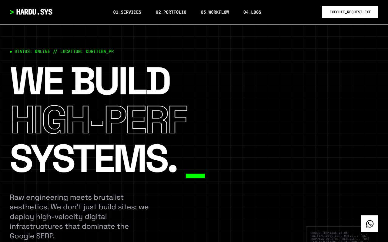
SpecOS Brutalist MonochromeSuperdesign library
Refined brutalism: black and white, 2px borders, IBM Plex pairing. The style worn by a fintech-grade product.
Is brutalism still a web design trend in 2026?
Straight answer: it is past peak, and we have the receipts. We watched this rise and we are watching it cool. Demand peaked in March 2026 and has faded since, which no listicle hedging about trends can tell you.
Brutalism climbed from 2.5% to 3.3% of generations January to May 2026 (peaking at 3.6% in March), used in 3,417 projects (6,193 prompt mentions).
*June is month to date. Share of all Superdesign generations whose prompt mentions the style. 3,417 distinct projects, 6,193 prompt mentions total.
Methodology
How we count: numbers come from the prompts of 208,000+ real design generations on Superdesign, January to June 2026. A generation counts as mentioning a style when its prompt contains the style term or a close synonym as a whole word (for example glassmorphic or frosted glass for glassmorphism; the dark mode group counts explicit dark mode and dark theme requests, not every mention of the word dark). One generation counts once even if the term repeats. Distinct projects is the conservative figure: one project can produce many generations. June is month to date, so we show it but do not compare it against closed months. Counts are live and drift slightly day to day.
When should you not use brutalism?
Pure black on pure white can be too much contrast
All-caps everything hurts scanning
Monospace body text reads slower
Undifferentiated link walls are a cognitive-load tax
Deleting affordances is not brutalism, it is just broken
When the content is imagery
When the design must age past the trend
Want the whole site in this style, not just the CSS? Generate the full site, or build components with these exact tokens in the AI UI generator.
Generate a brutalism UI
Generate it on Superdesign
This prompt is tuned to the exact tokens in the recipe above. Copy it, paste it into the prompt box, and you get a full UI in this style on an infinite canvas. Free to start.
Design a brutalist landing page for a developer tool. Pure white background, black monospace type (JetBrains Mono), 2px solid black borders on every interactive element, default-blue underlined links (#0000EE), zero border-radius, zero box-shadows, all-caps headings, hover states that invert to black with white text. Dense, honest, fast.
Copies the prompt and opens Superdesign in a new tab.
Using the Superdesign skill from Claude Code or Cursor?
Paste this tuned style prompt into your coding agent. It carries the same tokens as the recipe, so what the agent builds matches what this page teaches.
/* Brutalism style prompt, via superdesign.dev/styles/brutalism */
Apply a raw brutalist web style to this UI:
- Palette: background #FFFFFF, ink #000000, links #0000EE underlined, optional single accent #00FF00 used only for status indicators
- Type: ui-monospace / "JetBrains Mono" for headings and UI labels, system-ui for body; body 16px minimum, line-height 1.45; headings uppercase, font-weight 700, letter-spacing -0.02em
- Structure: 1px to 2px solid #000 borders on buttons, inputs, cards, and table cells; border-radius 0 everywhere; box-shadow none everywhere; visible grid, generous nothing
- Interaction: hover inverts to black background with white text, no transitions or easing; focus-visible gets a 3px solid black outline offset 2px
- Forbidden: gradients, blur, drop shadows, rounded corners, decorative icons, stock imagery, skeleton shimmer
- Keep: underlined links, native form controls, semantic HTML, real buttons
Frequently asked questions
What is the difference between brutalism and neubrutalism in web design?
What fonts are used in brutalist web design?
Is brutalist web design accessible?
Is brutalism still a web design trend in 2026?
How do I make my website look brutalist?
Why do brutalist websites use Times New Roman and Courier?
Related styles
Minimalist web design →
Shares the restraint, swaps harshness for softness.
Dark mode UI →
Terminal-flavored brutalism is the always-dark cousin; the surface-tier rules still apply.
Glassmorphism →
The exact opposite: blur, depth, and gloss. Useful as a contrast link.
Bento grid →
Bento structure takes a brutalist skin surprisingly well: hard borders, zero radius, one grid.
Neubrutalism
Where the trend energy went: thick borders plus hard offset shadows and candy accents. Dedicated page coming soon.
Browse every style in the design styles encyclopedia, or steal a ready-made starting point from the prompt library.