Why did neumorphism rise and fall so fast?
The name is literally "new skeuomorphism", coined by Jason Kelly in 2019, and Wikipedia's history records the rest: a massive designer crush through 2020, then uptake that "quickly declined" by 2021 over accessibility. The poster child tells the story best. CRED, for years the most famous neumorphic app in production (as a 2022 UX Planet review of the revamp put it: "Few years back, when neumorphism faced a lot of criticism for its accessibility issues, Cred took the world by storm and introduced a neumorphic design"), shipped a non-neumorphic redesign in April 2022 and open-sourced NeoPOP, a components library based on its successor design system. When your flagship adopter publishes a successor system, the trend has spoken. Designers also widely cited the Tesla app's vehicle controls as the style's biggest mainstream sighting, and it has moved on too.
So why a whole page on it? Because the recipe is genuinely beautiful, still searched thousands of times a month, and still earns its keep in small doses. This page gives you the recipe, the generator, and the honest verdict in one place: here is how to build it, and here is why almost nobody ships it anymore.
How do you create neumorphism in CSS?
/* via superdesign.dev/styles/neumorphism */
/* The stage: element and page share ONE background color */
.neu-page { background: #e0e5ec; }
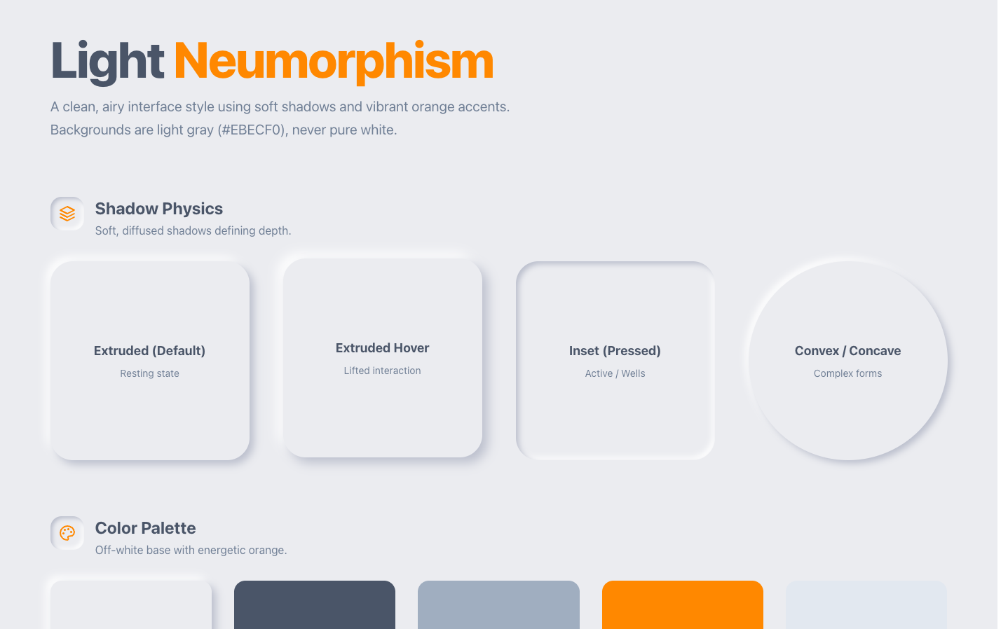
/* Raised (extruded) element */
.neu-card {
background: #e0e5ec; /* identical to page bg */
border-radius: 16px; /* soft corners sell the molded look */
box-shadow:
9px 9px 18px #bec3c9, /* dark shadow: bg darkened ~15% */
-9px -9px 18px #ffffff; /* light shadow: toward white, opposite corner */
}
/* Pressed / inset state (inputs, active buttons, wells) */
.neu-inset {
background: #e0e5ec;
border-radius: 16px;
box-shadow:
inset 6px 6px 12px #bec3c9,
inset -6px -6px 12px #ffffff;
}
/* Interactive elements: press on :active, and ALWAYS keep a real focus ring.
The shadow swap alone is not a perceivable state change (WCAG 1.4.11). */
.neu-button:active {
box-shadow:
inset 6px 6px 12px #bec3c9,
inset -6px -6px 12px #ffffff;
}
.neu-button:focus-visible {
outline: 2px solid #4d6bfe; /* do not skip this, shadows are not focus */
outline-offset: 2px;
}
/* Dark-mode variant: retune BOTH shadows, do not just invert */
.neu-card-dark {
background: #2d3239;
border-radius: 16px;
box-shadow:
9px 9px 18px #23272d,
-9px -9px 18px #373d46;
}The three rules that make or break the effect
- Element background MUST equal page background, same hex. The moment they differ, the illusion dies.
- The background must be a mid-tone. Pure white has no room for a lighter shadow; pure black has no room for a darker one. #e0e5ec is the canonical light value.
- Blur is roughly 2x the offset distance. The dark shadow is the background darkened about 15 percent; the light shadow is pushed toward white.
Tailwind notes worth keeping
- The element is a <button> on purpose: the active: and focus-visible: variants only do real work on something focusable.
- The bare focus-visible:outline utility is load-bearing, not redundant. In Tailwind v3, outline-2 only sets outline-width while outline-style stays none, so without the class that sets outline-style to solid, no ring renders at all. In v4 a width utility implies a solid style, so the extra class is harmless there. Keep all three so the snippet works in both versions.
- For a whole neumorphic surface, the v4 @theme token version is cleaner: define --shadow-neu once and compose shadow-neu / active:shadow-neu-inset.
Browser support: Everything here is box-shadow (multiple values plus inset) and border-radius: supported in every browser shipped in the last decade, no prefixes, no fallbacks needed. Two real gotchas instead: filter: drop-shadow() cannot do inset, so do not substitute it; and layered large-blur shadows on many elements can cost scroll performance on low-end devices, so apply them to a handful of containers, not hundreds of list items.
Tune the shadows live: the neumorphism generator
Pick a base color, drag distance and intensity, flip the light source, copy the CSS or Tailwind it writes. The edge-contrast badge under the preview is the honest part: it checks the shadow edge against WCAG's 3:1 component bar, and watching it fail is the fastest way to understand this whole page.
Controls
Base color
Shape
The badge is the dark shadow edge against the base color, checked at the WCAG 1.4.11 bar of 3:1 for component boundaries. Drag intensity and watch: by the time the edge passes, the softness is gone. This is why neumorphism is garnish, not navigation.
/* via superdesign.dev/styles/neumorphism */
border-radius: 16px;
background: #e0e5ec;
box-shadow: 9px 9px 18px #bec3c9,
            -9px -9px 18px #e5e9ef;
Want the whole screen, not one div? Generate a full neumorphic UI
What are the best neumorphism examples?
Notice the pattern in this grid: the strongest survivors are either hardware-flavored, dark, or tools for making more neumorphism. That is the niche talking.
Neumorphism (Superdesign library)Superdesign library
Dual shadows tuned so raised and inset states read at a glance, the one thing most neumorphic UIs get wrong. A one-prompt starting point.
The Drum MachineLive site
A DM-1 drum machine rebuilt in pure HTML and CSS, knobs and pads simulated entirely with light and shadow. Hardware-style controls are the one context where molded plastic is the content, not decoration.
NicecardLive site
Dark neumorphic fintech landing page: dark soft UI hides the contrast problem better than light, and the card-shaped product literally matches the card-shaped style.
Themesberg Neumorphism UILive site
A Bootstrap kit with 200+ neumorphic components: proves the style can systematize (forms, modals, tables), and shows exactly where it strains, dense tables and alerts go mushy.
neumorphism.ioLive site
The canonical generator, and the most-linked neumorphism page on the internet. Telling annotation: the most successful neumorphic site is a tool for making neumorphism, not a product using it.
Hype4 Neumorphism generatorLive site
The pedigree pick: built by Michal Malewicz, the designer who popularized the style, from the same shop as the articles that defined it.
Is neumorphism dead in 2026? The data
Our prompt corpus answers this more honestly than any think piece: across 208,000+ real generations on Superdesign, neumorphism requests are fading toward zero while glassmorphism, the style that replaced it on this exact trend curve, runs at roughly twenty times its share.
Neumorphism faded from 0.69% to 0.41% of generations January to May 2026, a niche style used in 386 projects (972 prompt mentions).
*June is month to date. Share of all Superdesign generations whose prompt mentions the style. 386 distinct projects, 972 prompt mentions total.
Methodology
How we count: numbers come from the prompts of 208,000+ real design generations on Superdesign, January to June 2026. A generation counts as mentioning a style when its prompt contains the style term or a close synonym as a whole word (for example glassmorphic or frosted glass for glassmorphism; the dark mode group counts explicit dark mode and dark theme requests, not every mention of the word dark). One generation counts once even if the term repeats. Distinct projects is the conservative figure: one project can produce many generations. June is month to date, so we show it but do not compare it against closed months. Counts are live and drift slightly day to day.
When should you not use neumorphism?
It structurally fails WCAG non-text contrast
States are invisible
Hierarchy collapses
Dark mode is a second design job
The market already voted
Where it still earns its keep: closed, low-stakes, hardware-flavored surfaces. Music tools, smart home controls, calculator widgets, profile badges, decorative cards. Keep text at 4.5:1, keep CTAs flat and high-contrast, add real :focus-visible outlines, and treat the soft shadows as garnish, not navigation. Mocking up a concept in this style for a client? Generate the mockup before you commit to the contrast fight.
Generate a neumorphism UI
Generate it on Superdesign
This prompt is tuned to the exact tokens in the recipe above. Copy it, paste it into the prompt box, and you get a full UI in this style on an infinite canvas. Free to start.
Design a smart home control dashboard in neumorphism (soft UI) style. Background #e0e5ec everywhere, every card and control the same color as the page, raised elements with dual box-shadows (9px 9px 18px #bec3c9, -9px -9px 18px #ffffff), pressed/inset states for active toggles, 16 to 24px rounded corners, one muted blue accent (#4d6bfe), dark high-contrast text (#2d3436). Include temperature dials, light toggles, and a music player card with soft circular buttons.
Copies the prompt and opens Superdesign in a new tab.
Using the Superdesign skill from Claude Code or Cursor?
Paste this tuned style prompt into your coding agent. It carries the same tokens as the recipe, so what the agent builds matches what this page teaches.
STYLE: Neumorphism (Soft UI)

Foundation
- Page and component background: identical color, #e0e5ec (light) or #2d3239 (dark). Never pure white or black.
- Raised elements: box-shadow: 9px 9px 18px #bec3c9, -9px -9px 18px #ffffff (light mode). Dark mode: 9px 9px 18px #23272d, -9px -9px 18px #373d46.
- Inset/pressed: same shadows with inset, offsets reduced to 6px/12px blur.
- Radius: 16px cards, 12px buttons, 50% circular controls. Blur always ~2x offset.
- Light source top-left, consistent across every element, no exceptions.

Color and type
- Monochromatic surface, one accent max (#4d6bfe), accent used for active states and focus rings only.
- Text #2d3436 on light (keep 4.5:1 minimum), no light-gray-on-gray labels.

Accessibility guardrails (non-negotiable)
- Primary CTAs stay flat and filled with the accent color, not neumorphic.
- Every interactive element gets a visible :focus-visible outline.
- State changes pair the shadow swap with a color or icon change, never shadow alone.

Best for: music/hardware controls, smart home dashboards, calculators, badges.
Avoid for: dense data tables, text-heavy pages, checkout flows.

/* via superdesign.dev/styles/neumorphism */
Frequently asked questions
What is the difference between neumorphism and glassmorphism?
Is neumorphism dead in 2026?
Why does neumorphism fail accessibility?
What is the difference between neumorphism and skeuomorphism?
How do you create neumorphism in CSS?
Does neumorphism work in dark mode?
Related styles
Glassmorphism →
The style that replaced it on this exact trend curve: translucency instead of extrusion, and contrast that survives.
Claymorphism →
Its friendlier 3D successor: distinct pastel fills fix the contrast problem while keeping the squish.
Skeuomorphism →
The ancestor: real materials and textures, where neumorphism kept only the physicality.
Minimalist web design →
What it rebelled against, and what it quietly is underneath the shadows: one color, few elements.
Brutalism →
The polar opposite: hard edges, maximum contrast, zero softness.
Browse every style in the design styles encyclopedia, or steal a ready-made starting point from the prompt library.