This page is about applying the glassmorphism recipe to a pricing. The full CSS recipe (the exact tokens, fallbacks and gotchas) lives on the Glassmorphism pillar page; here we focus on what changes when the build type is a pricing, then hand you a prompt tuned for it.
Generate a glassmorphism pricing
Generate it on Superdesign
This prompt is tuned to the exact tokens in the recipe above. Copy it, paste it into the prompt box, and you get a full UI in this style on an infinite canvas. Free to start.
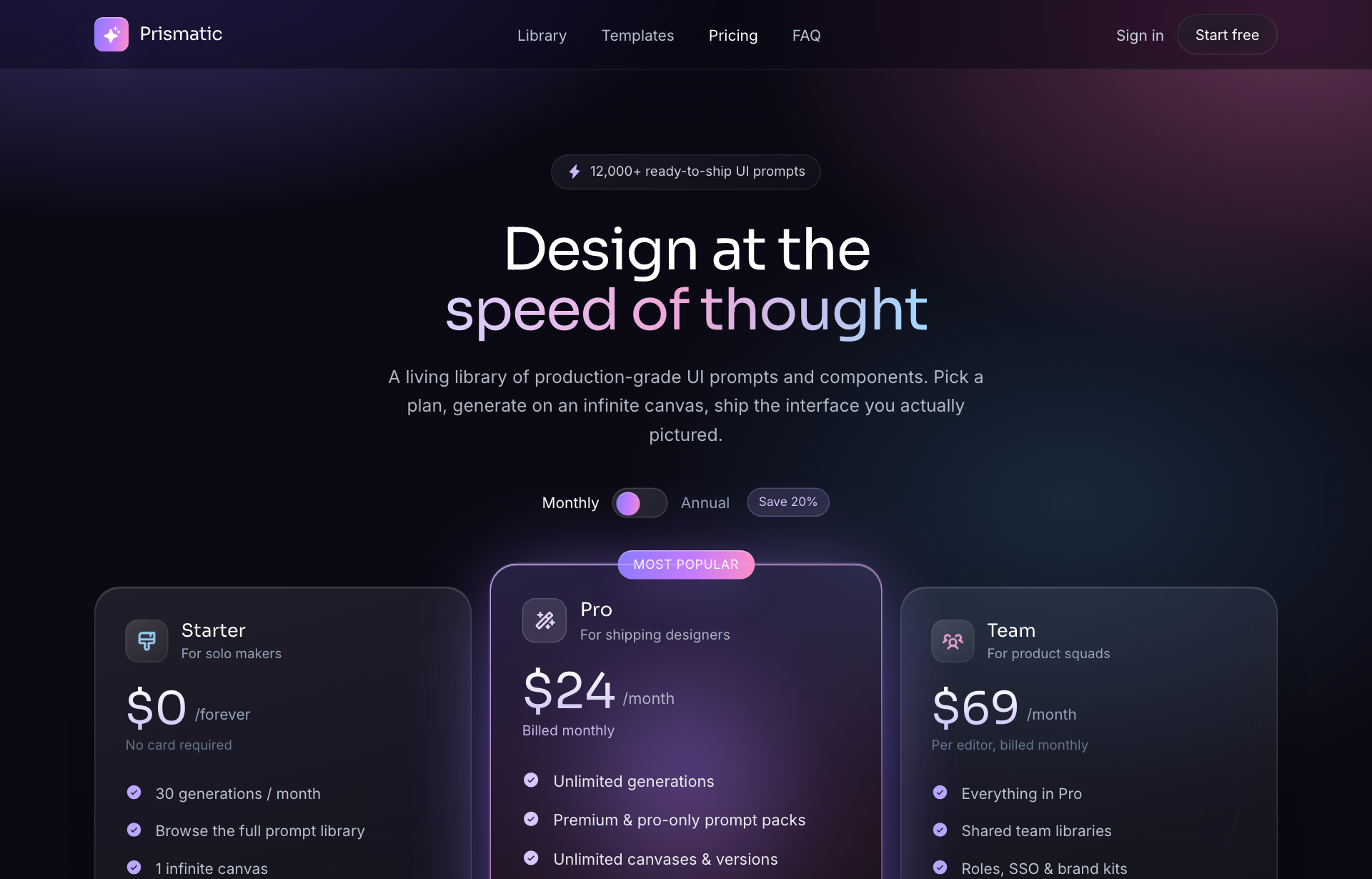
Design a dark glassmorphism SaaS pricing page on a violet-pink-cyan aurora gradient. Sticky blurred nav, a centered hero with a gradient headline and a monthly/annual billing toggle, then three frosted plan cards (Starter, Pro, Team) where the Pro tier is featured with a glowing border and a brighter fill. Each card lists a price, a feature list with check icons, and a CTA. Reflow from 3 columns to 2 to 1. Finish with an FAQ accordion and a slim footer. Add subtle film grain so the glass does not look flat. Keep feature text on the more opaque inner area of each card.
Copies the prompt and opens Superdesign in a new tab.
Using the Superdesign skill from Claude Code or Cursor?
Paste this tuned style prompt into your coding agent. It carries the same tokens as the recipe, so what the agent builds matches what this page teaches.
Build a glassmorphism pricing page with these tokens:
- Canvas: near-black violet base with a violet #8b5cf6 -> pink #ec4899 -> cyan
  #22d3ee aurora gradient, plus subtle film grain
- Plan cards: frosted glass rgba(255,255,255,0.07) fill, backdrop-filter
  blur(18px) saturate(150%), 1px white hairline border + inner highlight, 20px radius
- Featured (Pro) tier: brighter fill (rgba 0.12) and a glowing gradient border so
  it lifts without changing the layout grid
- Feature lists: place on the higher-fill inner region of the card; check icons
  in the cyan accent; price uses the gradient text-clip
- Billing toggle swaps price + suffix live (monthly/annual, "Save 20%")
- Reflow 3 -> 2 -> 1 column; FAQ accordion below
- Pair backdrop-filter with -webkit-backdrop-filter and an opaque @supports fallback

/* via superdesign.dev/styles/glassmorphism/pricing */
Glassmorphism pricing examples
Frequently asked questions
How do you highlight the featured plan on a glass pricing page?
Where does text break on a glassmorphism pricing card?
Keep exploring
Glassmorphism: the full recipe →
Frosted glass panels: translucent fill, backdrop blur, a thin light border, layered over a colorful backdrop.
Glassmorphism website →
The same style applied to a website.
Glassmorphism dashboard →
The same style applied to a dashboard.
Glassmorphism card →
The same style applied to a card.
Glassmorphism mobile app →
The same style applied to a mobile app.
Glassmorphism login →
The same style applied to a login.
Browse every style in the design styles encyclopedia.