This page is about applying the glassmorphism recipe to a mobile app. The full CSS recipe (the exact tokens, fallbacks and gotchas) lives on the Glassmorphism pillar page; here we focus on what changes when the build type is a mobile app, then hand you a prompt tuned for it.
Generate a glassmorphism mobile app
Generate it on Superdesign
This prompt is tuned to the exact tokens in the recipe above. Copy it, paste it into the prompt box, and you get a full UI in this style on an infinite canvas. Free to start.
Design a premium glassmorphism mobile app screen: a profile interface for a lifestyle or travel app. A full-bleed hero photo header at the top, then floating glass cards over a soft pastel tritone gradient. Use two transparency tiers: a higher-opacity glass (around 65% fill) for primary controls and stat cards so labels and numbers stay crisp, and a lower-opacity glass (around 25%) for decorative chips and secondary chrome. Heavy 20px to 24px backdrop blur, 1px white-at-25% borders, generous corner radius, and a floating frosted bottom tab bar. Bold sans headlines, functional body text, one accent color for the active tab and primary action. Make sure tap targets are at least 44px.
Copies the prompt and opens Superdesign in a new tab.
Using the Superdesign skill from Claude Code or Cursor?
Paste this tuned style prompt into your coding agent. It carries the same tokens as the recipe, so what the agent builds matches what this page teaches.
Build a glassmorphism mobile app screen with these tokens:
- Backdrop: a soft pastel tritone gradient + a full-bleed hero photo header (the
  busy backdrop is what makes the glass read on a small screen)
- Two glass tiers: primary controls/stat cards at ~65% fill (so labels stay
  legible), decorative chips/secondary chrome at ~25% fill
- Surface: backdrop-filter blur(20px) saturate(150%), 1px rgba(255,255,255,0.25)
  border, 20px+ radius; floating frosted bottom tab bar
- Type: bold sans headlines, functional body; one accent for the active tab +
  primary action
- Mobile rules: tap targets >= 44px, safe-area insets, and primary text on the
  higher-opacity tier only so contrast holds over the photo header
- Pair backdrop-filter with -webkit-backdrop-filter and an opaque @supports fallback

/* via superdesign.dev/styles/glassmorphism/app */
Glassmorphism mobile app examples
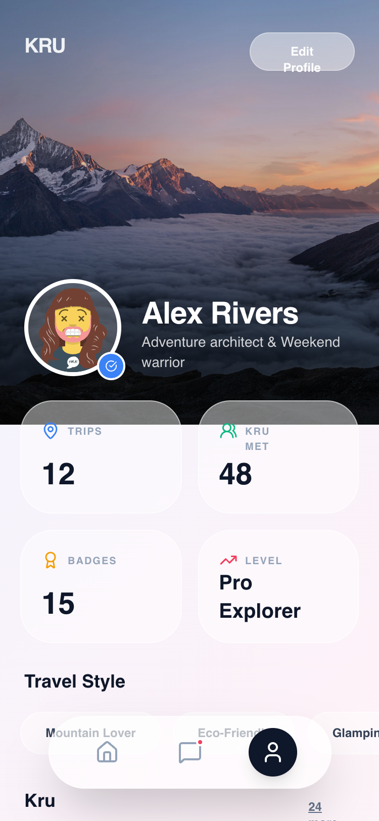
Kru Profile - Unified GlassmorphismSuperdesign library
A mobile profile with a photo header and two glass tiers: the 65% stat cards stay readable, the 25% chips stay decorative.
Subtle Targeted iOS Glass ShineSuperdesign library
The same iOS-glass language on a desktop app: floating pill nav and specular border 'shine' instead of heavy blur.
Frequently asked questions
How do you do glassmorphism on iOS or a mobile app?
What is the difference between glassmorphism and Apple's Liquid Glass on mobile?
Is glassmorphism good for mobile app usability?
Keep exploring
Glassmorphism: the full recipe →
Frosted glass panels: translucent fill, backdrop blur, a thin light border, layered over a colorful backdrop.
Glassmorphism website →
The same style applied to a website.
Glassmorphism dashboard →
The same style applied to a dashboard.
Glassmorphism card →
The same style applied to a card.
Glassmorphism login →
The same style applied to a login.
Glassmorphism pricing →
The same style applied to a pricing.
Browse every style in the design styles encyclopedia.