This page is about applying the glassmorphism recipe to a card. The full CSS recipe (the exact tokens, fallbacks and gotchas) lives on the Glassmorphism pillar page; here we focus on what changes when the build type is a card, then hand you a prompt tuned for it.
Generate a glassmorphism card
Generate it on Superdesign
This prompt is tuned to the exact tokens in the recipe above. Copy it, paste it into the prompt box, and you get a full UI in this style on an infinite canvas. Free to start.
Design a glassmorphism card component. A single frosted panel over a dark obsidian backdrop (#0a0a0a) with a subtle architectural grid and one organic glowing gradient. The card uses a 16px to 20px backdrop blur, a low-opacity white fill (rgba(255,255,255,0.06)), a 1px rgba(255,255,255,0.1) border, a soft shadow, and a faint grain overlay so it does not read flat. Inter typography, white headings, muted gray body, one neon lime accent (#ccff00) for a single primary action or live indicator. Keep body copy short so it stays crisp on the translucent surface.
Copies the prompt and opens Superdesign in a new tab.
Using the Superdesign skill from Claude Code or Cursor?
Paste this tuned style prompt into your coding agent. It carries the same tokens as the recipe, so what the agent builds matches what this page teaches.
Build a glassmorphism card component with these tokens:
- Backdrop: obsidian #0a0a0a with a faint architectural grid + one organic
  glowing radial gradient (so the blur has something to work with)
- Card: rgba(255,255,255,0.06) fill, backdrop-filter blur(16px) saturate(150%),
  1px rgba(255,255,255,0.1) border, 16px radius, shadow 0 8px 32px rgba(0,0,0,0.4),
  plus a subtle grain overlay
- Type: Inter; white #ffffff headings, zinc-400 body; keep body copy short
- Accent: neon lime #ccff00 on exactly one element (a button or a live dot)
- Glass needs a busy backdrop: never place this card on a flat single color
- Pair backdrop-filter with -webkit-backdrop-filter and an opaque @supports fallback

/* via superdesign.dev/styles/glassmorphism/card */
Glassmorphism card examples
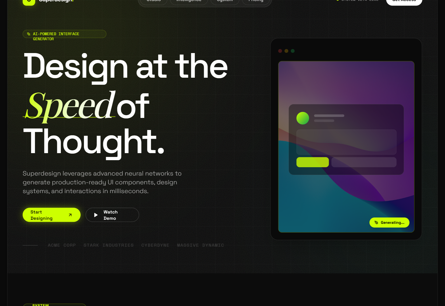
Glassmorphism Style (obsidian + lime)Superdesign library
Our flagship glass card system: the neon lime accent only works because the obsidian fill is opaque enough to anchor it.
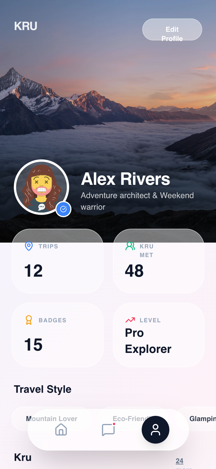
Kru Profile - Unified GlassmorphismSuperdesign library
Stacked glass stat cards in a mobile profile: the 65% fill keeps the numbers crisp while the chips stay translucent.
Frequently asked questions
Why does my glassmorphism card look washed out or gray?
How do I write the CSS for a glassmorphism card?
Keep exploring
Glassmorphism: the full recipe →
Frosted glass panels: translucent fill, backdrop blur, a thin light border, layered over a colorful backdrop.
Glassmorphism website →
The same style applied to a website.
Glassmorphism dashboard →
The same style applied to a dashboard.
Glassmorphism mobile app →
The same style applied to a mobile app.
Glassmorphism login →
The same style applied to a login.
Glassmorphism pricing →
The same style applied to a pricing.
Browse every style in the design styles encyclopedia.