This page is about applying the glassmorphism recipe to a login. The full CSS recipe (the exact tokens, fallbacks and gotchas) lives on the Glassmorphism pillar page; here we focus on what changes when the build type is a login, then hand you a prompt tuned for it.
Generate a glassmorphism login
Generate it on Superdesign
This prompt is tuned to the exact tokens in the recipe above. Copy it, paste it into the prompt box, and you get a full UI in this style on an infinite canvas. Free to start.
Design a dark aurora-glass sign-in screen. Split layout: a left product pitch column beside a frosted-glass auth card floating over a near-black ink canvas (#0b0f14) scattered with soft blurred aqua and magenta aurora blobs and a faint masked grid. The card uses heavy backdrop blur, a 1px white hairline border, email and password fields, a glowing aqua focus ring on the active field, and an aqua-to-magenta gradient primary button. Add Google and GitHub SSO, a sticky translucent nav, and a trust logo strip. Space Grotesk for display, Inter for body.
Copies the prompt and opens Superdesign in a new tab.
Using the Superdesign skill from Claude Code or Cursor?
Paste this tuned style prompt into your coding agent. It carries the same tokens as the recipe, so what the agent builds matches what this page teaches.
Build a glassmorphism login screen with these tokens:
- Canvas: near-black ink #0b0f14 with soft blurred aurora blobs in aqua #2dd4bf
  and magenta #e879f9, plus a faint masked grid veil and light film grain
- Auth card: frosted glass, rgba(255,255,255,0.06) fill, backdrop-filter
  blur(20px) saturate(150%), 1px rgba(255,255,255,0.18) hairline border, 20px radius
- Focus state: a glowing aqua ring (box-shadow 0 0 0 3px rgba(45,212,191,0.4))
  on the active input, since contrast on glass needs an explicit focus cue
- Primary CTA: aqua->magenta gradient, white label; secondary SSO buttons are
  outlined glass
- Type: Space Grotesk (display) + Inter (body); inputs must stay >= 4.5:1 over
  the darkest blob behind the card
- Pair backdrop-filter with -webkit-backdrop-filter and an opaque @supports fallback

/* via superdesign.dev/styles/glassmorphism/login */
Glassmorphism login examples
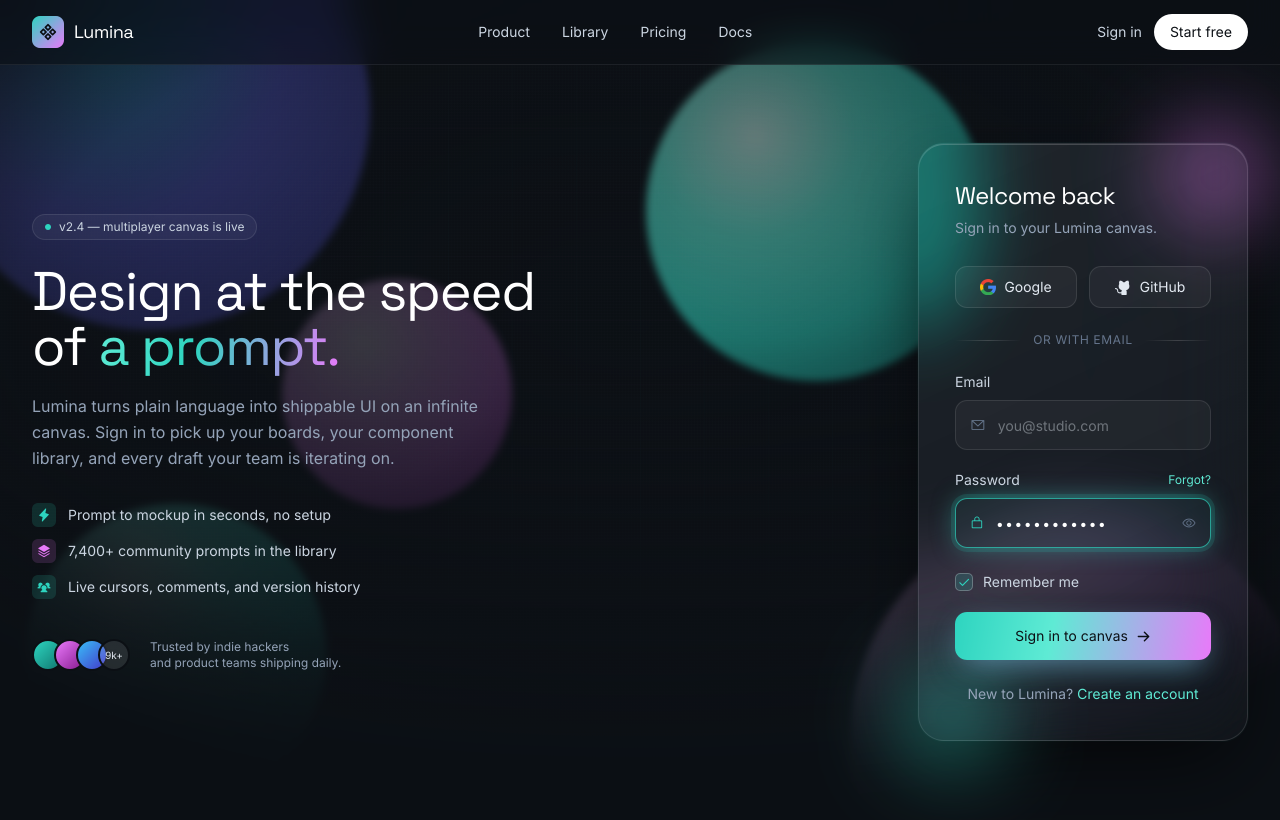
Aurora Glass - Sign in to the canvasSuperdesign library
A split sign-in: pitch on the left, frosted card on the right, with the glowing aqua focus ring doing the accessibility work.
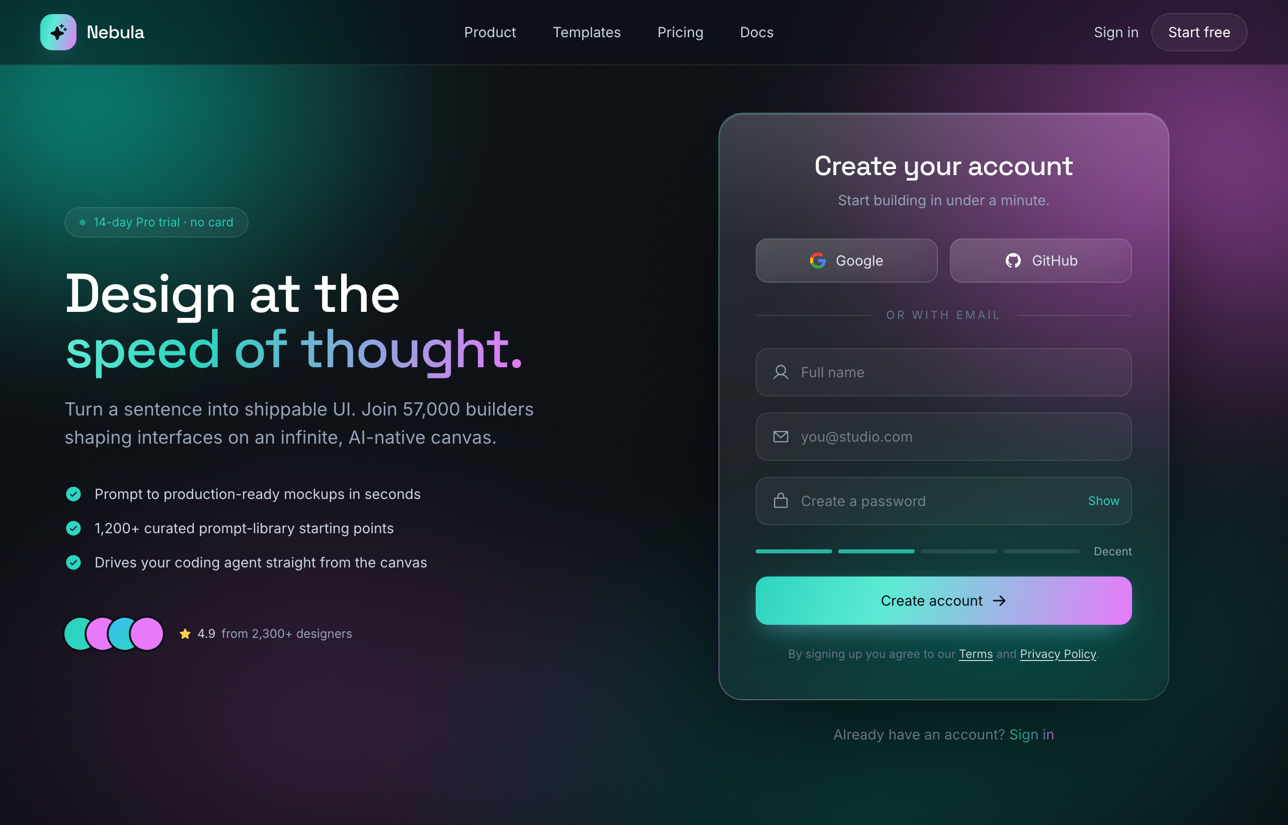
Aurora Glass - Sign Up at the Speed of ThoughtSuperdesign library
The sign-up sibling: same aurora glass system with a password-strength meter and email-first SSO flow.
Frequently asked questions
How do I make a glassmorphism login accessible?
Should the whole login page be glass, or just the card?
Keep exploring
Glassmorphism: the full recipe →
Frosted glass panels: translucent fill, backdrop blur, a thin light border, layered over a colorful backdrop.
Glassmorphism website →
The same style applied to a website.
Glassmorphism dashboard →
The same style applied to a dashboard.
Glassmorphism card →
The same style applied to a card.
Glassmorphism mobile app →
The same style applied to a mobile app.
Glassmorphism pricing →
The same style applied to a pricing.
Browse every style in the design styles encyclopedia.