How do you build a dark mode color system in CSS?
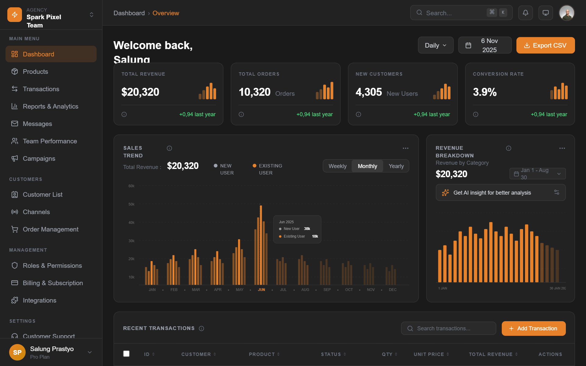
Card on surface-1 (#1e1e1e)
Primary text #e6e6e6 at 15.0:1, secondary #a3a3a3 at 7.4:1. Elevation comes from the lighter surface, not the shadow.
/* via superdesign.dev/styles/dark-mode */

:root {
  /* Declare both schemes so the browser styles form controls,
     scrollbars and the canvas correctly */
  color-scheme: light dark;
}

[data-theme="dark"] {
  color-scheme: dark;

  /* SURFACES: never pure black. Elevation = lighter, not shadowed.
     Each tier steps up roughly 4-6% in lightness. */
  --surface-0: #121212;  /* page background (Material Design's dark baseline) */
  --surface-1: #1e1e1e;  /* cards, raised panels */
  --surface-2: #2a2a2a;  /* dropdowns, sticky headers */
  --surface-3: #333333;  /* tooltips, popovers, highest elevation */

  /* TEXT: off-white, never #ffffff (pure white on dark causes halation) */
  --text-primary: #e6e6e6;    /* 15.0:1 on #121212, passes AAA */
  --text-secondary: #a3a3a3;  /* 7.4:1 on #121212, passes AA and AAA */
  --text-disabled: #6b6b6b;   /* 3.5:1, below the 4.5:1 AA body-text bar
                                 on purpose; never use for real content */

  /* ACCENTS: desaturated versions of your light-mode brand colors.
     Take your 500-weight color and use its 300-400 weight instead. */
  --accent: #8ab4f8;          /* desaturated blue, 8.9:1 on #121212 */
  --accent-pressed: #aecbfa;
  --danger: #f28b82;          /* desaturated red, 7.8:1 on #121212 */

  /* BORDERS: low-alpha white reads cleaner than solid gray on dark */
  --border: rgba(255, 255, 255, 0.12);

  /* SHADOWS barely register on dark backgrounds; always pair a shadow
     with a lighter surface tier */
  --shadow-raised: 0 1px 3px rgba(0, 0, 0, 0.5), 0 4px 12px rgba(0, 0, 0, 0.4);
}

/* Respect the OS preference when the user has not chosen a theme */
@media (prefers-color-scheme: dark) {
  :root:not([data-theme="light"]) {
    color-scheme: dark;
    --surface-0: #121212;
    --surface-1: #1e1e1e;
    --surface-2: #2a2a2a;
    --surface-3: #333333;
    --text-primary: #e6e6e6;
    --text-secondary: #a3a3a3;
    --text-disabled: #6b6b6b;
    --accent: #8ab4f8;
    --accent-pressed: #aecbfa;
    --danger: #f28b82;
    --border: rgba(255, 255, 255, 0.12);
    --shadow-raised: 0 1px 3px rgba(0, 0, 0, 0.5), 0 4px 12px rgba(0, 0, 0, 0.4);
  }
}

body {
  background: var(--surface-0);
  color: var(--text-primary);
}

.card {
  background: var(--surface-1);
  border: 1px solid var(--border);
  border-radius: 12px;
  box-shadow: var(--shadow-raised);
}
The numbers next to the tokens are computed, not vibes
- Every contrast ratio in the snippet was computed with the WCAG 2.x relative-luminance formula against the stated background: #e6e6e6 on #121212 is 15.0:1, #a3a3a3 is 7.4:1, the #8ab4f8 accent is 8.9:1, #f28b82 danger is 7.8:1.
- --text-disabled (#6b6b6b, 3.5:1) sits below the 4.5:1 AA bar on purpose: it exists for genuinely disabled states and must never carry real content.
- Accent rule of thumb: take your light-mode 500-weight brand color and ship its 300 to 400 weight on dark. Fully saturated hues visually vibrate against dark surfaces.
- Test secondary text against --surface-3 (your lightest tier), not the page background: opacity-based muted text silently fails on elevated surfaces.
Browser support: CSS custom properties and prefers-color-scheme work in every modern browser (the media query landed in Chrome 76, Firefox 67, Safari 12.1, all 2019). color-scheme is supported since Safari 13 and Chrome 81. The newer light-dark() function (Baseline 2024: Chrome 123, Safari 17.5, Firefox 120) can replace the duplicated media-query block, but the pattern above is the safe default. Fallback behavior: browsers that ignore the media query simply get your light theme, nothing breaks.
Who is shipping great dark mode UI right now?
All five famous sites were verified dark by default by reading their theme-color metas and page CSS, not from memory (notably, Cursor and Vercel respect system preference and are NOT dark by default, so they are not on this list). Dark dashboards are the most-requested dark UI in our corpus; if that is what you are building, start with the AI dashboard builder.
LinearLive site
Near-black #08090a canvas with elevation done entirely through faint surface lightening and 1px white-alpha borders, so the product feels native to a developer's late-night terminal setup.
SupabaseLive site
The base is Material's classic #1E1E1E dark gray, and the brand green stays desaturated enough to pass contrast instead of glowing.
RailwayLive site
The dark is hue-tinted purple (#13111C): proof that dark does not mean gray, the brand lives in the background color itself.
NetflixLive site
Content-forward dark mode: the dark chrome disappears so poster art and thumbnails carry all the color. Also the legitimate use of a true-black base.
SynapseSuperdesign library
Deep black base with violet and cyan neon accents used sparingly: how far you can push accent energy when the surface stays quiet.
Disruptor Beta LaunchSuperdesign library
A #121212 base punctuated by a single volt #CCFF00 accent: one loud color against a calm dark system.
How much do people actually want dark mode?
More every month: across 208,000+ real generations on Superdesign, explicit dark mode and dark theme requests climbed through the spring and now sit among the most-requested styles on the platform.
Explicit dark mode and dark theme requests rose from 9.1% to 11.7% of generations January to May 2026, used in 10,578 projects (21,586 prompt mentions).
*June is month to date. Share of all Superdesign generations whose prompt mentions the style. 10,578 distinct projects, 21,586 prompt mentions total.
Methodology
How we count: numbers come from the prompts of 208,000+ real design generations on Superdesign, January to June 2026. A generation counts as mentioning a style when its prompt contains the style term or a close synonym as a whole word (for example glassmorphic or frosted glass for glassmorphism; the dark mode group counts explicit dark mode and dark theme requests, not every mention of the word dark). One generation counts once even if the term repeats. Distinct projects is the conservative figure: one project can produce many generations. June is month to date, so we show it but do not compare it against closed months. Counts are live and drift slightly day to day.
When should you not use dark mode?
Long-form reading
Bright environments
White-background product imagery
Your brand color fails on dark
The contrast traps, with numbers
Undecided on the default? Mock both themes before committing; it is a one-prompt experiment instead of a sprint.
Generate a dark mode ui UI
Generate it on Superdesign
This prompt is tuned to the exact tokens in the recipe above. Copy it, paste it into the prompt box, and you get a full UI in this style on an infinite canvas. Free to start.
Design a dark mode analytics dashboard for a SaaS product. Dark gray #121212 base (never pure black) with elevation tiers: #1e1e1e cards, #2a2a2a dropdowns. Off-white #e6e6e6 primary text, #a3a3a3 secondary. One desaturated accent color, 1px rgba(255,255,255,0.12) borders instead of heavy shadows, WCAG AA contrast everywhere.
Copies the prompt and opens Superdesign in a new tab.
Using the Superdesign skill from Claude Code or Cursor?
Paste this tuned style prompt into your coding agent. It carries the same tokens as the recipe, so what the agent builds matches what this page teaches.
Apply a dark mode design system to this UI.

Tokens:
- Surfaces (elevation = lighter, never shadows alone):
  --surface-0 #121212 page, --surface-1 #1e1e1e cards,
  --surface-2 #2a2a2a overlays, --surface-3 #333333 tooltips
- Text: #e6e6e6 primary, #a3a3a3 secondary, #6b6b6b disabled only.
  Never pure #ffffff text.
- Accent: desaturate the brand color to its 300-400 weight
  (e.g. #8ab4f8 style blue); danger #f28b82.
- Borders: rgba(255,255,255,0.12) 1px instead of gray dividers.
- Shadows: pair every shadow with a lighter surface tier.

Rules:
- color-scheme: dark on the root so native controls match.
- Respect prefers-color-scheme; persist manual toggle in localStorage
  via [data-theme] on <html>.
- Every text/background pair must pass WCAG AA 4.5:1, checked against
  the LIGHTEST surface it appears on, not just the page background.
- No saturated hues at full strength on dark surfaces; no #000 base;
  no filter: invert() anywhere.

/* via superdesign.dev/styles/dark-mode */
Frequently asked questions
What background color should dark mode use?
Is pure black bad for dark mode?
How do I make dark mode accessible (WCAG)?
Should dark mode be the default?
How does dark mode work in Tailwind CSS?
What is the difference between dark mode and a dark UI aesthetic?
Related styles
Glassmorphism →
Dark glass needs these same surface tiers underneath the blur.
Brutalism →
Terminal UI, the always-dark cousin: mono fonts on near-black, no theme toggle in sight.
Minimalist web design →
Resend-style quiet dark is minimalism on the inverted palette.
Bento grid →
The #161617 dark bento cell variant runs on this exact token logic.
Neumorphism →
Its paired-shadow trick breaks on dark backgrounds unless both shadows are retuned: the contrast case.
Browse every style in the design styles encyclopedia, or steal a ready-made starting point from the prompt library.