How do you make a bento grid in CSS?
/* via superdesign.dev/styles/bento-grid */
.bento {
  display: grid;
  grid-template-columns: repeat(4, minmax(0, 1fr)); /* 4 tracks: enough span variety without chaos */
  grid-auto-rows: 180px;        /* fixed row unit makes row spans predictable */
  gap: 16px;                    /* ONE consistent gutter everywhere sells the "tray" look */
  grid-auto-flow: dense;        /* backfills holes left by spanning cells */
}

.bento > * {
  background: #f5f5f7;          /* Apple-style soft gray cell; dark variant: #161617 + 1px rgba(255,255,255,0.08) border */
  border-radius: 24px;          /* the large radius IS the signature; under 16px it reads as a plain card grid */
  padding: 24px;
  overflow: hidden;             /* clips edge-to-edge media to the rounded corner */
}

.bento .hero {
  grid-column: span 2;          /* exactly one 2x2 anchor cell creates the hierarchy */
  grid-row: span 2;
}

.bento .wide {
  grid-column: span 2;          /* use grid-column: 1 / -1 for a full-row banner cell */
}

@media (max-width: 768px) {
  .bento { grid-template-columns: repeat(2, minmax(0, 1fr)); }
}

@media (max-width: 480px) {
  .bento { grid-template-columns: 1fr; grid-auto-rows: auto; }
  .bento .hero, .bento .wide { grid-column: auto; grid-row: auto; }
}
The values that do the work
- repeat(4, minmax(0, 1fr)): minmax(0, 1fr) instead of bare 1fr prevents long unbroken content (URLs, code) from blowing out a track.
- grid-auto-rows: 180px: spans only feel bento when the row unit is fixed; auto rows make 2x2 cells collapse unevenly.
- Relax the fixed row unit on one-column layouts (the CSS version resets grid-auto-rows: auto under 480px, the Tailwind version scopes it to sm:). With overflow: hidden on every cell, a fixed 180px row on mobile silently clips any cell that needs more height.
- grid-auto-flow: dense is the one property most tutorials miss; it fills the holes that spanning cells leave behind. Caveat below: it decouples visual order from DOM order.
- The radius (20 to 28px) plus a single consistent gap is what reads as bento. Mixed gaps or square corners and the effect dies.
Browser support: CSS Grid and grid-auto-flow: dense have shipped in every major browser since 2017 (Chrome 57, Firefox 52, Safari 10.1, Edge 16). The unprefixed gap property in grid context landed slightly later, in 2018 (Chrome 66, Firefox 61, Safari 12; Edge 16 had it from 2017), and every browser still accepts the older grid-gap as an alias. In practice: nothing in this recipe needs a fallback in 2026. grid-flow-dense requires Tailwind v3.3+; on older v3 use the arbitrary property [grid-auto-flow:dense].
What are the best bento grid examples?
All four famous examples were verified live. A note on what is NOT here: Linear, Vercel, Cursor, Notion, Reflect, and Framer all get cited in bento listicles, and none of them currently run bento homepages. Found a bento you love in the wild? Screenshot-to-code turns it into a working layout.
Apple, MacBook Air pageLive site
The "Get the highlights" section: five mixed-size rounded tiles, exactly one idea per cell, and motion rationed so only the hero tiles animate. The brand that made this pattern the default.
RaycastLive site
A dozen feature cells at mixed spans: bento is the honest answer to "we have 30 features and 3 seconds of your attention", breadth without a wall of text.
AmieLive site
Cell size encodes priority: the calendar hero earns the big cell and chat actions stay small.
GitHub CopilotLive site
Three mixed-size workflow cards: the asymmetry tells you which entry point GitHub wants you to pick first.
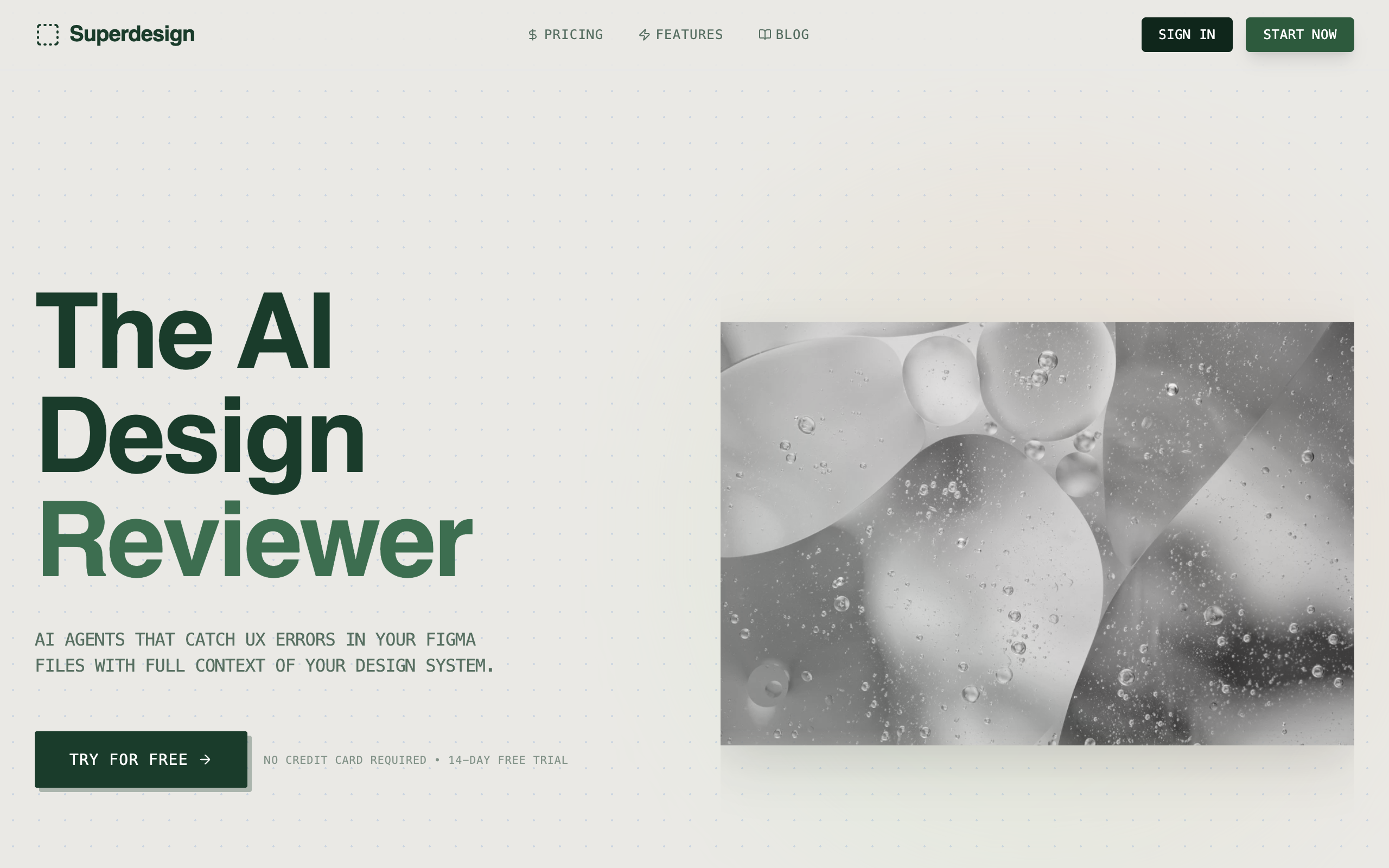
BentoSuperdesign library
The pattern stripped to its essentials: grid plus radius plus one hover affordance (spotlight, tilt, border glow). A one-prompt starting point.
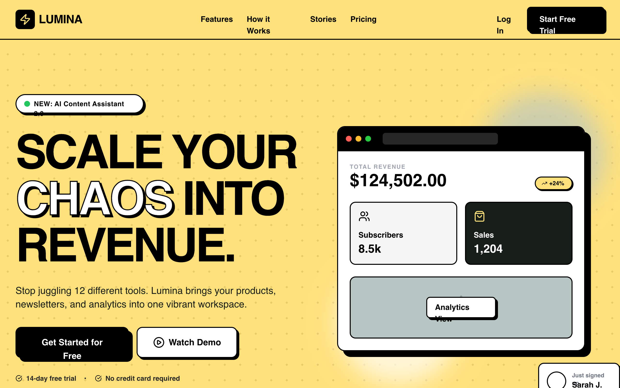
Lumina SaaS Landing PageSuperdesign library
Proof the structure survives a completely different skin: bento feature grids in #ffe17c yellow with hard black borders. Bento is a layout, not a color scheme.
Are bento grids still a trend in 2026?
They are holding, not exploding: across 208,000+ real generations on Superdesign, bento demand has hovered between 1 and 1.6 percent of prompts all year, with the curve easing off its January peak.
Bento grids eased from 1.6% to 1.3% of generations January to May 2026, used in 1,711 projects (2,867 prompt mentions).
*June is month to date. Share of all Superdesign generations whose prompt mentions the style. 1,711 distinct projects, 2,867 prompt mentions total.
Methodology
How we count: numbers come from the prompts of 208,000+ real design generations on Superdesign, January to June 2026. A generation counts as mentioning a style when its prompt contains the style term or a close synonym as a whole word (for example glassmorphic or frosted glass for glassmorphism; the dark mode group counts explicit dark mode and dark theme requests, not every mention of the word dark). One generation counts once even if the term repeats. Distinct projects is the conservative figure: one project can produce many generations. June is month to date, so we show it but do not compare it against closed months. Counts are live and drift slightly day to day.
When should you not use a bento grid?
Tab order vs eye order
Text over media cells is a contrast minefield
It dies on mobile if you let it
It fights long-form content
Equal cells = not a bento
One place the pattern translates beautifully: dashboards, where bento cells map one-to-one onto widgets. If that is your screen, the AI dashboard builder speaks bento natively.
Generate a bento grid UI
Generate it on Superdesign
This prompt is tuned to the exact tokens in the recipe above. Copy it, paste it into the prompt box, and you get a full UI in this style on an infinite canvas. Free to start.
Design a SaaS landing page feature section as a bento grid: 4-column CSS grid, one 2x2 hero cell with the main product screenshot, two 1x1 stat callout cells, one 2x1 wide cell with an integration logo strip, and one accent gradient cell. 24px rounded corners, 16px gaps, soft neutral #f5f5f7 cells on white, generous padding, Apple-level restraint. Desktop and mobile variants.
Copies the prompt and opens Superdesign in a new tab.
Using the Superdesign skill from Claude Code or Cursor?
Paste this tuned style prompt into your coding agent. It carries the same tokens as the recipe, so what the agent builds matches what this page teaches.
Use a bento grid layout for the feature section. Style contract:
- Container: display grid, grid-template-columns repeat(4, minmax(0, 1fr)), grid-auto-rows 180px, gap 16px
- Cells: border-radius 24px, padding 24px, overflow hidden; light theme background #f5f5f7, dark theme #161617 with a 1px rgba(255,255,255,0.08) border
- Hierarchy: exactly one 2x2 hero cell (main screenshot or headline metric), one or two 2x1 wide cells, the rest 1x1; max 8 cells total
- Cell typography: one heading 17-21px semibold with tight tracking, one supporting line 14-15px at 65% opacity; no paragraphs inside cells
- Media: fills the cell edge to edge and clips to the radius; any text over imagery gets a bottom scrim from rgba(0,0,0,0.55) to transparent
- Motion: hover only, scale 1.02 plus a soft shadow, 200ms ease-out; nothing autoplays
- Responsive: 2 columns under 768px, 1 column under 480px with all spans reset and the fixed row height relaxed to auto; keep DOM order identical to reading order and do not rely on grid-auto-flow dense for meaning

/* via superdesign.dev/styles/bento-grid */
Frequently asked questions
How do I make a bento grid in CSS?
How do I build a bento grid in Tailwind CSS?
Why is it called a bento grid?
What is the difference between a bento grid and masonry?
Are bento grids responsive?
Are bento grids bad for accessibility?
Related styles
Glassmorphism →
Glass cells inside bento trays: our glassmorphism library item literally ships bento layouts.
Minimalist web design →
Apple-style soft-gray bento is minimalism's commercial form: one idea per cell, whitespace as structure.
Brutalism →
The Lumina example is the bridge: bento structure wearing a brutalist skin with hard borders.
Dark mode UI →
The #161617 dark cell variant in the recipe comes straight from dark-mode surface-tier thinking.
Browse every style in the design styles encyclopedia, or steal a ready-made starting point from the prompt library.