This page is about applying the brutalism recipe to a website. The full CSS recipe (the exact tokens, fallbacks and gotchas) lives on the Brutalism pillar page; here we focus on what changes when the build type is a website, then hand you a prompt tuned for it.
Generate a brutalism website
Generate it on Superdesign
This prompt is tuned to the exact tokens in the recipe above. Copy it, paste it into the prompt box, and you get a full UI in this style on an infinite canvas. Free to start.
Design a neo-brutalist agency website in a warm paper-and-ink palette with one hot red signal accent. A thin red accent tape across the top, a sticky paper nav with a boxed monogram, uppercase mono links and an ink CTA pill. The hero is dominated by a giant black uppercase Archivo wordmark on a flat off-white canvas with a faint engineering grid, hard 2px to 3px black borders on every block, and zero rounded corners or drop shadows except hard offset blocks. Then a bordered services grid, a case-study list with monospace metadata, a loud stats band, and an inverted ink footer. System and grotesk fonts, raw left-aligned grid, no gradients.
Copies the prompt and opens Superdesign in a new tab.
Using the Superdesign skill from Claude Code or Cursor?
Paste this tuned style prompt into your coding agent. It carries the same tokens as the recipe, so what the agent builds matches what this page teaches.
Build a neo-brutalist website (web UI) with these tokens:
- Canvas: flat off-white paper #f4f1ea with a faint engineering grid; pure black
  ink #0a0a0a; ONE signal accent (hot red #ff2d2d or acid)
- Every block: 2-3px solid #000 border, square corners, no soft shadows; depth
  comes from HARD offset blocks (box-shadow: 8px 8px 0 #000, zero blur)
- Type: heavy Archivo/Archivo Black uppercase display + a mono (Space Mono /
  JetBrains Mono) for labels and metadata; system fonts are on-brand
- Layout: raw left-aligned grid, visible structure, asymmetry over centering;
  no gradients, no rounded cards, no glassy effects
- Accent used sparingly: nav CTA, one hero word, key stats
- Keep contrast trivially high (black on paper); links stay underlined

/* via superdesign.dev/styles/brutalism/website */
Brutalism website examples
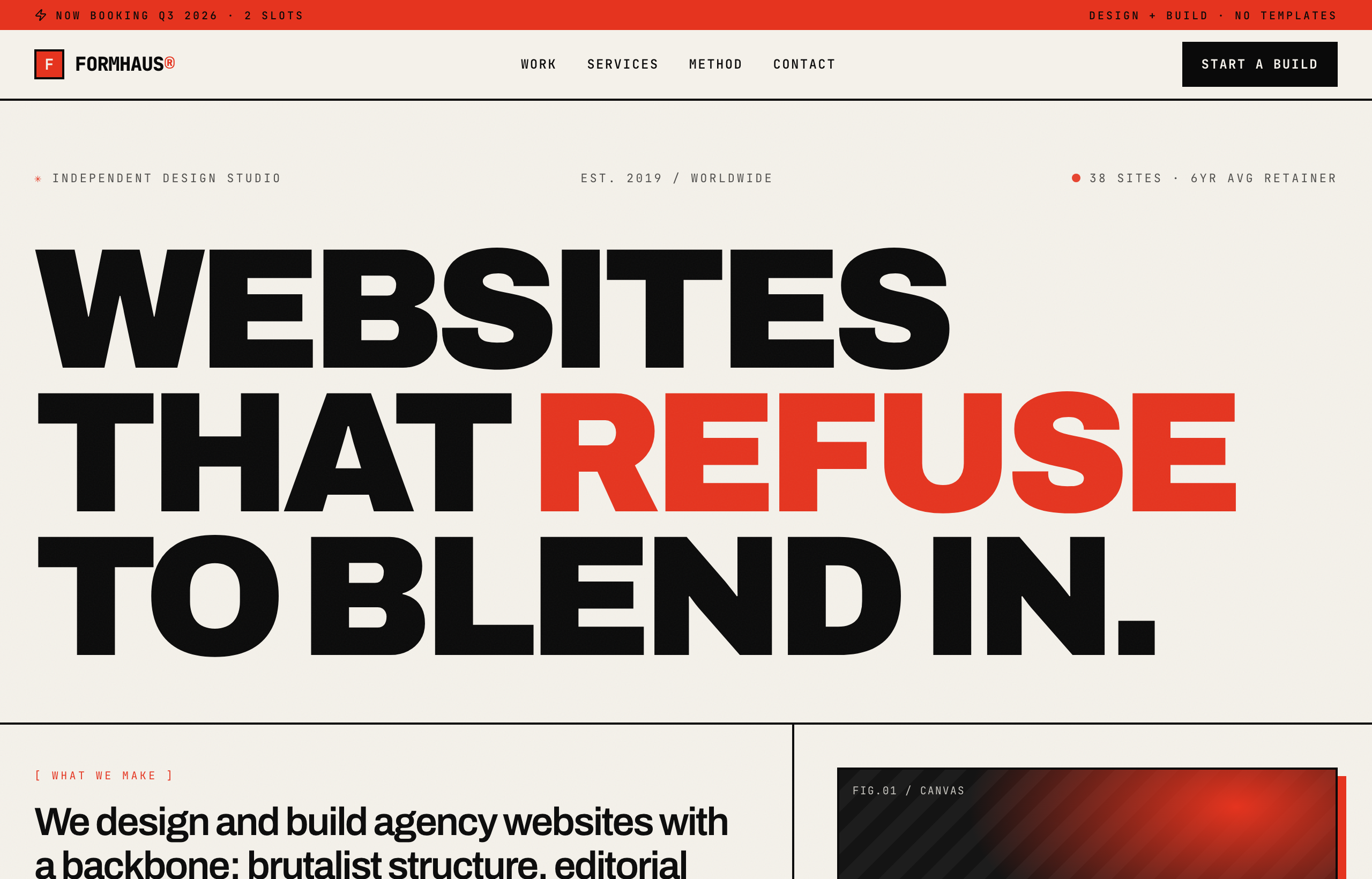
FORMHAUS - Agency Website (Brutalist Red)Superdesign library
Restrained brutalism for a real agency: paper-and-ink, one red accent, a strict grid that reads professional rather than chaotic.
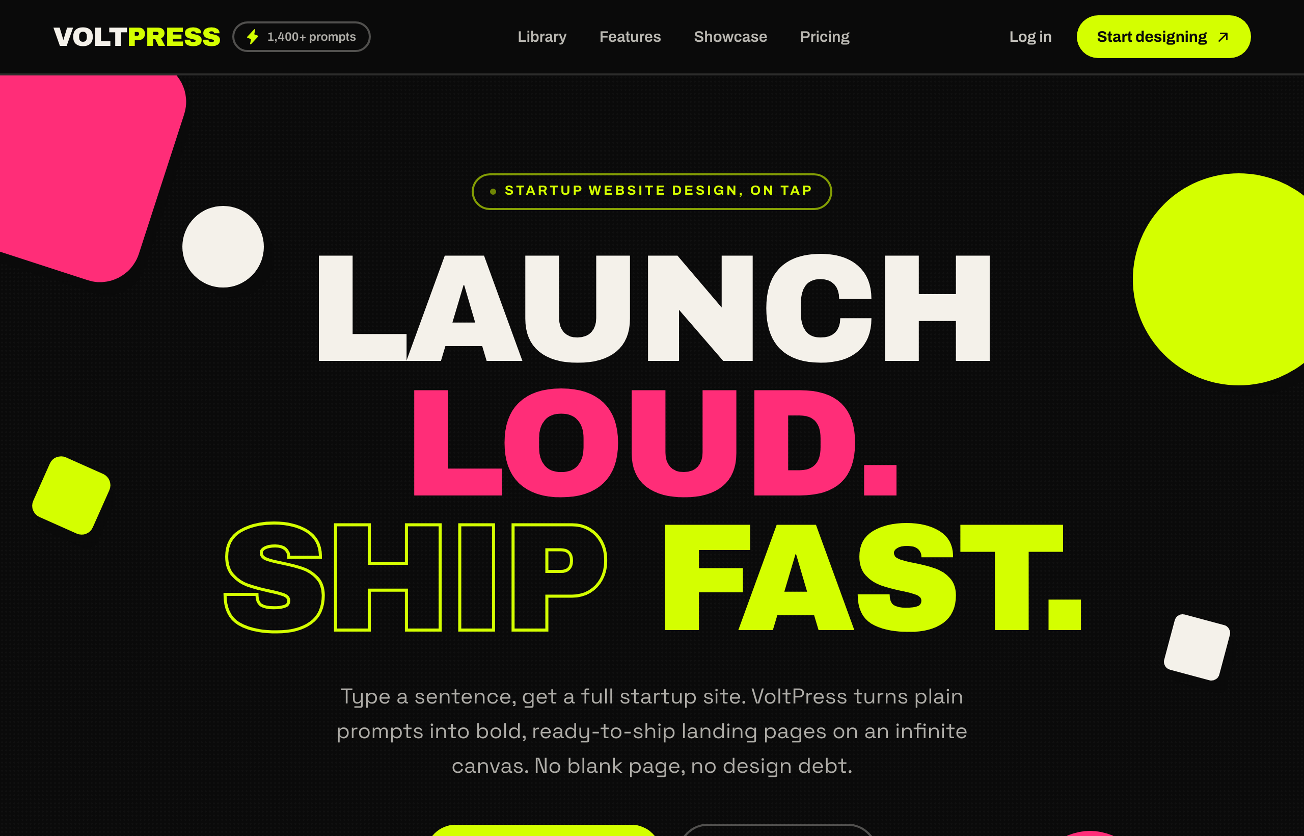
VOLTPRESS - Acid-Maximalist Startup SiteSuperdesign library
The loud end of the spectrum: 150px Archivo Black headlines, acid-lime and hot-pink, an outlined text-stroke word for maximum scream.
Frequently asked questions
What makes a brutalist website design instead of a broken one?
What fonts and colors work for neo-brutalist web design?
Is brutalist web design good for conversion?
Keep exploring
Brutalism: the full recipe →
The website with its structure exposed: mono fonts, default-blue links, hard black borders, zero decoration.
Brutalism ui components →
The same style applied to a ui components.
Brutalism ecommerce →
The same style applied to a ecommerce.
Brutalism pricing page →
The same style applied to a pricing page.
Brutalism login page →
The same style applied to a login page.
Browse every style in the design styles encyclopedia.