This page is about applying the brutalism recipe to a ui components. The full CSS recipe (the exact tokens, fallbacks and gotchas) lives on the Brutalism pillar page; here we focus on what changes when the build type is a ui components, then hand you a prompt tuned for it.
Generate a brutalism ui components
Generate it on Superdesign
This prompt is tuned to the exact tokens in the recipe above. Copy it, paste it into the prompt box, and you get a full UI in this style on an infinite canvas. Free to start.
Design a neo-brutalist UI component system as a single showcase page: buttons, modals, and a slider. Thick 3px black borders, square corners, and a hard offset shadow that compresses to zero on press so every control feels physically pushable. Acid-yellow as the only accent, JetBrains Mono plus Archivo type, and a graph-paper grid backdrop. Include primary, secondary, destructive and disabled button states, an icon button and a loading state, a confirmation modal with a thick-bordered overlay, and a chunky arrow-stepped carousel. Show focus states as a bold offset outline, not a soft ring. Keep contrast high: black ink on paper, black text on the acid fills.
Copies the prompt and opens Superdesign in a new tab.
Using the Superdesign skill from Claude Code or Cursor?
Paste this tuned style prompt into your coding agent. It carries the same tokens as the recipe, so what the agent builds matches what this page teaches.
Build neo-brutalist UI components with these tokens:
- Surface: flat paper #f4f1ea with a graph-paper grid; black ink #0a0a0a; ONE
  accent (acid-yellow #e8ff00); black text ON the acid (never white-on-acid)
- Every control: 3px solid #000 border, square corners, hard offset shadow
  (box-shadow: 4px 4px 0 #000); on :active translate by the offset and drop the
  shadow to 0 so it physically "presses"
- Buttons: primary (acid fill), secondary (paper fill), destructive, disabled,
  icon, loading; focus = a bold 3px offset outline, NOT a soft ring
- Modal: thick-bordered dialog on a flat scrim, hard offset shadow, blocky title bar
- Slider/carousel: chunky arrow steppers, visible track, mono index labels
- Type: Archivo (display) + JetBrains Mono (labels); zero gradients, zero blur

/* via superdesign.dev/styles/brutalism/components */
Brutalism ui components examples
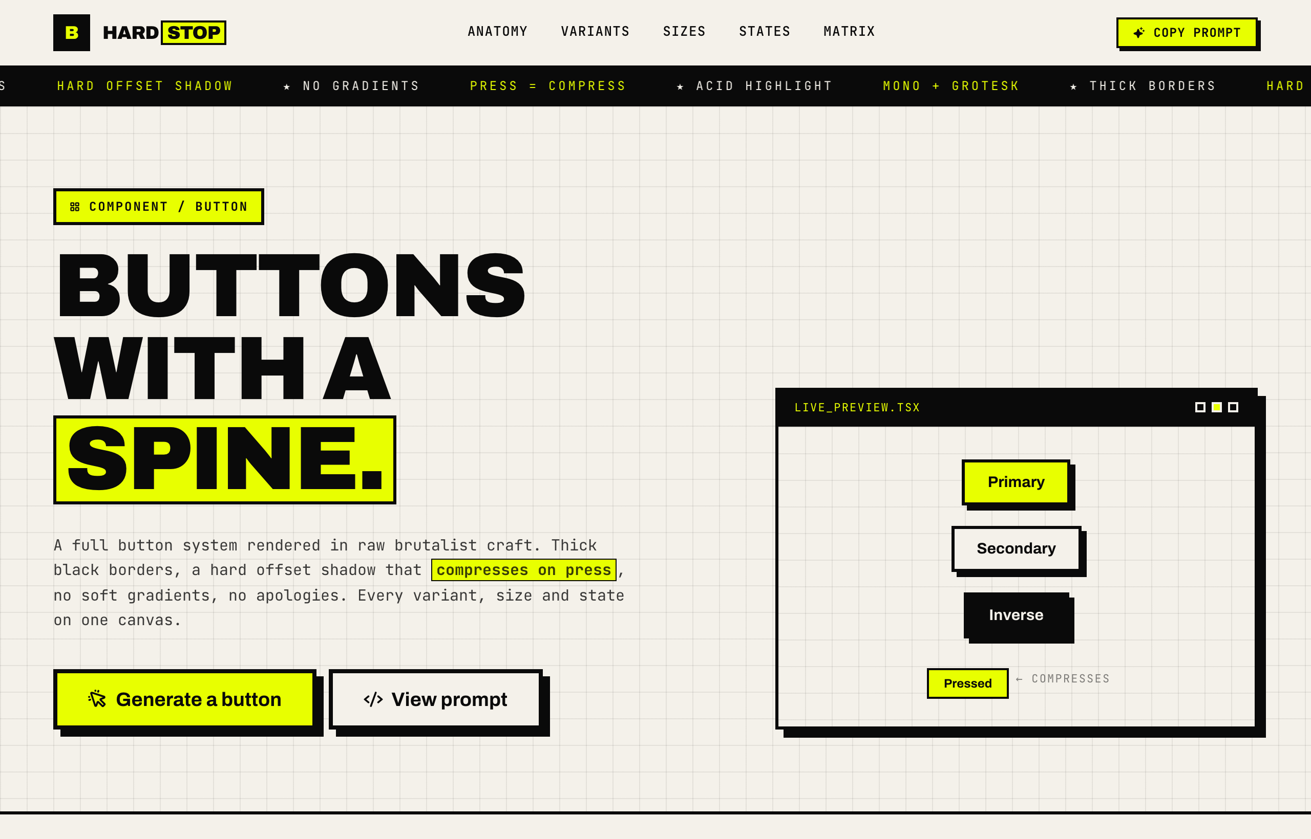
HARDSTOP - Brutalist Button SystemSuperdesign library
A full button system with every state; the press animation that collapses the offset shadow is the whole brutalist trick in one move.
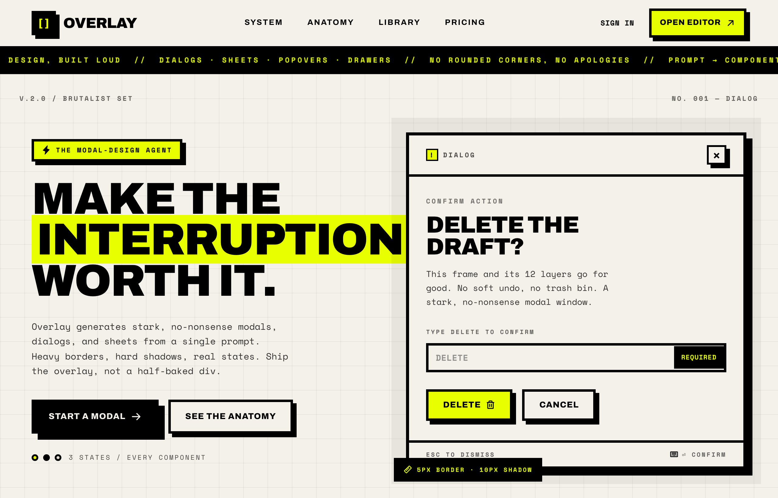
OVERLAY - Brutalist Modal DesignSuperdesign library
A confirmation dialog built loud: 4 to 5px borders, a flat scrim and a hard shadow, proving modals work in brutalism without blur.
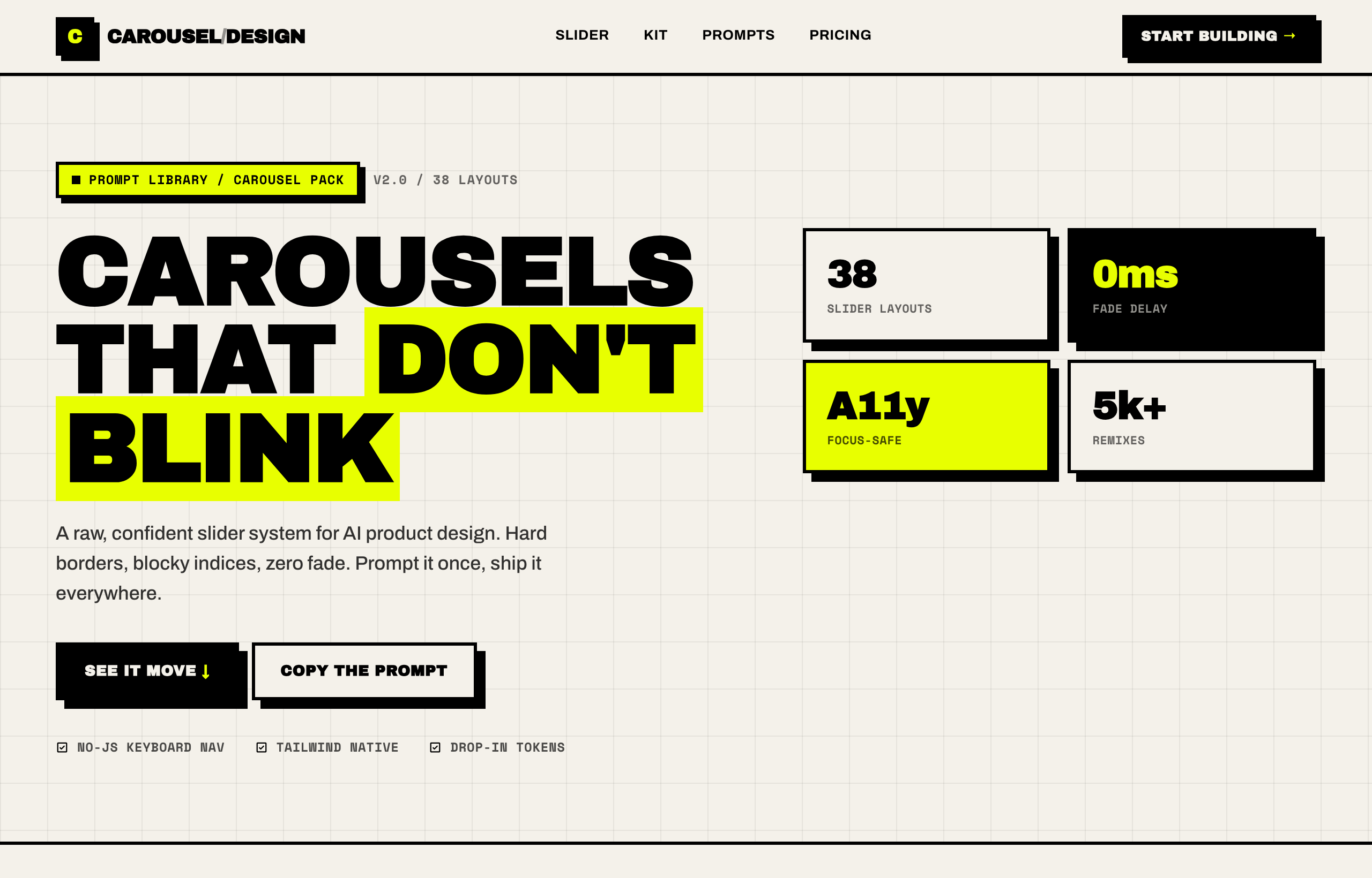
Brutalist Slider / CarouselSuperdesign library
Chunky arrow steppers and a visible track with mono index labels: navigation you can see, not a subtle dot row.
Frequently asked questions
How do you make a brutalist button?
Do brutalist UI components hurt accessibility?
What is the difference between neo-brutalism and brutalism in UI?
Keep exploring
Brutalism: the full recipe →
The website with its structure exposed: mono fonts, default-blue links, hard black borders, zero decoration.
Brutalism website →
The same style applied to a website.
Brutalism ecommerce →
The same style applied to a ecommerce.
Brutalism pricing page →
The same style applied to a pricing page.
Brutalism login page →
The same style applied to a login page.
Browse every style in the design styles encyclopedia.