A design system is a single source of truth for how a product looks and behaves: a maintained set of design tokens, components, patterns, and guidelines that lets a team build consistent UI at scale instead of redeciding the same details on every screen. The Nielsen Norman Group's definition is the one most people quote: "a complete set of standards intended to manage design at scale using reusable components and patterns" (NN/g, Design Systems 101).
This guide explains what a design system actually contains, how it differs from a style guide and a component library, why teams build them, and then sends you to four teardowns of real systems (Apple, Airbnb, Atlassian, Uber) so you can learn the taste from the people who set it. At the end, the practical part for 2026: how to capture a design system as a file your AI coding agent reads, so every generation comes out on-brand.
What is a design system?
A design system is the shared, versioned source of truth for a product's interface: the reusable components, the visual foundations they are built from, and the documented rules for using them, so designers and engineers build the same thing the same way every time. It is not a single Figma file or an npm package. It is the agreement those artifacts represent, maintained and owned over time.
The clearest one-line definition comes from the Nielsen Norman Group:
A design system is a set of standards to manage design at scale by reducing redundancy while creating a shared language and visual consistency across different pages and channels.
The keyword is scale. One person designing one screen does not need a system. The moment two people, two platforms, or two hundred screens are involved, every undocumented decision (which blue? which button radius? how much padding?) gets re-made, slightly differently, forever. A design system answers those questions once, for everyone.
The anatomy of a design system
A design system stacks from the bottom up. Tokens are the atomic decisions; components are built from tokens; patterns are components composed into solutions; guidelines and governance hold the whole thing together. You cannot have a healthy upper layer without the one beneath it, which is why a folder of components with no tokens and no owner is a component kit, not a system.
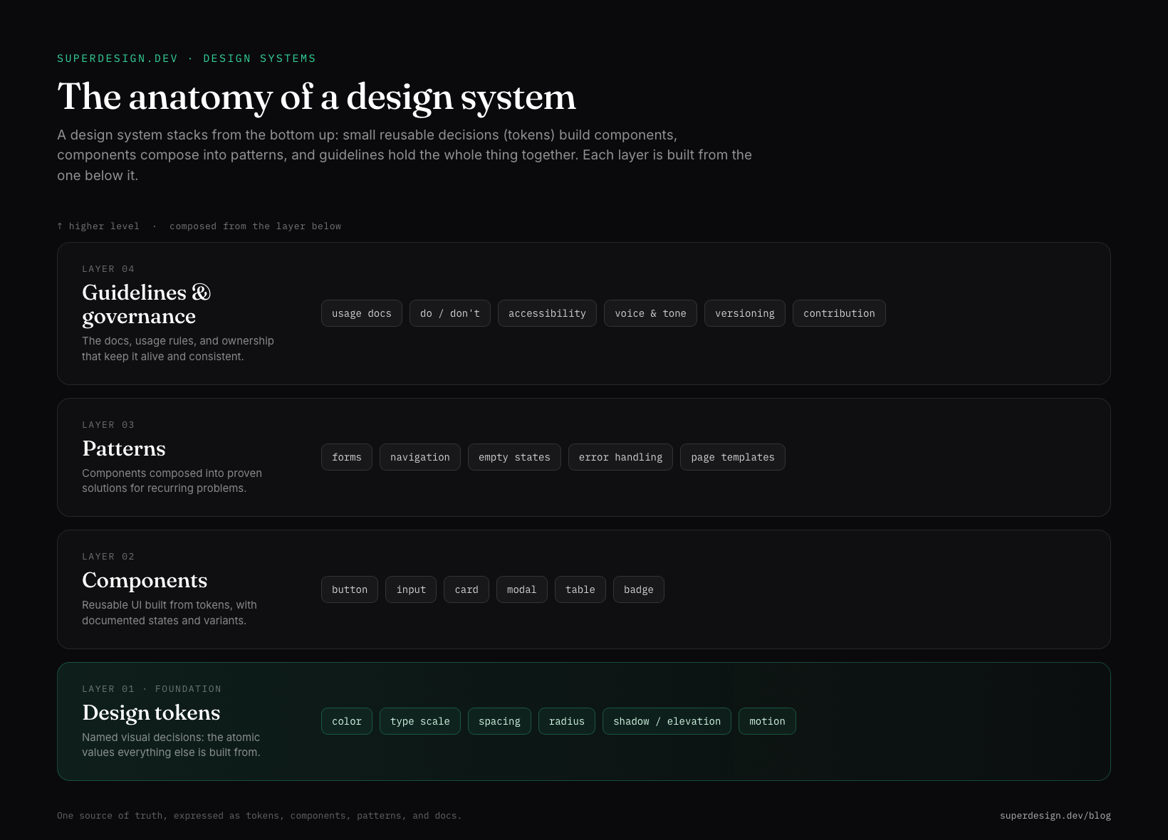
Here is what lives in each layer:
| Layer | What it is | Examples |
|---|---|---|
| Design tokens | Named visual values, the atomic decisions | color, type scale, spacing, radius, shadow, motion |
| Components | Reusable UI built from tokens, with states | button, input, card, modal, table |
| Patterns | Components composed into proven solutions | forms, navigation, empty states, error handling |
| Guidelines | The docs, rules, and ownership that keep it alive | usage docs, do and don't, accessibility, versioning |
What are design tokens?
Design tokens are named variables for visual decisions, so a value like a brand blue is stored once as color-primary instead of being pasted as a raw hex into five hundred places. Change the token, and every button, header, and alert that references it updates at once. They are the bridge between design and code: the same space-4 or radius-card can resolve to a Figma variable for designers and a CSS custom property or TypeScript constant for engineers.
There is now a portable standard for them. The W3C Design Tokens Community Group publishes a JSON format so tokens travel between tools, and government and enterprise systems like the U.S. Web Design System describe their whole visual design as "consistent palettes of typography, spacing units, color, and other discrete elements of style we call design tokens." The lesson worth copying: design to semantic role names, not raw values, so theming, dark mode, and rebrands come almost for free.
Design system vs style guide vs component library
These three get used interchangeably and they are not the same thing. A style guide is documentation, a component library is code, and a design system is the governed whole that connects both to a single source of truth. NN/g puts it plainly: style guides are "just one piece in a design system" (Design Systems vs. Style Guides).
| Style guide | Component library | Design system | |
|---|---|---|---|
| What it is | Documented visual rules | Coded, reusable UI components | The governed whole: tokens, components, patterns, docs |
| Form | Doc or PDF | npm package or Storybook | Living product with an owner |
| Answers | How it should look | What to import | How to build it correctly at scale |
| On its own | Tells, does not build | Builds, but can drift without rules | Connects standards to production code |
The common failure mode, in NN/g's words and most teams' experience, is treating a component kit as a system: components with no token layer, no release process, and no owner. That produces inconsistency faster, not slower.
Why teams build design systems
Teams build design systems to stop paying the consistency tax: without one, large organizations "end up designing and coding multiple versions of the same design element," which NN/g notes "leads to internal inconsistency, wasted time, and messy code" (Design Systems vs. Style Guides). A system trades a one-time investment for speed and coherence on everything that comes after.
The concrete payoffs:
What a healthy design system buys you
- ✓Consistency: one button, one blue, one spacing scale across every screen and platform
- ✓Speed: assemble from documented components instead of redesigning primitives each sprint
- ✓A shared language: designers and engineers name the same things the same way
- ✓Quality at scale: accessibility, focus states, and dark mode handled once in tokens, not per page
- ✓Versioned decisions: a palette or spacing change ships as a reviewable diff, not a Slack message
Verbatim from Nielsen Norman Group, Design Systems 101
The honest caveat: a system is a product, not a one-off artifact. NN/g's own framing is that design systems "are living products and an ongoing practice of decision-making," so a system with no owner and no contribution process decays into an "unwieldy collection of components and code." If you are one person on one small project, you may not need one yet. You need the discipline (a few tokens, a consistent scale) long before you need the governance.
Design system examples to learn from
The fastest way to develop taste is to study systems that already have it. Some are public and exhaustive: Google's Material Design, IBM's Carbon, and Shopify's Polaris publish their tokens, components, and guidelines in full. Others, like Apple's and Airbnb's, are best understood by reverse-engineering the live product.
We tore down four of them, marking what is officially published versus community-observed, and ending each with a copyable spec:
- Apple's design system is the Human Interface Guidelines: SF Pro type, semantic system colors that adapt to light and dark mode, a 44pt minimum tap target, and the principles Clarity, Deference, Depth. The honest lesson: Apple ships adaptive color roles, not fixed hex.
- Airbnb's design system, internally the Design Language System (DLS), is built on restraint: one typeface (Airbnb Cereal), the Rausch coral-red, soft rounded corners, and depth from photography instead of heavy shadows.
- Atlassian's design system is one of the most thorough public systems: an 8px grid, Atlassian Sans, status Lozenges, and tokens documented down to the role.
- Uber's design system (Base) is a high-contrast, black-and-white base with a single blue accent, pill inputs, and a tight 4px grid for a system that has to work across dozens of countries and product lines.
Read any one of them to see the same four layers (tokens, components, patterns, guidelines) expressed as a distinct visual language.
Capture a design system as a DESIGN.md
Here is the 2026 version of this work: once you understand a design system, you can capture one as a plain-text file your AI coding agent reads on every generation, so the UI it produces comes out on-brand by default instead of drifting to generic gradients. The emerging convention for this is DESIGN.md, a markdown config that pins your tokens and rules the way CLAUDE.md pins your agent's behavior.
A minimal version looks like this:
---
name: "Your product"
colors:
primary: "#2563EB"      # design to the role, not the raw hex
background: "#0a0a0c"
text: "#ffffff"
typography:
font_family: "Inter, system-ui, sans-serif"
scale: { h1: 32, h2: 24, body: 16, small: 14 }
layout:
spacing_unit: 4          # 4px grid; all spacing is a multiple
radius_card: 12
principles:
- "One accent color. Neutrals carry the rest."
- "Spacing on a 4px grid, never arbitrary."
---

## Components
Buttons, inputs, and cards inherit the tokens above. Document states.

## Do's and Don'ts
- Do: reuse tokens for every value.
- Don't: invent a new blue or a one-off padding.
You do not have to write it from scratch. If you already have a product, you can extract the design system from your live site by reading its rendered styles, and Superdesign's skill reads your repo to derive the design-system file for you, then generates on-brand variations on an infinite canvas you compare and ship. It pairs that with one of the largest community prompt libraries (covering styles, components, and animations, and it works with any coding agent), because tokens pin the values but good prompts and proven patterns are the other half of UI that does not look generic.
For the format itself, see what is DESIGN.md, and for designing by feel with an agent, what is vibe design. Then study the Apple, Airbnb, Atlassian, and Uber teardowns to see four mature systems up close.