An ecommerce website generator turns a prompt into a storefront, a product hero, a product detail page, trust signals, and a cart flow, in minutes instead of a weekend with a theme editor. The catch is that most of them hand you a hosted theme tied to one platform, the same Shopify Theme number 12 a shopper has already scrolled past a hundred times. If you are a developer or founder, the useful endpoint is a store that actually converts AND ships as real React and Tailwind you own. One honesty note up front: a design agent generates the UI and storefront design, not the payments backend, so you wire the output to your own commerce backend. This guide covers what a high-converting store and product page needs, the prompt patterns that produce it, the generic-theme trap, and how to walk away with the code.
Build a product page in the right order
The tool loop is the same for any store: prompt, compare a few directions, take the code. (Here is how that loop works.) What converts a shopper is the order you build the page in, and the one rule that matters at each step:
Build a product page in the right order
Show the real product first
A product-led hero with one clear Shop or Add to Cart action beats a stock gradient and a clever headline every time.
Put the rating under the title
A star rating with the review count, right below the product name, is the single highest-impact trust signal on the page.
Move trust next to the buy button
Shipping estimate, returns, and payment logos belong beside Add to Cart, where the decision happens, not stranded in the footer.
Cut the path to cart
A frictionless cart, the buy action above the fold, and a mobile-first layout. Every extra step between want and buy leaks customers.
What a high-converting store needs
An online store converts when three things are true: a shopper understands the product within a few seconds, they trust that buying is safe, and they can reach checkout without friction. Most stores leave conversion on the table because the basics are missing, not because the design is ugly. Baymard Institute research suggests only about 49 percent of ecommerce sites have decent product-page UX, which means most stores have low-hanging fixes waiting (ezCommerce).
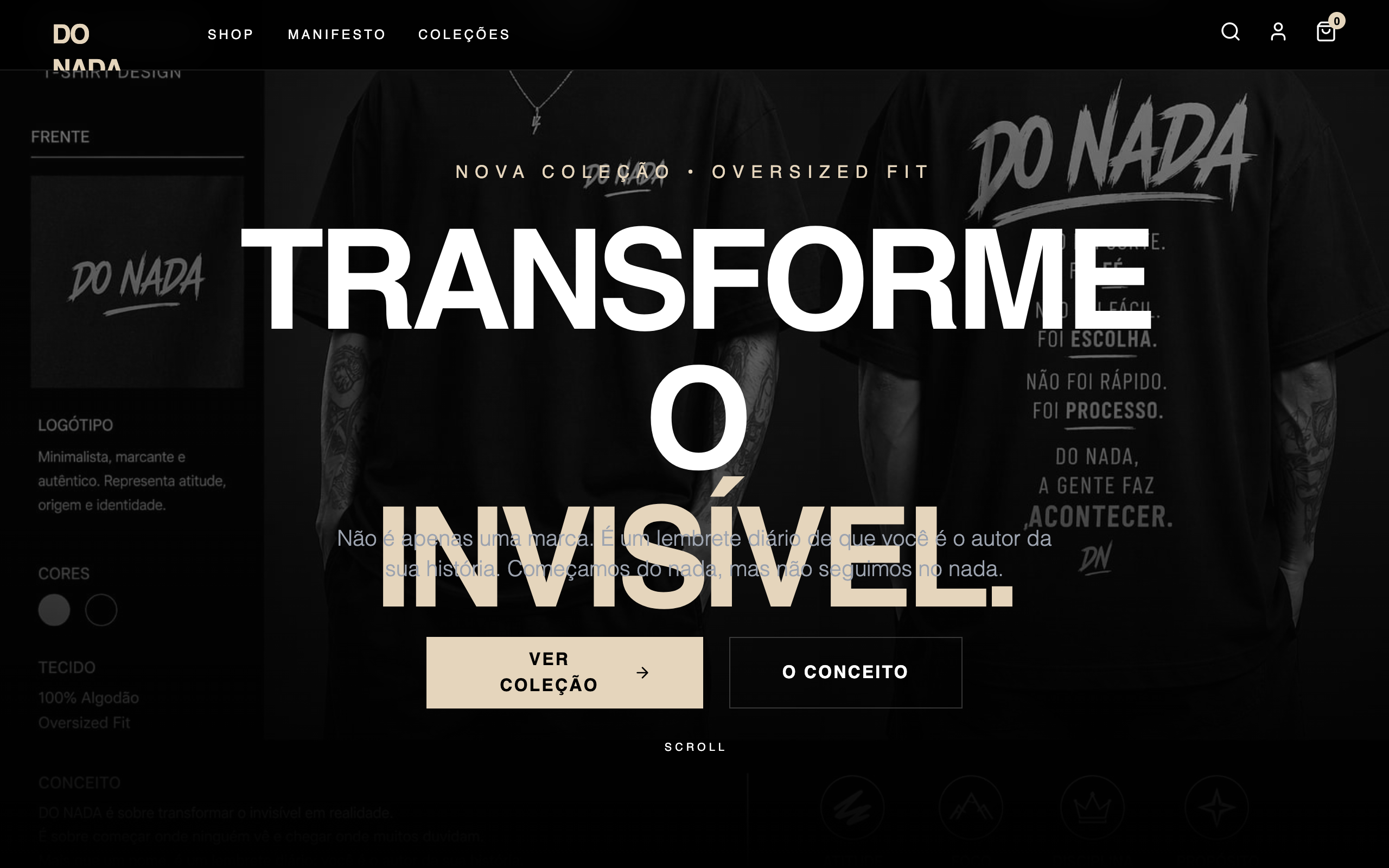
A strong store starts with a hero that shows the actual product, with real imagery and a clear brand voice, not a stock gradient. Here is a real example from the Superdesign prompt library, the most-copied store design in it, that leads with confident typography and a single obvious action.

Use this as the checklist to grade whatever a generator gives you back.
Your ecommerce store checklist
- ✓A hero that shows the real product with real imagery and a clear brand voice, not a stock gradient
- ✓A product detail page with a large image, a 6 to 10 word benefit headline, price, and one primary Add to Cart
- ✓Star rating with the review count right below the product title, volume over a perfect score
- ✓Shipping estimate and a return-policy line placed next to the Add to Cart button
- ✓Security and payment logos near the payment action, not buried in the footer
- ✓Three to six high-priority trust signals, each mapped to a real objection, not a wall of badges
- ✓A frictionless cart and checkout with the buy action visible above the fold on mobile
- ✓A sub two second load, since image latency quietly kills mobile conversion
Verbatim from EcomEye and ezCommerce PDP guides; Baymard
Avoid the generic theme trap
The single most common store mistake is shipping the template everyone else ships. Ask a generator for "a modern online store" and you get the statistical average of every store the model has seen: an indigo-to-violet gradient hero, a "Summer Collection" headline, four identical placeholder product cards, and a row of generic trust seals. It looks fine and it converts like everything else, which is to say not well.
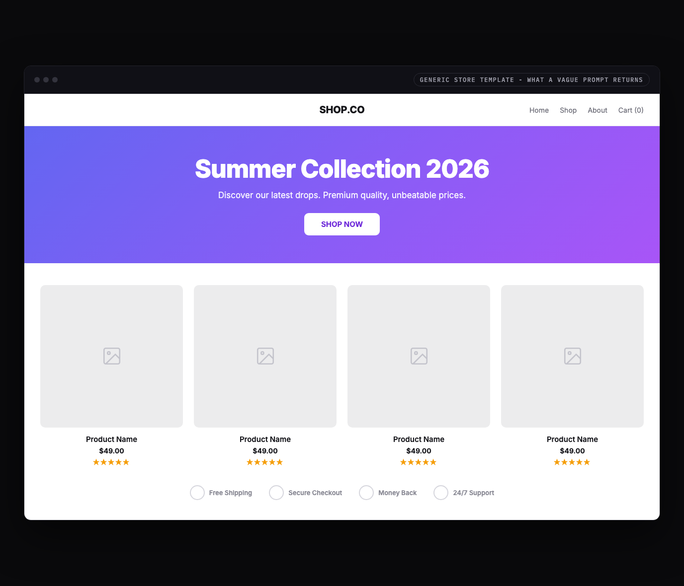
The fix is not a different gradient, it is substance. Headless commerce teams keep hitting the same wall: they want a storefront that "feels less like templates and more like actual brands," more like Nike and less like Shopify Theme number 12 (Webiators). You get there by naming your brand, showing the real product, and designing the product page around real objections, then letting the tool handle the layout.
Trust signals near the decision
Trust signals work through proximity: a badge earns its place only if it sits at the exact moment a doubt arises. Placing trust signals next to the relevant page element drives conversion uplifts between 15 and 42 percent, and badges placed near the payment field alone drive a 15 to 30 percent lift (EcomEye). The same badge stranded in a footer does almost nothing.
The highest-impact signal is reviews, not seals. About 86 percent of online shoppers say social proof is the primary driver of their purchase decision, and 58 percent of users who engage with reviews go on to buy (EcomEye). Volume matters more than a perfect score: a product at 4.6 stars with 3,000 reviews reads as more trustworthy than a flawless 5 stars from 12. So design the product page to place each signal where the matching objection lives.
| PDP zone | Trust signal to design in | Why it works there |
|---|---|---|
| Near the price and Add to Cart | One product-confidence cue plus a star rating and review count | Answers "is this any good" at the decision point |
| Beside Add to Cart | A shipping estimate and a one-line return policy | Removes "when will it arrive, can I send it back" friction |
| Near the payment action | Security and recognized payment logos (Visa, PayPal, Apple Pay) | Reduces payment anxiety exactly when it peaks |
| Mid-page proof section | Customer photos and specific quotes, tied to a use case | Social proof with context beats a generic seal |
Keep it to a few high-priority signals. The highest-converting product pages are not the ones with the most badges, they are the ones that answer the right objection at the right moment with the least visual noise (StoreBuilt).
Prompt patterns that produce it
The quality of the output tracks the quality of the prompt: a one-liner gives you the generic store above, while a prompt that names the product, the brand, the pages, and the conversion rules gives you something with a point of view. Here is a copyable starting prompt that bakes the checklist into the request.
Design an ecommerce storefront and product detail page for [brand], which sells [product].

Audience: [who buys it].
Brand feel: [e.g. "premium minimal streetwear" / "warm handmade ceramics"]. Not generic.
Primary action: get the shopper to Add to Cart with confidence.

Storefront (home):
1. Hero: a brand-voice headline, the real product shown large (not a stock gradient), ONE primary CTA "Shop Now", a visible search and cart icon.
2. A featured-product row: 3 to 4 cards, each with a real product image, name, price, and a star rating with review count.
3. One trust strip with real, specific proof (free 30-day returns, X happy customers), not decorative seals.

Product detail page (PDP):
- Large product image with thumbnails, a 6 to 10 word benefit headline, price, and ONE primary Add to Cart.
- Star rating and review count directly below the title.
- A shipping estimate ("Arrives by [date]") and a one-line return policy right next to Add to Cart.
- Variant selectors (size, color) that are obvious and easy to tap.
- Payment logos near the buy action.

Style: real brand voice, one accent color, strong type hierarchy, generous whitespace, mobile-first.
Avoid the default indigo-to-violet gradient, repeated placeholder cards, and a wall of generic trust badges.
For a deeper library of store and product-page prompts, raid the free prompt library and adapt one to your brand. It works with any coding agent and saves you guessing at the wording.
Real store examples
The strongest proof is the output itself. These are real stores generated from the Superdesign prompt library, each with a distinct point of view, the opposite of the one theme everyone ships.
Iterate, do not settle for the first draft
The first generation is a draft, not the answer, so the real win is exploring directions fast and refining the one that fits. Most tools make you re-roll one variation at a time. Superdesign forks several directions in parallel on an infinite canvas, so you can compare a few hero or product-page treatments side by side and carry the best one forward, instead of committing too early. Then you keep prompting in plain English to tighten it.
Take the current product detail page and give me 3 variations:
1. A version that leads with a full-bleed product image and a sticky Add to Cart bar.
2. A version with a review summary (stars plus count) pinned directly under the title.
3. A quieter, editorial version with one accent and more whitespace.

Keep the same type scale and accent. Make all 3 mobile-first, with the buy action above the fold on a phone.Design the store, own the code
Here is the difference that matters once you actually want to ship: most ecommerce website generators stop at a hosted theme tied to their platform, while a code-output design agent hands you real React and Tailwind you drop into your repo. A locked theme is fine for a quick microstore, and a dead end the moment you want a custom interaction, an A/B test in your own stack, or a storefront that does not look like every other store on the platform.
Be clear about the boundary, though. A design agent generates the storefront and product-page UI, not the payments backend. That is actually the modern, flexible setup: in 2026, headless commerce pairs a custom React storefront (the "head") with a commerce backend over APIs, so AI shopping agents and your own UI both read clean data (Ariel Software). You own the front end and wire it to Shopify Hydrogen, Medusa, or your own Stripe checkout.
| Tool type | What you get | Best for |
|---|---|---|
| Hosted store builders (Shopify themes, Wix) | A hosted store and checkout tied to their theme system | Non-technical sellers who never need the code |
| AI store builders (Shopify Magic, Godmode) | A full store with copy and checkout, often as Liquid | Operators who want the whole store wired up fast |
| Code-output design agents (Superdesign, v0) | Real React and Tailwind storefront UI you own | Developers and founders building a headless or custom store |
Superdesign sits in the third row. It is an AI design agent that outputs production React and Tailwind, runs in the browser or as a skill inside Claude Code and Cursor, and when you point it at an existing project it reads your current UI first, so a new storefront speaks your tokens, spacing, and components instead of arriving as a stranger theme. You generate the store, compare variations on the canvas, then have your coding agent fetch the design and implement it. No handoff, no platform lock-in. That makes it a real Shopify alternative for the design layer: you keep Shopify or any backend for payments and inventory, and own the storefront UI as code.
For the wider landscape of how the AI generators compare on output quality, pricing, and codebase fit, see the pillar guide on the best AI UI generator. It maps where each tool fits; this page is about the store-specific moves that convert. A product page is also a kind of ecommerce landing page, so the landing-page conversion patterns there are a useful companion.
Turn your design into a Shopify theme
Headless is one path. The other is staying native: if you want your store to live in the Shopify admin so a non-technical team can edit it, you can turn your Superdesign output into a real Shopify Liquid theme instead of a React app. The trick is to let your coding agent do the HTML-to-Liquid conversion, validated against Shopify's own tooling, so the result is a proper theme with editable sections, not a static page bolted on. The full walkthrough lives in the Superdesign docs; here is the shape of it.
Convert a Superdesign store into a Shopify theme
Design each page type as its own frame
Build separate frames for the store's key templates and name them the way Shopify does: index, product, collection, cart, page. Clean, descriptively-named frames map straight onto Shopify templates and convert far cleaner than one giant page.
Export the HTML, then add the Shopify Dev MCP
Export the code from Superdesign, then install the Shopify Dev MCP in Cursor or Claude Code. It gives your agent Liquid validation and Shopify-specific assistance, so the conversion targets real Shopify objects instead of guessing.
Prompt the agent to convert HTML into Liquid
Ask it to build the standard theme folder structure (assets, config, layout, locales, sections, snippets, templates), convert each page to Liquid with the right objects (product, collection, cart), make text editable via section settings and schema, add locales for translation, and serve images through Shopify's image_url filter. Then have it validate with the Dev MCP.
Make everything editable in the theme editor
The difference between a real theme and a glorified screenshot is section settings. Each section needs a schema block so a merchant can change copy, images, and order from Online Store, Customize, without touching code. Ask the agent to expose every piece of content as a setting.
Deploy with the Shopify CLI or a zip upload
Preview live with shopify theme dev --store your-store.myshopify.com, or zip the theme folder and upload it in Shopify Admin under Online Store, Themes, Add theme. From there it behaves like any other Shopify theme.
One mapping detail that saves rework: name your frames so they line up with Shopify templates from the start. index becomes templates/index.json, product becomes templates/product.json, collection becomes templates/collection.json, and cart becomes templates/cart.json. Designing page-by-page like this keeps the generated Liquid organized and the theme editor clean.
Common store mistakes
The most expensive errors are about substance and trust, not pixels. The recurring ones reviewers and CRO teams flag: a stock-gradient hero that hides the real product, a product page with no review summary near the title, trust seals stranded in the footer instead of next to the buy button, a wall of equal-priority badges that adds noise instead of confidence, a hidden or multi-step cart, and slow image loads that spike mobile bounce. Distribute proof through the page next to the claim it backs, keep one consistent primary action, and design mobile-first, since mobile traffic usually dominates (ezCommerce).
AI will not save you from a weak brand or a buried buy button. If a shopper cannot tell what you sell and how to buy it in a few seconds, no generator fixes that. Nail the product, the proof, and the path to cart first, then let the tool handle the layout.
Ship your store
You can have a real, on-brand store UI in well under an hour: start with a prompt that names your brand and bakes in the conversion checklist, grade the result against the list above, fork a couple of product-page directions on a canvas, then export real React and Tailwind into your repo and wire it to your commerce backend. The whole point is to skip the locked-theme trap and end with a storefront you own and can keep optimizing.
Start in the browser with the AI UI generator, or if you live in Claude Code or Cursor, add the Superdesign skill and drive it from your agent. For the full tool landscape, the best AI UI generator pillar lays out where each option fits. Ping me anytime if you want a second set of eyes on your product page, and we'll sort it together. 🙂


