A blog website generator turns a prompt into a full blog, an index of posts, an article page, and a type system, in minutes instead of a weekend of fighting a theme. The catch is that most of them hand you a generic Medium or Ghost theme that a thousand other blogs already use. If you are a writer or developer, the useful endpoint is an editorial, magazine-style blog that actually looks designed AND ships as real React and Tailwind you own. This guide covers what a strong editorial blog needs, the prompt patterns that produce it, the generic-theme trap to avoid, and how to walk away with the code.
Build an editorial blog in the right order
The tool loop is the same for any site: prompt, compare a few directions, take the code. (Here is how that loop works.) What makes a blog read as editorial is the order you build it in, and the one rule that matters at each step:
Build an editorial blog in the right order
Set the type system first
A display face for headlines plus a readable body face on a clear scale is most of the editorial look. Pick the pairing before anything else.
Cap the reading column
Hold body text near 66 characters per line. Paragraphs that run the full width of a desktop are the top reason a blog feels unreadable.
Give the index a point of view
A featured story, an editorial grid, and category filters, instead of a uniform endless feed that treats every post as equal.
Build the article page for reading
Generous leading, pull quotes, and room to breathe. The article page is where readers actually spend their time, so design it like it matters.
What a strong editorial blog needs
An editorial blog works when a reader can scan the index in seconds, lands on an article that is genuinely comfortable to read, and feels a point of view in the typography, not a stock template. The fastest way to see the bar is to look at a real editorial site: type used with confidence and restraint, the thing a default theme never commits to.
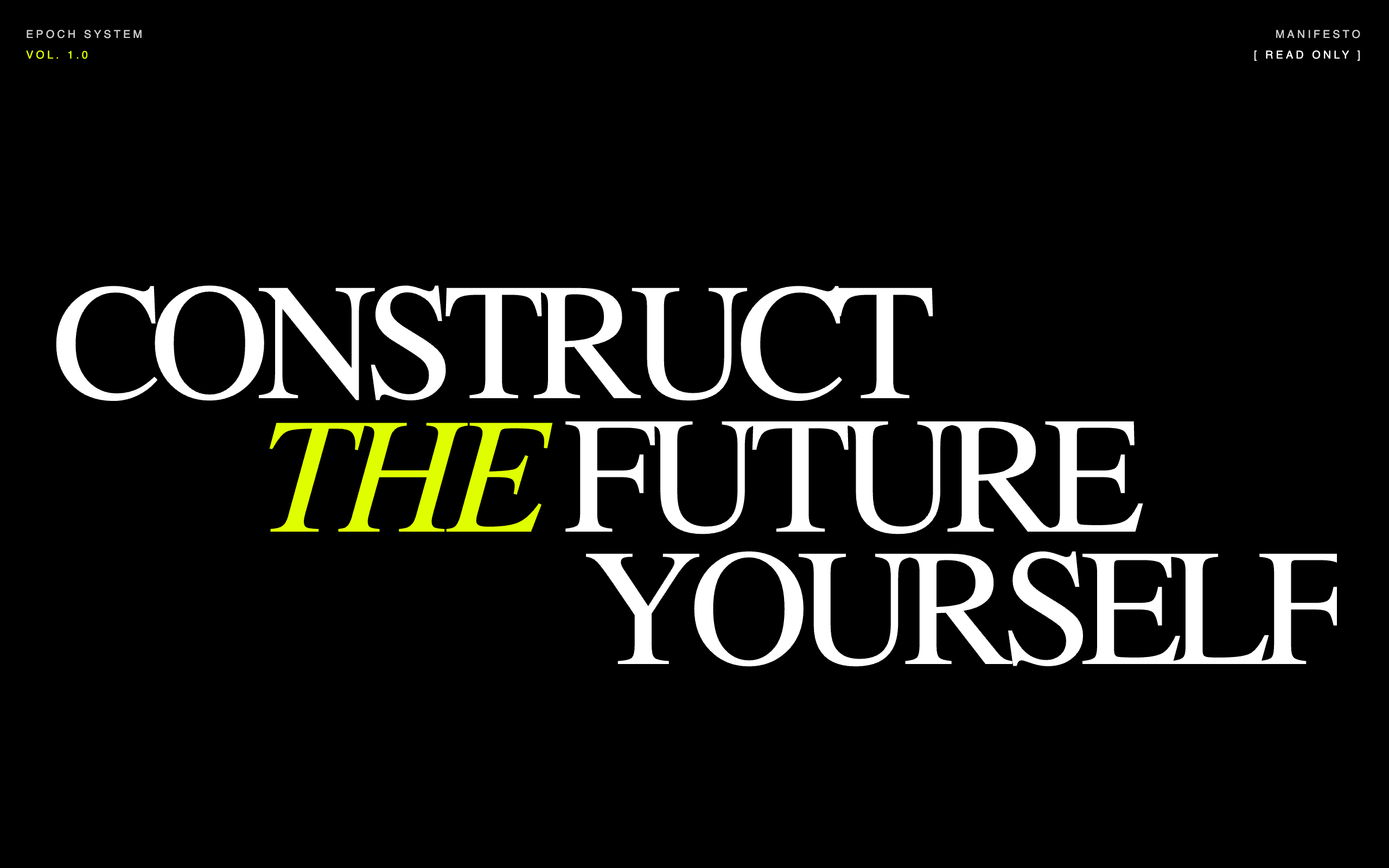
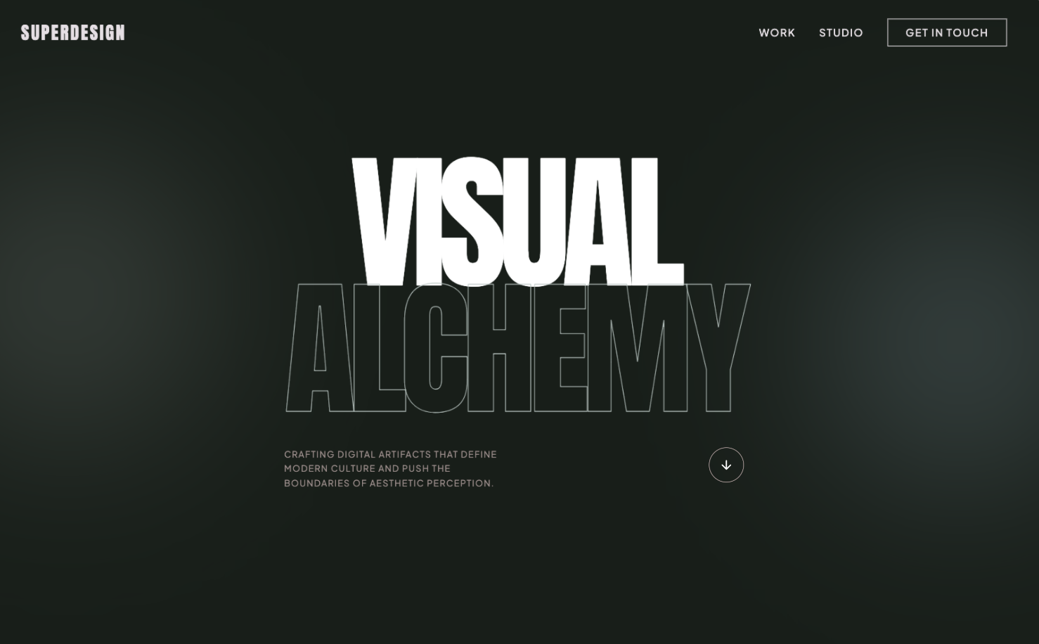
What separates a designed blog from a theme is rarely the colors, it is the typographic confidence and the restraint. A bold editorial direction commits to one or two expressive typefaces and lets large, confident type carry the brand instead of leaning on heavy imagery (Kontra).
Use this as the checklist to grade whatever a generator gives you back.
Your editorial blog checklist
- ✓A real type system: one display face for headlines, one readable face for body, a clear scale, not browser defaults
- ✓A comfortable reading column, body text capped around 45 to 75 characters per line
- ✓An editorial grid index with a clear masthead, category filters, and posts that have room to breathe
- ✓A great article page: generous leading, pull quotes, in-line headings, and a visible reading rhythm
- ✓One accent color and tasteful restraint, personality over decoration
- ✓A confident masthead and post meta (author, date, read time, category), not a stock header
- ✓Responsive type that scales smoothly across phone and desktop
- ✓Fast load and clean semantic HTML, since blogs live or die on reading and search
Verbatim from Bringhurst measure, designer-daily long-form typography
A type system that actually reads
Typography is the entire job of a blog, so a strong type system is the first thing to get right and the first thing a generic theme gets wrong. A good editorial type system pairs a characterful display face for headlines with a comfortable face for body, on a clear modular scale, the way a print style guide would lay it out.
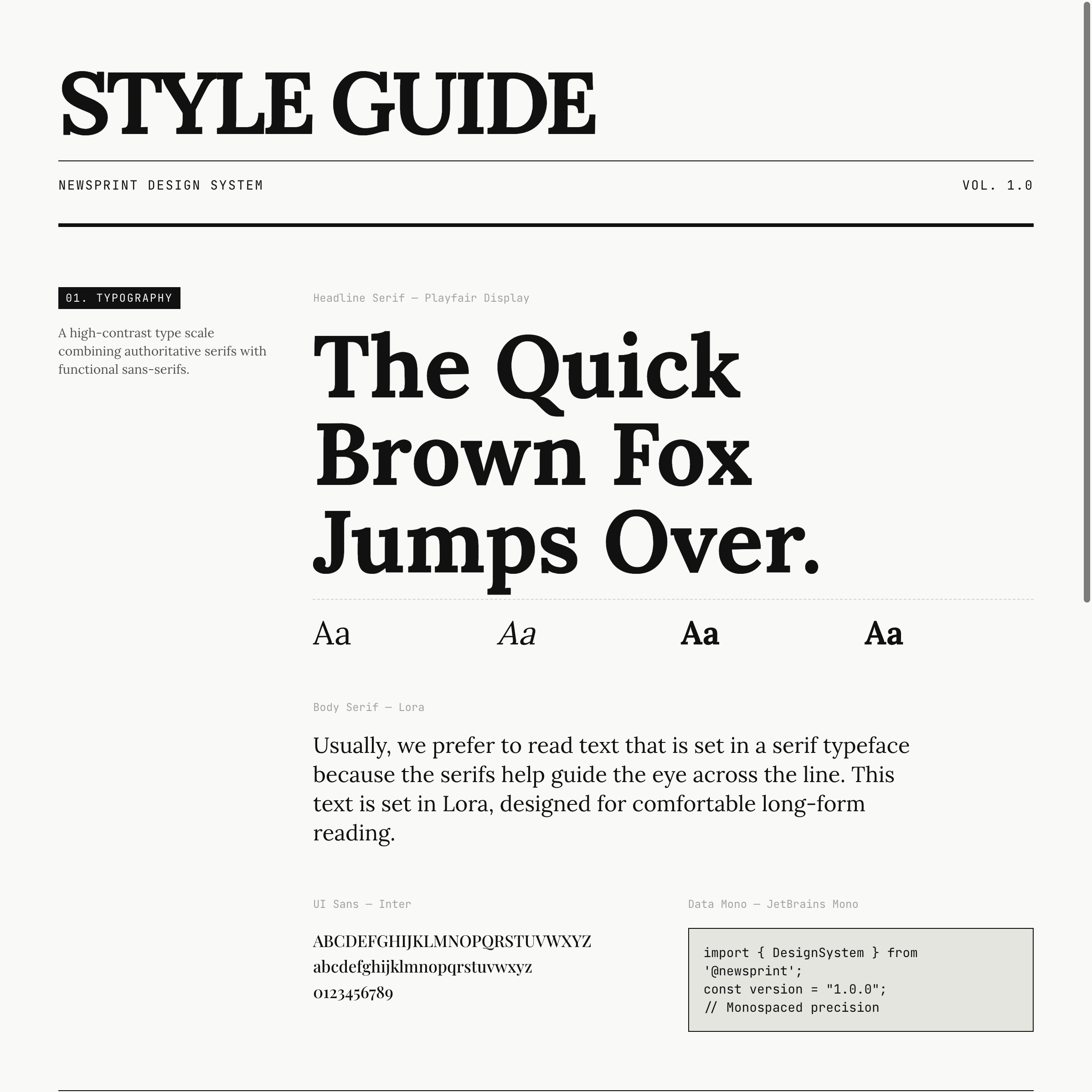
The single highest-leverage detail is line length, the measure. Robert Bringhurst's long-standing rule is that 45 to 75 characters per line is comfortable for body text, with about 66 the ideal, and the WCAG accessibility guidance caps a line at 80 characters (UXPin, CSS-Tricks). A blog that lets paragraphs run the full width of a desktop browser is already failing the reader, however nice the fonts. Here is the table to prompt against.
| Element | The rule that reads well | Why |
|---|---|---|
| Body line length | 45 to 75 characters (cap a reading column near 66ch) | Long lines make the eye lose its place returning to the next line |
| Body size and leading | 16 to 18px, line-height about 1.5 | Long-form reading needs vertical room, not dense rows |
| Type scale | A consistent modular scale, not arbitrary sizes | A clear hierarchy is what makes a page feel designed |
| Responsive type | Fluid scaling with CSS clamp(), in rem | Smooth scaling across devices, and it respects user zoom |
Tell the generator the measure, the scale, and the pairing, and you skip the most common reason an AI blog looks generic.
The editorial grid index
A blog index is a magazine cover, not a list, so it should reward scanning with hierarchy instead of dumping every post in one uniform feed. The pattern that reads as editorial is a clear masthead and kicker, category filters, and a grid where a featured post can be larger than the rest, each card carrying a category tag, a real headline, and post meta. That is what the index in the first image above is doing: it looks curated, not auto-generated.
The mistake to avoid is the infinite uniform feed, every post the same size in one endless column, which is exactly what default themes ship because it is the safe average. Give the index a point of view: a featured story, a tidy three-column grid below it, and filters that actually help a reader find a topic.
A great article page
The article page is where a blog is won or lost, because that is where the reader actually spends time, so design it for long-form reading rather than treating it as an afterthought. Long-form pages that people actually finish share a few craft details: a constrained reading column, generous leading, and signposts like in-line headings and pull quotes that give the eye rest stops through a long piece (designer-daily).
Concretely, a strong article page has a confident title block with author, date, and read time, a single readable column for the body, real heading levels for structure, pull quotes for emphasis, and proper handling of images, code, and captions. Ask for those explicitly. An AI that is told to "make a blog post page" will give you a centered title and a wall of text; an AI told to build a reading experience with a 66ch column, pull quotes, and a sticky table of contents gives you something people finish.
Prompt patterns that produce it
The quality of the output tracks the quality of the prompt: a one-liner gives you the generic theme, while a prompt that names the type system, the index grid, and the article reading experience gives you something editorial. Here is a copyable starting prompt that bakes the checklist into the request.
Design an editorial, magazine-style blog for [topic/publication name].

Voice: [confident and literary / clean and technical / playful and bold]. Not a default theme.
Audience: [who reads it].

Type system:
- A characterful display serif (or grotesque) for headlines, a readable face for body.
- A clear modular type scale; body 16 to 18px, line-height ~1.5.
- Body reading column capped near 66ch (45 to 75 characters per line).
- Fluid type with CSS clamp() so it scales smoothly on mobile.

Pages:
1. Index: a confident masthead + kicker, category filter pills, ONE featured post larger than the rest, then a 3-column grid. Each card has a category tag, headline, excerpt, and meta (author, date, read time).
2. Article page: a title block with author/date/read time, a single readable column, real H2/H3 headings, pull quotes, styled blockquotes, and clean image + code handling. Add a sticky table of contents on desktop.

Style: one accent color used sparingly, strong type hierarchy, generous whitespace, tasteful restraint. Avoid the default indigo-to-violet gradient, a centered everything layout, and a uniform endless feed.
For a deeper library of editorial and blog prompts, raid the free prompt library and adapt one to your publication. It works with any coding agent and saves you guessing at the wording. The UI design prompts guide covers the prompt structure in more depth.
Avoid the generic-theme trap
The biggest risk with any blog website generator is that it returns the statistical average of every blog it has seen, which is the exact theme you are trying to escape. Most "best AI blog website builder" tools optimize for getting any blog online fast, which is genuinely useful for non-technical writers, and a dead end the moment you want a look that is yours or the code under it.
The generic-blog-theme starter pack
- ✕Default system fonts or Inter everywhere, no display face, no real scale
- ✕Body text running the full browser width, far past 75 characters per line
- ✕A uniform endless feed where every post is the same size, no featured story
- ✕A centered hero with a stock illustration instead of confident typography
- ✕Cramped leading and no pull quotes, so long articles read as a wall of text
- ✕A hosted theme you cannot export, so customization stops where the builder stops
Verbatim from Bringhurst measure; long-form typography craft
AI will not save you from a vague brief. If you ask for "a modern blog" you get the average of every blog the model has seen. Name the type system, the index grid, and the article experience, then let the tool handle the layout.
Iterate, do not settle for the first draft
The first generation is a draft, not the answer, so the real win is exploring directions fast and refining the one that fits. Most tools make you re-roll one variation at a time. Superdesign forks several directions in parallel on an infinite canvas, so you can compare a few index grids or article layouts side by side and carry the best one forward, instead of committing too early. Then you keep prompting in plain English to tighten it.
Take the current blog index and give me 3 variations:
1. A bolder, oversized-type masthead in the style of an editorial cover.
2. A version with one full-bleed featured story above a tighter grid.
3. A quieter, monochrome version with a serif body and more whitespace.

Keep the same type scale and accent. Show the matching article page for each, all mobile-first with a readable 66ch column.Get real React you own, not a hosted theme
Here is the difference that matters once you actually want to ship: most blog builders stop at a hosted theme tied to their platform, while a code-output design agent hands you real React and Tailwind you drop into your repo. Ghost and Medium are great for publishing fast without touching code, and Framer makes a beautiful designed blog, but the site lives on their hosting and their CMS. That is fine for a pure writer, and a dead end the moment you want a custom layout, your own MDX pipeline, or the blog to live inside an existing app.
| Tool type | What you get | Best for |
|---|---|---|
| Hosted blog platforms (Ghost, Medium) | A hosted blog and theme, limited code access | Writers who want to publish and never touch code |
| Visual site builders (Framer, Wix) | A designed, hosted blog tied to their platform | Designers who want a visual editor and never need export |
| Code-output design agents (Superdesign, v0) | Real React and Tailwind you own | Writers and developers who want to own and keep editing the site |
Superdesign sits in the third row. It is an AI design agent that outputs production React and Tailwind, runs in the browser or as a skill inside Claude Code and Cursor, and when you point it at an existing project it reads your current UI first, so a new blog speaks your tokens, spacing, and components instead of arriving as a stranger theme. You generate the index and article pages, compare variations on the canvas, then have your coding agent fetch the design and implement it. No handoff, no platform lock-in.
For the wider landscape of how the AI generators compare on output quality, pricing, and codebase fit, see the pillar guide on the best AI UI generator. It maps where each tool fits; this page is about the editorial-specific moves that get you a blog worth reading.
Common editorial blog mistakes
The most expensive errors are about typography and structure, not pixels. The recurring ones: body text running the full browser width past the comfortable 45 to 75 character measure (UXPin), default system fonts with no real type hierarchy, a uniform endless feed with no featured story, cramped leading that turns a long article into a wall of text, and a hosted theme you cannot export when you outgrow it. Long-form readers finish when the reading experience does not fight them, when line length feels natural, spacing gives room to breathe, and headings provide orientation (designer-daily).
A designed blog is mostly subtraction: one display face, one body face, one accent, a constrained column, and real hierarchy. Get those right and even a simple layout reads as editorial.
Ship your blog
You can have a real, editorial blog in under an hour: start with a prompt that names the type system, the index grid, and the article reading experience, grade the result against the checklist above, fork a couple of directions on a canvas, then export real React and Tailwind into your repo and wire it to your own MDX or CMS. The whole point is to skip the generic-theme trap and end with a blog you own and can keep editing as it grows.
Start in the browser with the AI UI generator, or if you live in Claude Code or Cursor, add the Superdesign skill and drive it from your agent. For the full tool landscape, the best AI UI generator pillar lays out where each option fits. Ping me anytime if you want a second set of eyes on your type system, and we'll sort it together. 🙂


