You can design without a designer, and the result can look genuinely good, if you stop trying to invent taste from a blank page. The people who ship clean UI solo are not more artistic than you. They run a system: steal structure from proven references, lock a tiny set of design tokens, point AI at a reference instead of asking it to "make it pretty," then cut everything that screams generic. That is the whole playbook, and none of it requires an art degree or a budget. Here is the honest version.
Can you design without a designer?
Yes. For most product UI (a SaaS dashboard, a landing page, an app screen) you do not need a designer, you need a process that replaces taste with decisions you can copy. A designer's real job is making a thousand small calls (type, spacing, color, hierarchy) so the result feels intentional. You can borrow those calls from products that already made them well, encode them once, and let everything inherit them. The trap is the blank canvas, where you and the AI both default to the average. Avoid the blank canvas and you are most of the way there.
This works for the boring 90 percent: internal tools, marketing pages, CRUD apps, MVPs. It does not replace a designer for genuinely novel interaction problems or a brand identity that has to be unique. Know which one you are doing.
Steal structure, don't invent it
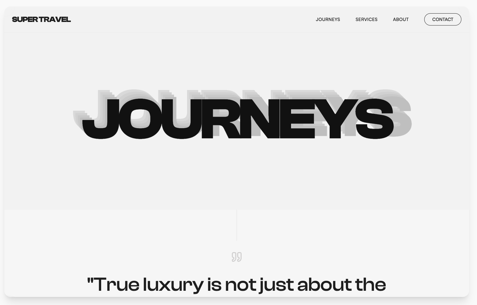
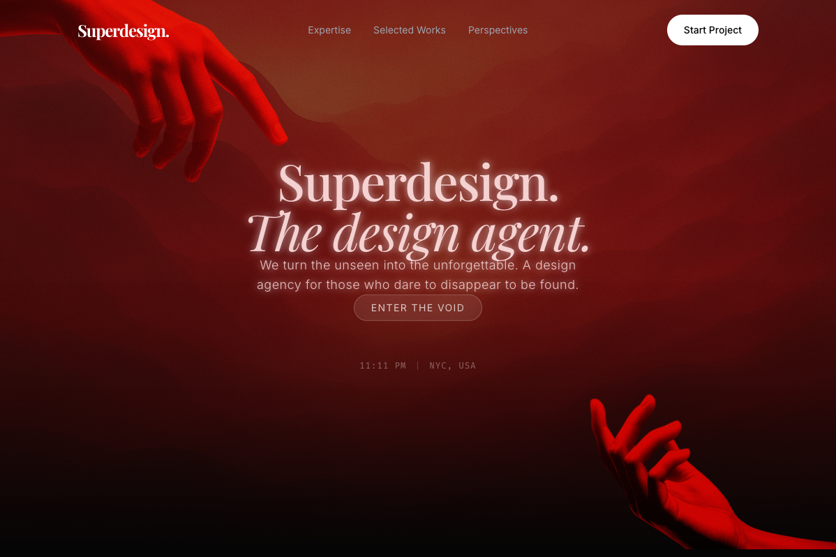
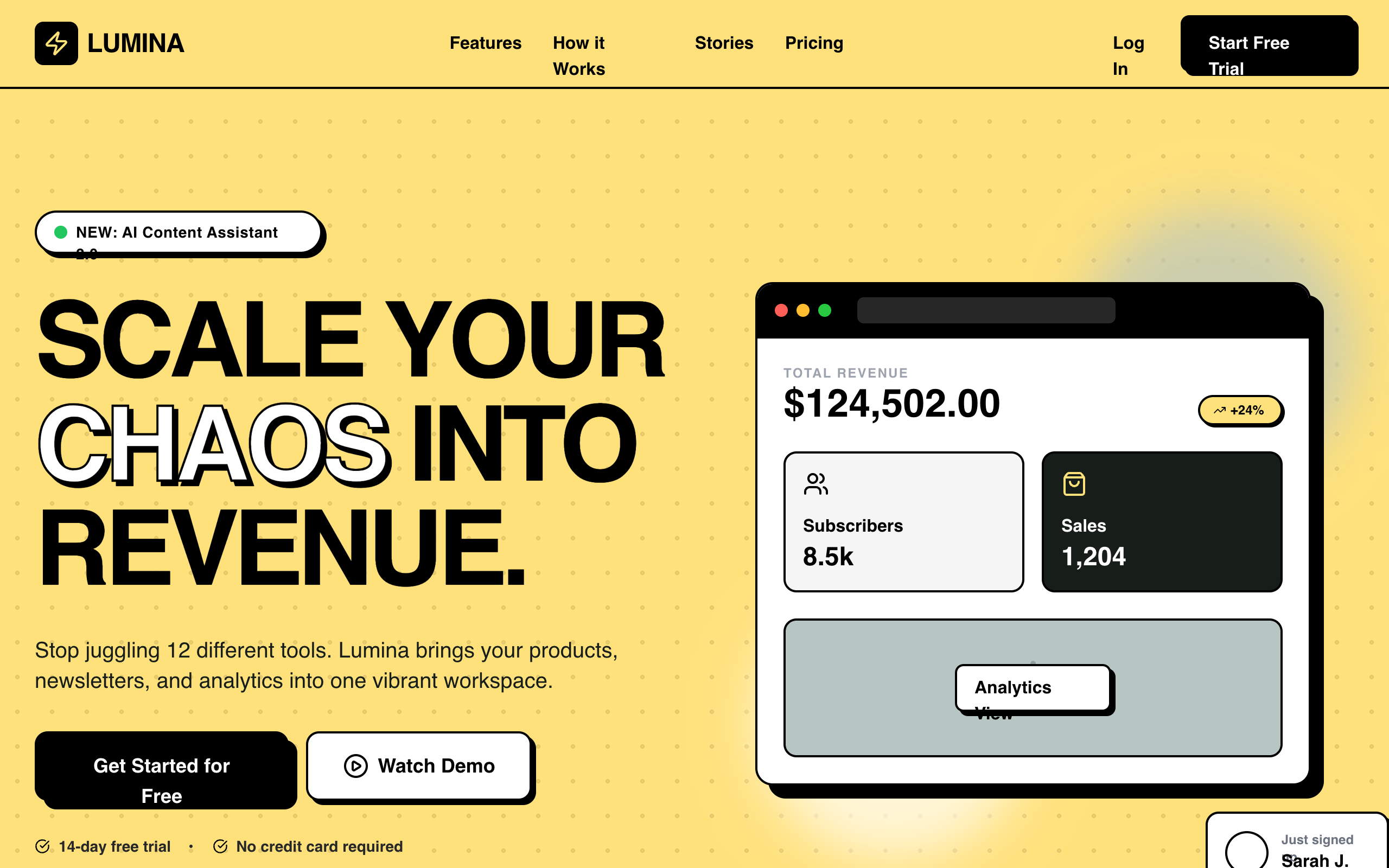
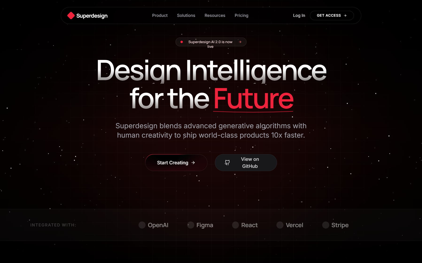
The single highest-leverage move is to copy the structure of a product you already admire, then change the content, not the bones. Good design is mostly structure: where the eye lands first, how dense the page is, how many things compete for attention. Founders waste weeks "designing" when they should be reverse-engineering. Open three products in your space that you think look great (Linear, Stripe, Vercel, Height, whatever fits), and for each one write down the bones:
- The layout grid: sidebar plus content, single centered column, or two-pane master-detail.
- The hierarchy: what is biggest, what is muted, what is the one primary action per screen.
- The density: lots of whitespace and few elements, or a tight data-heavy table.
You are not copying pixels, you are copying decisions. A dashboard that borrows Linear's restraint (one accent, a quiet sidebar, real data over decorative cards) will look ten times more intentional than one you freehand. This is the same reason "make it look like a Qt app" famously de-slops AI output: a strong reference collapses a thousand open choices into one coherent direction. We unpack why that happens in why AI design looks generic.
Lock a tiny design system
Before you generate or build anything, write down five categories of tokens, and never decide them again per screen. A design system sounds heavy. The version that matters for one person fits on a napkin: a few colors, one type choice, a spacing rhythm, a corner radius, and a shadow rule. Locking these is what makes ten different screens feel like one product instead of ten experiments.
Put it in a DESIGN.md (or plain CSS variables) so both you and any AI tool inherit it automatically:
---
name: "My product (one-person design system)"
colors:
bg:      "#0B0B0F"   # one background, pick light OR dark and commit
surface: "#15151B"   # cards/panels, one step off the bg
text:    "#ECECEF"   # primary text
muted:   "#8A8A93"   # secondary text, the ONLY gray you need
accent:  "#3B82F6"   # ONE accent, used once per screen for the primary action
line:    "#26262E"   # hairline borders instead of heavy shadows
type:
font:  "One characterful sans or serif. Not Inter-by-default."
scale: "4 sizes max: 32 / 20 / 15 / 13. Big confident headings."
space:  "Multiples of 4px only: 4, 8, 12, 16, 24, 32, 48."
radius: "One value, 8px. Apply everywhere. No mixing pill and square."
shadow: "Prefer 1px borders. If you must, ONE soft shadow token, used rarely."
---
The rule that does the most work: one accent color, used once per screen. The fastest tell of amateur UI is three competing brights and a different gray in every component. Pick one accent, reserve it for the single primary action, and let everything else be your background, your text, and your muted gray. We go deeper on why this file is the highest-leverage artifact you can keep in what is DESIGN.md.
Use AI the right way
AI design tools produce slop when you ask them to "make it pretty" and produce good work when you feed them a reference and your tokens. The difference is grounding. A vague prompt makes the model return the statistical center of everything it has seen (Inter, a purple gradient, three rounded cards). A grounded prompt removes the guesswork: name the reference, paste the tokens, and describe the screen concretely.
A bad prompt and a good prompt for the same screen:
- Bad: "Design a modern, clean settings page for my app."
- Good: "Settings page, two-pane master-detail like Linear's. Use my DESIGN.md tokens. Left nav with 5 sections, right pane shows a form with labeled fields, one primary save button in the accent color, everything else muted. Dense, not airy."
The second one cannot drift to the average, because you removed the openness it would have averaged over. The other unlock is exploration: generate several distinct directions and compare them side by side before you commit to one, instead of nudging a single output with adjectives. If you have never written a strong design prompt, do not start from scratch. Steal one. Our free prompt library is a grab bag of prompts that already encode structure and taste, so you copy a proven starting point instead of typing "make it nice" into a box.
For more on picking AI tools that fit a developer or solo-founder workflow (codebase-aware, real code out, no credit-meter anxiety), see the best AI UI generator guide and the AI design tool for developers.
Taste by subtraction
When something looks off and you cannot name why, the fix is almost always removal, not addition. Non-designers reach for more: another gradient, another shadow, another icon, more copy. Designers reach for less. "Taste" in practice is mostly the discipline to delete the thing that is doing nothing. Before you ship a screen, run it against the two lists below. The first is the slop starter pack to kill on sight. The second is the subtraction pass.
The slop tells to kill on sight
- ✕Inter or Roboto left as the default font
- ✕A purple-to-indigo gradient on the hero or buttons
- ✕A centered hero with two competing CTAs
- ✕A row of three rounded cards, each with an emoji icon
- ✕Drop shadows at 0.1 opacity on every element
- ✕Three different accent colors fighting for attention
- ✕Decorative cards wrapping plain data that wants a table
Verbatim from Why AI design looks generic
The subtraction pass before you ship
- ✓One primary action per screen, in the accent color, nothing else competing
- ✓One accent, one muted gray, one background. Delete the rest
- ✓Every gray standardized to your single muted token
- ✓Borders over shadows. Remove shadows that add no information
- ✓Real content over lorem ipsum and placeholder avatars (fake content hides real problems)
- ✓Left-aligned text where centered was just a default
- ✓Fewer font sizes: if you have six, cut to four
For a deeper list of the specific moves that make developer-built UI look designed (spacing rhythm, contrast, alignment, empty states), read UI design tips for developers.
Your weekend build, in order
If you do these in sequence, you will ship something that looks intentional by Sunday. Skip the order and you will be back to negotiating with vibes.
Design without a designer, in order
Steal the bones from references
Pick two or three reference products and write down their structure: grid, hierarchy, density.
Fill in the DESIGN.md
Lock the five token categories above (accent, grays, radius, spacing, type), then stop deciding.
Feed reference plus tokens to the AI, screen by screen
Give the tool both the reference and your tokens with concrete prompts, one screen at a time.
Generate several directions and pick one
Produce a few directions per screen, compare them side by side, and choose, instead of nudging one output.
Run the subtraction pass before shipping
Cut the slop tells (extra accents, mismatched grays, shadow soup) so every screen reads intentional.
None of this needs a designer. It needs you to make decisions once, write them down, and steal the rest from people who already got them right.
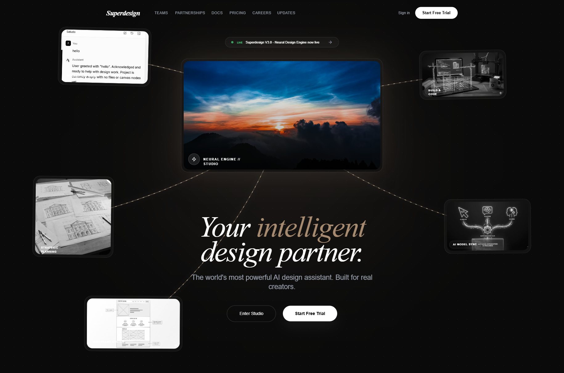
Where Superdesign fits
Superdesign is the design layer for people who have no designer, because it runs exactly this playbook for you instead of leaving it as discipline you maintain. It is an AI design agent on an infinite canvas: it reads your existing project and captures your design system as a file (your tokens, applied automatically), it pulls real proven patterns from sources like Mobbin and Dribbble so generations start from a reference instead of the average, and it forks several distinct directions at once on the canvas so you choose from options rather than nudging one. You can drive it from the web app or from your coding agent (Claude Code, Cursor, or any agent), and it outputs real React and Tailwind, on a free tier plus a flat $20 per month so iterating does not meter your budget. You still make the taste call. It just removes the blank canvas, which was the actual problem.