You do not need taste to ship UI that looks intentional. You need rules. Most of what reads as "designed" is just a handful of constraints applied consistently: one spacing unit, one accent color, a real type scale, things lined up on a grid. Below are ten you can apply to your next screen today, each as a rule plus a one-line before and after so you can see the move. None of them require a designer, and as a bonus, every one of them also makes your AI design prompts sharper, because a vague prompt produces vague UI.
The short version
Good UI for developers is mostly subtraction and consistency, not flair. If you only remember one thing: pick a unit, an accent, and a type scale, then apply them everywhere without exception. Here is the whole list before we walk through each one.
The 10 rules, in order
- ✓Space everything on a single 8px unit
- ✓Use exactly one accent color
- ✓Drop in a real type scale with line-height
- ✓Align everything to a grid
- ✓Hit AA contrast on every text color
- ✓Cut the border noise
- ✓Design the empty, loading, and error states
- ✓Pick one corner radius and reuse it
- ✓Build hierarchy with size and weight, not color
- ✓Skip the default Inter plus purple plus three-card look
Space everything on 8px
Pick one spacing unit and make every gap a multiple of it. 8px is the standard (with 4px for tight cases), so padding, margins, and gaps become 8, 16, 24, 32, never 7, 13, 22. The eye reads the rhythm even when it cannot name it.
Before: padding of 11px here, 14px there, a random 6px gap. After: everything snaps to 8, 16, 24, and the layout suddenly looks deliberate.
Use one accent color
Commit to a single accent and let everything else be neutral grays. One color carries your primary action, links, and focus states. The moment you have two "important" colors competing, nothing is important. Neutrals do the heavy lifting, the accent points at the one thing you want clicked.
Before: a blue button, a green badge, a purple link, an orange tag, all shouting. After: grayscale UI with one confident accent, and the eye goes exactly where you want.
Use a real type scale
Set font sizes from a fixed scale instead of typing whatever number feels right. A simple ratio works: 12, 14, 16, 20, 24, 32, 48. Then set line-height to about 1.5 for body text and tighter (1.1 to 1.2) for big headings. Most "off" looking text is just cramped line-height or three sizes that are almost-but-not-quite the same.
Before: 15px body, 17px subhead, 19px heading, all 1.0 line-height and stacked tight. After: 16px body at 1.5, a 24px heading at 1.2, and it reads like a document instead of a wall.
Align to a grid
Line elements up to shared edges. Pick a small number of left edges and stick to them, so labels, inputs, and buttons share a vertical line down the page. Ragged left edges are the single most common thing that makes a hobbyist UI look hobbyist.
Before: every card and form field starts at a slightly different x position. After: one clean left margin runs down the whole page, and it feels engineered.
Hit AA contrast
Make sure text passes WCAG AA: a contrast ratio of at least 4.5 to 1 for normal text, 3 to 1 for large text. That gray-on-white placeholder you think looks "elegant and subtle" is often unreadable. Run colors through a contrast checker, it takes ten seconds and catches the thing reviewers will ding you for.
Before: #AAAAAA text on white at 2.3 to 1, invisible in sunlight. After: #595959 or darker, readable everywhere, and it still looks calm.
Cut the border noise
Delete most of your borders. Borders around every card, input, and section create visual static. Use whitespace and a subtle background shade to separate things instead, and reserve actual lines for where you genuinely need division (a table, a clear boundary). One quiet 1px hairline beats a box around everything.
Before: every element wrapped in its own 1px gray box, the screen looks like a spreadsheet. After: groups separated by space and a faint fill, borders only where they earn their place.
Design the empty states
Build the empty, loading, and error states on purpose, not as an afterthought. The happy path with three rows of fake data is the easy 20%. Real apps spend a lot of time empty (new user, no results, offline), and a blank white void or a raw error string is where polished UIs separate from prototypes. Give each one a short message and a next action.
Before: an empty list renders as nothing, a failed fetch dumps "undefined" on screen. After: "No projects yet. Create your first one" with a button, and a friendly retry on error.
Tip
One radius, everywhere
Choose a single corner radius and apply it to everything: buttons, cards, inputs, modals. Mixing a 4px button with a 16px card and a 24px modal reads as accidental. Pick one value that matches your vibe (crisp at 4 to 6px, soft at 12px) and use it without exception.
Before: sharp inputs, pill buttons, very round cards, all on the same screen. After: one radius across the board, and the components look like a set.
Hierarchy by size and weight
Show what matters using size and font weight, not more colors. A title is bigger and bolder, a label is smaller and lighter, secondary text is a muted gray. You almost never need a second color to signal importance. Reaching for color to create hierarchy is what produces the rainbow dashboard.
Before: the heading is red, the subhead blue, the meta text green, all the same size. After: one ink color, three sizes and two weights, and the order of importance is obvious.
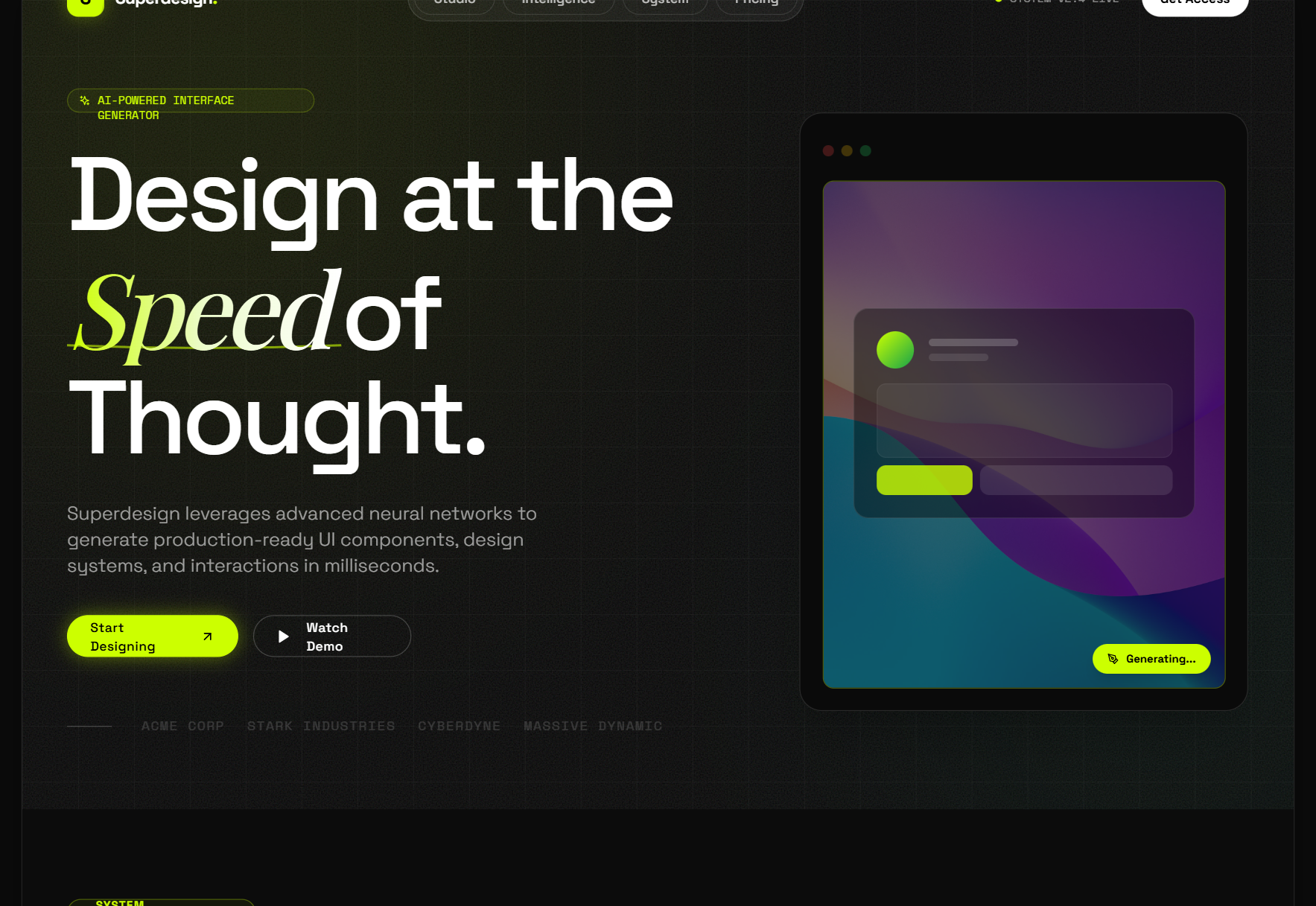
Skip the slop defaults
Avoid the look every AI tool and starter template ships by default. You know it on sight: Inter font, a purple-to-indigo gradient, a centered hero, and a row of three rounded cards with little icons. It is the statistical average of "modern web UI," which means it signals "nobody made a real decision here." Swap the font for something with a bit of personality, drop the gradient, and your project stops looking generated.
The default look to avoid
- ✕Inter or Roboto with zero personality
- ✕A purple or indigo gradient accent
- ✕A centered hero with one CTA
- ✕Three icon-cards in a row below it
- ✕Rounded corners and 0.1-opacity shadows on everything
Verbatim from superdesign.dev
We went deep on why this specific look happens, and how to steer out of it, in why AI design looks generic. The short answer: the model returns the average unless you give it a point of view.
These rules sharpen your prompts too
Every rule above doubles as a prompt instruction. The reason AI UI comes out generic is that an open ask ("build me a dashboard") leaves every one of these decisions to the model, so it picks the safe average for all of them. Hand it the constraints instead: "8px spacing scale, one #C2410C accent, 16px body at 1.5 line-height, one 6px radius, no card borders, design the empty state." Now you are directing, not hoping.
If you would rather grab a proven starting point than write all of that from scratch, the free Superdesign prompt library is full of curated, copy-and-paste design prompts you can drop into any coding agent.
The best way to make these rules permanent is to write them down once and reuse them. That is exactly what a design-system file does for a coding agent: see what is DESIGN.md for the format. And if you want the whole "ship decent UI with no designer on the team" playbook, start with design without a designer.
The rules above are the FAQ-worthy answers too: spacing on an 8px scale, one accent, a fixed type scale, AA contrast, one radius, and real empty states. Apply them and a plain UI reads as professional without any innate taste.