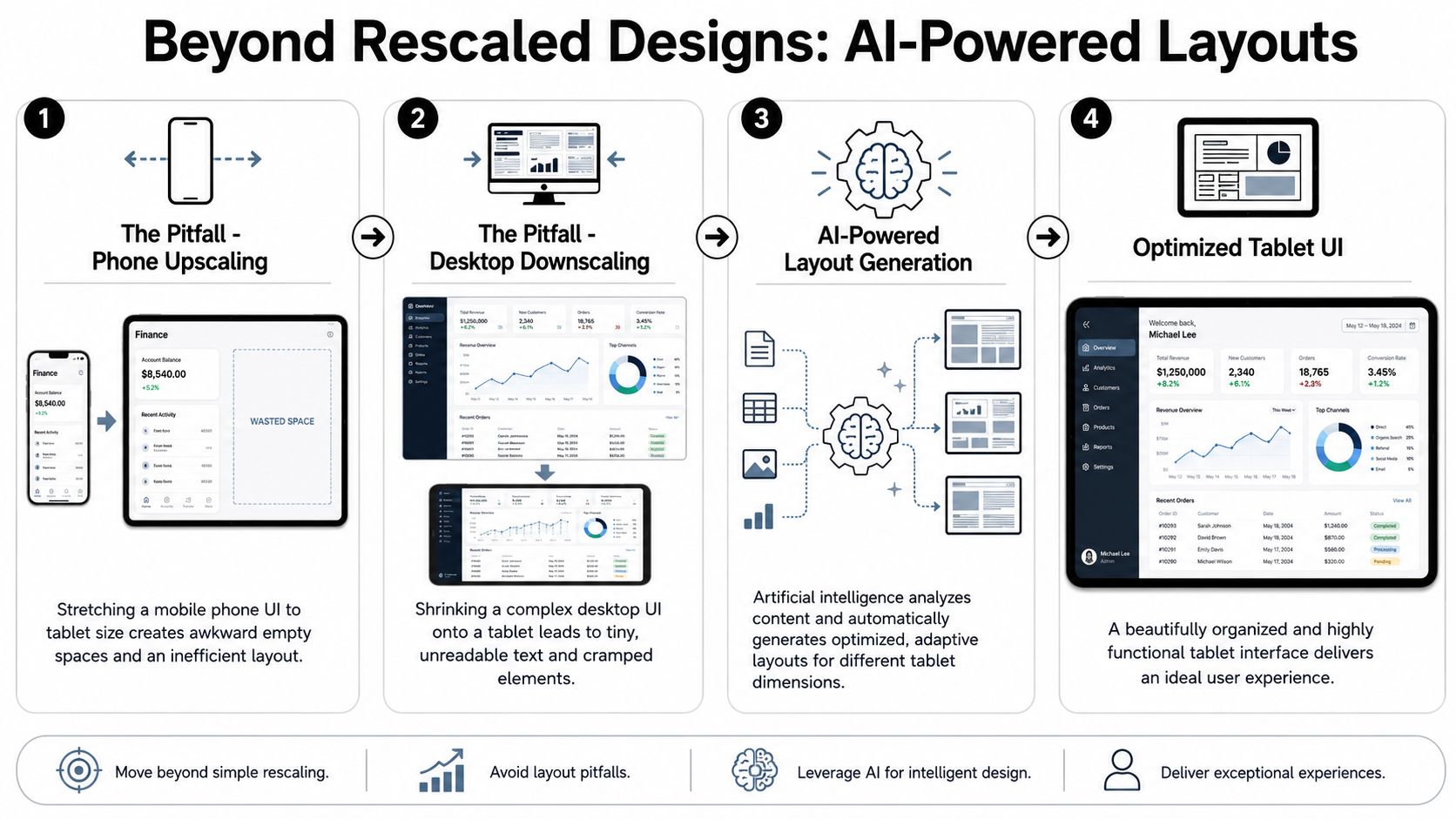
You're probably in one of two situations right now. You have a phone design that looks sparse and awkward on a tablet, or you have a desktop interface that turns into a cramped mess the moment someone touches it.
That tension is why tablet work still trips up solid teams. A good tablet user interface isn't a bigger mobile screen or a smaller desktop app. It needs its own layout logic, interaction model, and handoff process. If you skip that, you get dead space, tiny controls, hidden actions, and navigation that feels wrong in portrait and horizontal mode.
The good news is that the workflow has improved. AI-assisted design tools make it much easier to generate native tablet directions, adapt existing work, prototype interactions, and move into code without rebuilding the same interface three times. The key benefit isn't speed alone. It's getting to the right structure earlier, while the cost of change is still low.
Beyond rescaled designs: AI-powered layouts
The fastest way to ruin a tablet user interface is to inherit the wrong parent. Teams often stretch a phone layout until it fills the screen, or compress a desktop layout until it technically fits. Both approaches feel off because the user's task model changes on a tablet.
Nielsen Norman Group points out a persistent gap in tablet guidance. Many products still treat tablets as large phones or shrunken desktop screens, and rescaled design remains a major usability threat. Their guidance also makes an important distinction for navigation: multi-pane layouts can improve efficiency on larger screens, but tabs may work better when people switch views frequently, so the right pattern depends on task frequency rather than screen size alone, as noted in NN/g's tablet usability guidance.
Start with task structure, not screen inheritance
Before you draw anything, ask a sharper question than "How should this look on tablet?" Ask, "What can the user do at the same time on tablet that they can't do comfortably on phone?"
That question usually reveals the right direction:
- Reference plus action: A split-pane layout works well when users need a list on one side and details or editing on the other.
- Browse plus compare: A multi-column grid helps when users scan visual content, products, or documents side by side.
- Frequent mode switching: Tabs are often better than persistent side structures when users jump between views often.
Practical rule: If the tablet screen should reduce navigation steps for a common task, don't enlarge the phone layout. Recompose it.
Use AI to generate tablet-native layout directions
AI is helpful, but only if you prompt for structure rather than style alone. Ask for layout behavior, hierarchy, and interaction assumptions. Don't start with "make it modern." Start with "show the list, selection state, and working area simultaneously."
A good workflow is to generate three competing tablet concepts from the same brief:
- Split-pane concept for operational workflows such as inboxes, project boards, or file managers.
- Editorial multi-column concept for dashboards, content libraries, or analytics overviews.
- Bento-style concept for apps where modules have different weights and priorities.
If you want a broader view of the ecosystem before choosing your workflow, Figr's roundup of top AI design tools is useful because it shows how different products handle ideation, iteration, and build handoff.
One warning. AI outputs tend to become generic when prompts focus on surface polish instead of interaction logic. The problem is well explained in this piece on why AI design looks generic, and it's especially relevant for tablet projects where layout decisions matter more than visual garnish.
Prompt examples that produce better starting points
Use prompts that specify content relationships, not just components.
- For a productivity app: "Create a tablet workspace with a left navigation rail, a central item list, and a right detail pane. Prioritize scanability in horizontal mode and collapse the detail pane in portrait."
- For commerce: "Generate a tablet shopping interface with immersive product imagery, filter access without hover, and side-by-side comparison cards."
- For a CMS: "Design a content management tablet UI with multi-column overview, clear draft status, and an editing panel that doesn't hide context."
A useful review method is to compare concepts against failure modes instead of preferences. Ask which option leaves the least dead space, which one reduces context switching, and which one still works when content length doubles.
That's how you stop designing a resized interface and start designing a native one.
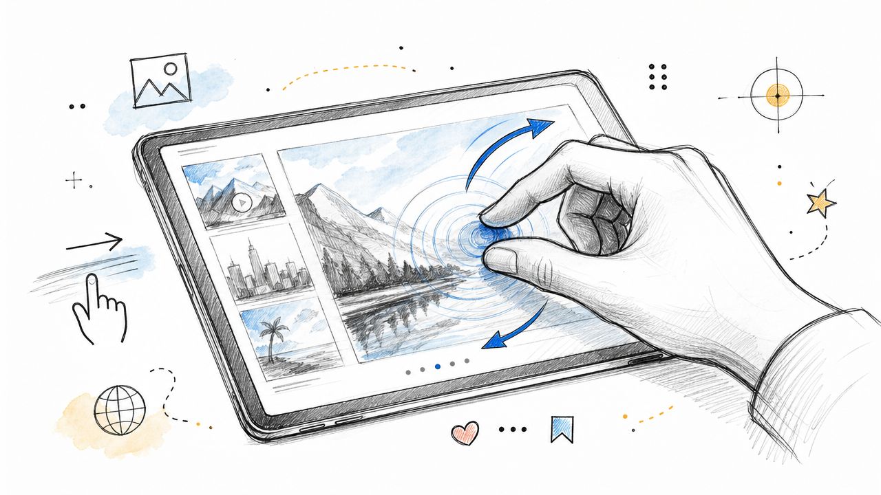
Designing for touch and fluid interaction
A clean layout won't save a tablet interface if people can't hit the controls comfortably. Touch changes everything. Precision drops, fingers obscure content, and the screen no longer gives you hover as a safety net.
Tablet UI design became a separate discipline when Apple introduced the iPad on January 27, 2010, creating a mainstream tablet category that demanded larger touch targets, clearer navigation, and roomier layouts. The Interaction Design Foundation recommends 44-pixel minimum touch targets for buttons and icons in tablet and smartphone interfaces, a guideline built for finger-operated screens and the reality of fat-finger use cases in which the hand partly covers the display, as explained in their tablet and smartphone usability guidance.
Design for hands, not cursors
Treat 44 pixels as the minimum, not the target outcome. In real interfaces, spacing around the target matters almost as much as the target itself. A tiny icon inside a padded button can work. A tiny icon with another tiny icon right next to it usually won't.
When I review tablet work, I check three things first:
| Interaction area | What usually fails | Better approach |
|---|---|---|
| Top bars | Dense icon clusters | Fewer primary actions, grouped secondary actions |
| Card controls | Small save/share buttons at corners | Full-width action rows or larger explicit buttons |
| Side navigation | Narrow tap zones and ambiguous states | Broad rows with strong selected states |
On tablet, accidental taps often come from proximity problems, not just control size.
Replace hover logic with explicit touch behavior
Desktop patterns often hide useful actions behind hover states. On a tablet, that means actions either disappear or require awkward discovery.
Replace those patterns with touch-first alternatives:
- Use visible affordances: Show action buttons, overflow menus, or inline controls instead of expecting reveal-on-hover.
- Expand on tap: For metadata, filters, or secondary details, let users tap to expand a section.
- Use press states clearly: Active, selected, disabled, and loading states need to be obvious without relying on cursor feedback.
A common fix is to move from "clean until hover" to "calm but explicit." That doesn't make the UI heavier if the hierarchy is strong. It makes the interface legible.
Build consistency into components early
Touch problems get expensive when every screen solves them differently. The smarter approach is to encode your decisions into reusable components from the start.
Create a small tablet component set with fixed rules:
- Buttons: Minimum target size, consistent icon placement, and predictable label wrapping.
- Navigation items: One row height, one selected-state pattern, one badge placement.
- Cards: Stable tap area, clear primary action, and no hidden hit zones.
If your component library enforces those rules, the interface stays usable even when screens multiply. That matters more on tablet than teams often expect because layout freedom increases, and inconsistency sneaks in fast.
Building adaptive and responsive strategies
Tablet work gets messy when teams design for a single ideal device and call it done. Real use happens across portrait, horizontal orientation, browser-based views, and app shells with different available widths. Your system needs to adapt without feeling unstable.
A practical baseline for tablet UIs is to define breakpoints in the 768-1024 px range, then retune grids, typography, and image sizing for those widths. The same guidance recommends 44 by 44 px touch targets, extra spacing around controls, and replacing hover-only behavior, which directly addresses the common desktop-first mistake of assuming dense navigation and mouse interactions will translate well to touch, according to this tablet optimization guidance.
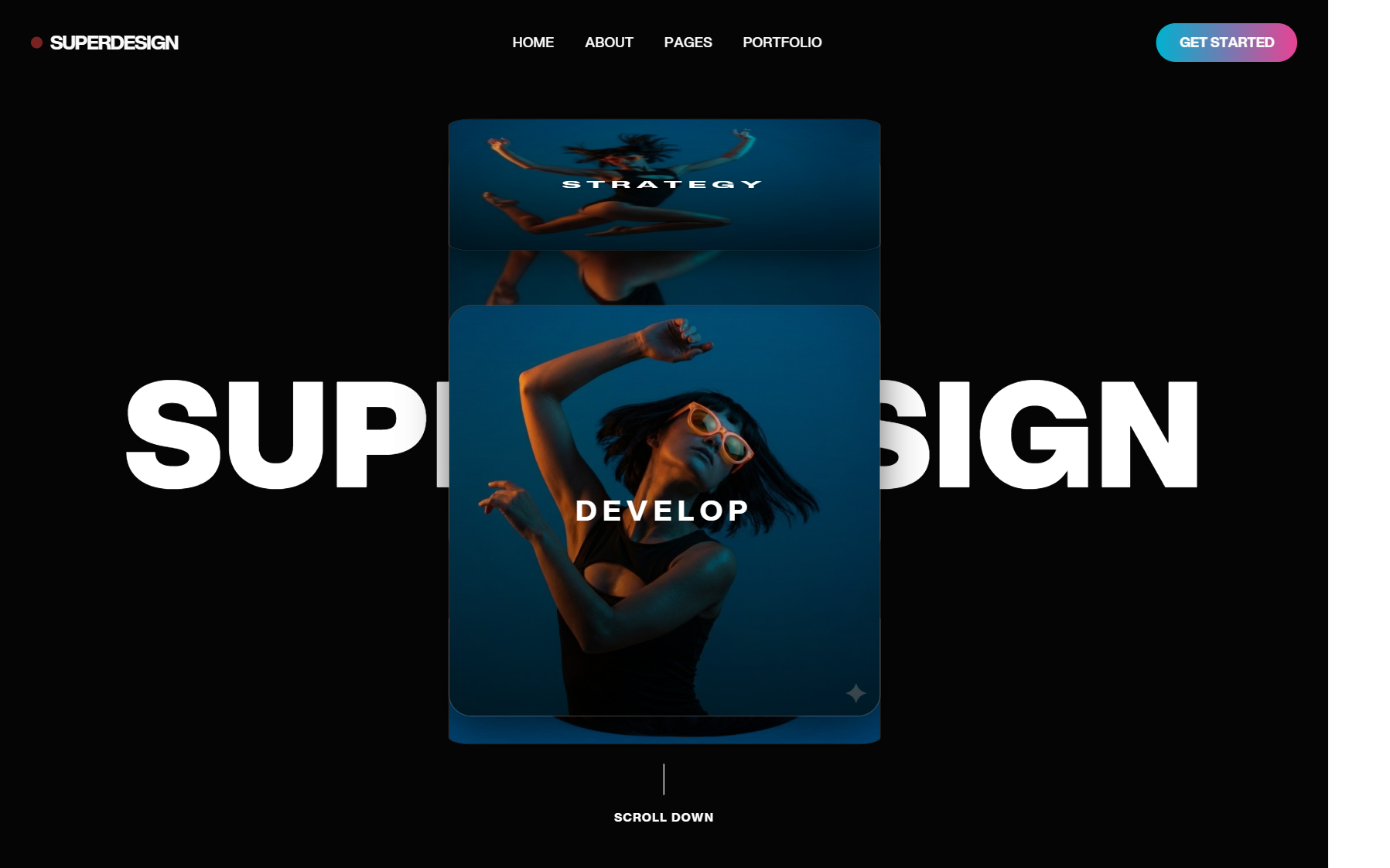
Near the start of the workflow, it helps to inspect the design environment and imported structure visually:
Use breakpoints as behavior changes, not resize events
A weak responsive approach asks, "What should shrink?" A stronger one asks, "What should reorganize?"
For tablet design, that usually means these breakpoint behaviors:
- Single column to dual column: Feeds, content indexes, and product lists gain scan efficiency when they split.
- Collapsed navigation to persistent navigation: A temporary menu can become a rail or sidebar when width allows.
- Inline details to adjacent details: Instead of drilling into a new screen, users can inspect content beside the source list.
Those changes should feel intentional. If your interface scales cards, text, and gutters proportionally, the tablet version may look polished but still behave like a stretched phone.
A practical adaptation workflow
When adapting an existing product, I'd use this sequence.
- Import the current experience. Start from the live mobile page or a desktop reference so you're working with the actual information structure, not a guessed reconstruction.
- Identify the main task loop. Separate browsing, selection, editing, and confirmation. The tablet layout should reduce jumps inside that loop.
- Prompt structural changes. Use commands like:
- "Convert this single-column feed into a two-column grid for screens wider than 768px."
- "Turn this drill-down detail page into a split-pane tablet layout with persistent context."
- "Replace top-nav dropdown patterns with visible touch-friendly controls."
- Refine component behavior. Adjust card heights, image crops, sticky regions, and overflow handling.
What matters is that the AI is doing adaptation work on top of a real artifact. That's much more useful than generating an abstract mockup with no relation to the product you need to ship.
What to change between portrait and landscape
Orientation changes shouldn't just trigger a rearrangement. They should change emphasis.
In portrait, keep the hierarchy tighter. Prioritize one main reading or action path. When oriented horizontally, spend the extra width on simultaneous visibility. That often means keeping reference information, secondary controls, or related content on screen.
For a more detailed walk-through of AI-assisted design and refinement, this product demo is worth watching before you lock your production rules:
The best tablet adaptations don't feel responsive in the visual sense. They feel like the product finally has enough room to behave properly.
Validating your design with prototypes and testing
Static comps hide weak decisions. A tablet user interface can look resolved in a frame and still fall apart once someone scrolls, switches panes, or tries to compare content while holding the device with one hand.
Econsultancy highlights a useful standard for tablet experiences. They recommend content-dense, multi-column layouts that use the larger screen to show more information while keeping interaction fluid rather than hierarchical. They also report that 70% of consumers say photography and design quality influence purchase decisions on tablet sites, and they note that users shouldn't be forced to pinch and zoom. Swipe and scroll should lead, while text-heavy desktop layouts often feel cluttered on tablets, as summarized in their tablet experience guidance.
Prototype the risky parts first
Don't prototype the whole app at the same fidelity. Prototype the places where your assumptions can fail:
- Pane switching: Does the user understand what stays persistent and what changes?
- Comparison flows: Can they evaluate two items without losing context?
- Gesture-dependent interactions: Do swipe, scroll, and tap compete with each other?
I'd also test interruption points. Open a filter tray. Rotate the device. Return from a detail panel. Tablet UX often breaks in state transitions, not on the happy path.
"If a user has to pinch just to read or reveal a core action, the interface isn't finished."
If you need a lightweight way to structure interviews around those flows and get actionable product insights, that guide from Formbricks is a solid reference for planning prompts and follow-ups.
Test for visual quality, accessibility, and flow
A tablet screen rewards visual ambition, but it also exposes sloppy hierarchy. Large surfaces make weak alignment, vague grouping, and uneven component rhythm much more obvious.
Run review passes in three layers:
| Review layer | What to check |
|---|---|
| Visual quality | Image prominence, scan paths, text density, balance across columns |
| Accessibility | Contrast, visible focus states, readable labels, touch-safe spacing |
| Performance-aware design | Heavy media, oversized decorative elements, unnecessary motion |
If your prototype tooling supports it, simulate real interaction states instead of linking static screens only. Selected rows, expanded panels, keyboard focus, loading placeholders, and empty states tell you more than polished hero screens do.
For teams comparing AI-assisted design platforms before committing to one for prototyping and iteration, this review of Framer AI is helpful because it frames where generation helps and where manual UX judgment still matters.
From AI design to production-ready code
The handoff usually fails long before developers touch the file. It fails when the design has inconsistent spacing logic, unnamed states, duplicated components, and responsive behavior that exists only in the designer's head.
Tablet projects amplify that problem because there are more layout modes to preserve. A list-plus-detail view, portrait fallback, navigation shift, and orientation-specific composition all need to survive export. If they don't, the build team ends up reverse-engineering the prototype.
Here's the useful shift with modern AI tooling. You can carry the same system from concept through implementation instead of redrawing the interface in a separate code step.
Clean handoff starts before export
If you want production-ready output, organize the design like a front-end system before you export anything.
That means:
- Name components by role:
PrimaryButton,ContentCard,SplitPaneNav,FilterSheet. - Define state variants: Default, active, selected, disabled, loading, expanded.
- Keep spacing token-based: Don't let every screen invent its own paddings and gaps.
- Specify responsive intent: Which modules persist, collapse, stack, or scroll.
A code generator can only preserve what exists clearly in the source. It can't rescue a design file built from ad hoc frames and visual approximations.
What production-ready export should preserve
For tablet work, the exported output should maintain more than appearance.
Look for continuity in these areas:
- Layout semantics so split panes, rails, cards, and content regions keep their structure.
- Component reuse so one button pattern doesn't turn into five near-duplicates.
- Responsive behavior so portrait and horizontal rules remain explicit.
- Style tokens so typography, color, and spacing stay consistent during implementation.
This is also where IDE-connected workflows become useful. Designers can refine the source artifact, and developers can pull from a system that already reflects the intended states and breakpoints rather than a static handoff packet.
A handoff checklist for tablet projects
A simple checklist catches most downstream pain:
- Check navigation persistence: What remains visible when held horizontally that disappears in portrait?
- Check overflow behavior: What happens when titles, filters, or metadata run long?
- Check touch states: Are pressed, selected, and disabled states represented in the export?
- Check empty and loading views: Tablet layouts often look broken when one pane has no content.
- Check code readability: Generated code should be structured enough for engineers to extend, not just paste.
For teams building an end-to-end workflow around AI-assisted design, this overview of the 2026 AI design stack is a useful reference point for thinking about how generation, systems, and code export fit together.
The strongest handoff is the one that removes translation work. Designers define the intended behavior once. Engineers receive a starting point that matches the actual product logic. That's where speed turns into fewer implementation errors.
Your modern tablet UI workflow
Good tablet design starts when you stop treating the format as an in-between device. A strong tablet user interface has its own structure, its own touch behavior, and its own responsive rules. It should reduce navigation friction, keep more useful context visible, and feel comfortable under a hand instead of merely fitting the screen.
The practical workflow is straightforward. Generate tablet-native layouts instead of rescaled ones. Build touch-safe components early. Adapt the interface around task behavior across widths and orientations. Prototype the risky interactions before polishing. Then export from a system that already reflects the product's responsive and interaction logic.
AI changes this process in a helpful way. It shortens the distance between concept, variation, refinement, and implementation. That doesn't replace product judgment. It gives you more chances to apply that judgment where it matters most, especially in layout decisions that used to take too long to explore properly.
If you're leading a tablet project, that's the standard worth aiming for. Not a faster mockup. A better product, designed for the device it lives on.
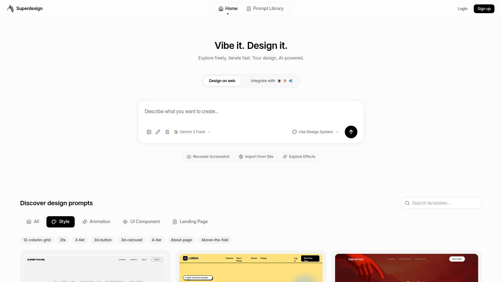
If you want to put this workflow into practice, Superdesign gives you a direct path from prompt-based concept generation to editable UI, responsive iteration, prototyping, and production-ready code export in one browser-based tool. It's a practical option when you need to move a tablet interface from rough idea to buildable system without losing the logic of the design along the way.