These are nine Claude Code design prompts you can copy, paste, and ship today. They are not generic "make it beautiful" lines. Each one is engineered around the three things Claude Code actually gets wrong: it is blind (it writes CSS but cannot see the result), it has no design memory between sessions, and left alone it defaults to safe Tailwind (Inter, a purple gradient, three rounded cards). Fix those and the same model that gave you slop yesterday ships UI you would actually keep.
Use them standalone. The one variable in almost every prompt below is "paste a reference", and getting a good reference is the genuinely hard part, so the last section covers how to get one fast. For the why behind all of this, the pillar on designing good UI with Claude Code goes deep.
Why Claude Code needs special prompts
Because a coding agent is a great front-end engineer and a blind designer, so the prompts that work for logic do not work for looks. Claude writes flawless, accessible, responsive code, then converges on the statistical average of its training data when you leave the aesthetic open. A normal prompt ("build a dashboard") hands it three jobs at once (taste, layout, code) and it returns the safe middle of all three. The prompts below split those jobs apart and feed Claude the two things it lacks: a persistent system and a concrete reference. More on the manual version of this in how to make Claude Code UI look good.
1. The design-system prompt
This writes Claude a memory. Run it once per project so every later prompt inherits the same rules instead of re-guessing your fonts and colors each session.
Audit my repo before designing anything. Read package.json, my tailwind config,
globals.css, and 3 or 4 existing components. Then write a DESIGN.md at the project
root as rules you will follow every time:

- Fonts: display, body, mono. List the generic ones to NEVER use: Inter, Roboto,
Open Sans, Arial, system-ui.
- Color: ONE dominant color plus ONE accent, all as CSS variables. Ban purple or
indigo gradients on white.
- Spacing: an 8px rhythm. Type scale uses weight extremes (200 vs 800) and size
jumps of 3x, not 1.5x.
- Components: the shadcn/ui primitives plus the real components already in my repo,
with import paths, so you reuse instead of hand-rolling.
- Forbidden: three rounded cards in a row, centered-everything heroes, 0.1-opacity
drop shadows on everything.

Do NOT generate UI yet. Write DESIGN.md, show it to me, and wait.
Why it works: Claude has no design memory between sessions, so a committed DESIGN.md becomes the one it is missing, and forcing it to read your real code first stops it inventing a system that fights your repo.
2. The anti-slop constraint block
Paste this before any UI task. It makes Claude commit to one named direction and confirm it back to you, which is the single cheapest way to pull it off the center of the distribution.
Before you write any UI, follow these constraints and confirm them back first:

1. Pick ONE specific aesthetic direction by name (editorial, brutalist, technical,
 warm-minimal, high-contrast mono) and commit. No "modern and clean".
2. No Inter, Roboto, or system fonts. No purple or indigo gradient. No centered
 three-card hero.
3. Hierarchy comes from type and space, not borders and boxes everywhere.
4. Use real, specific content, never Lorem ipsum or "Feature one / Feature two".
5. Read DESIGN.md and obey it.

Tell me the direction and the exact font and color choices you will use, then stop
and wait for my go-ahead.
Why it works: a vague "make it nice" returns the average; naming the direction and adding a confirm gate forces a deliberate choice before a single line gets written.
3. Reference-grounded screen prompts
This is the heavy lifting. Each prompt anchors Claude to a reference and lists the states it loves to skip. Replace the bracket with a pasted screenshot, a prompt-library pattern, or a captured component.
A dashboard, where density and states matter most:
Build an analytics dashboard. Match this reference, do not invent your own layout:
[paste a screenshot, a prompt-library pattern, or a Component Grab capture].

From the reference, copy: the sidebar and topbar structure, card density, table row
height, type pairings, and spacing rhythm. Use my DESIGN.md tokens for color.

Cover every state, not just the happy path: loading (skeletons), empty (no data
yet), error, and one row with very long text. Build the mobile reflow too.

Then screenshot the populated view AND the empty state and show me both.
Why it works: dashboards live or die on information density and state coverage, the exact things a blind model glosses over, so a reference plus an explicit state list closes the gap a generic prompt leaves open.
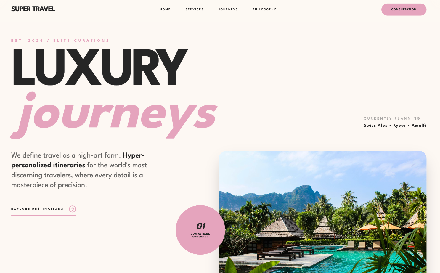
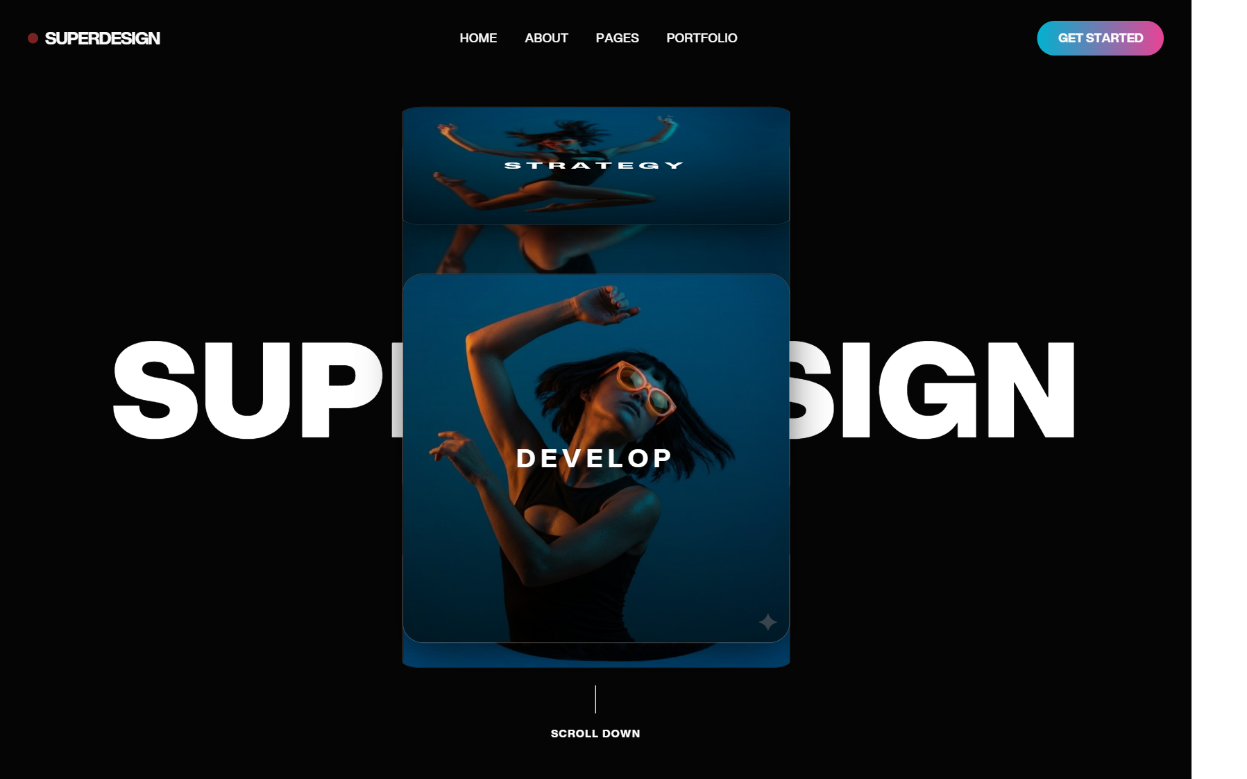
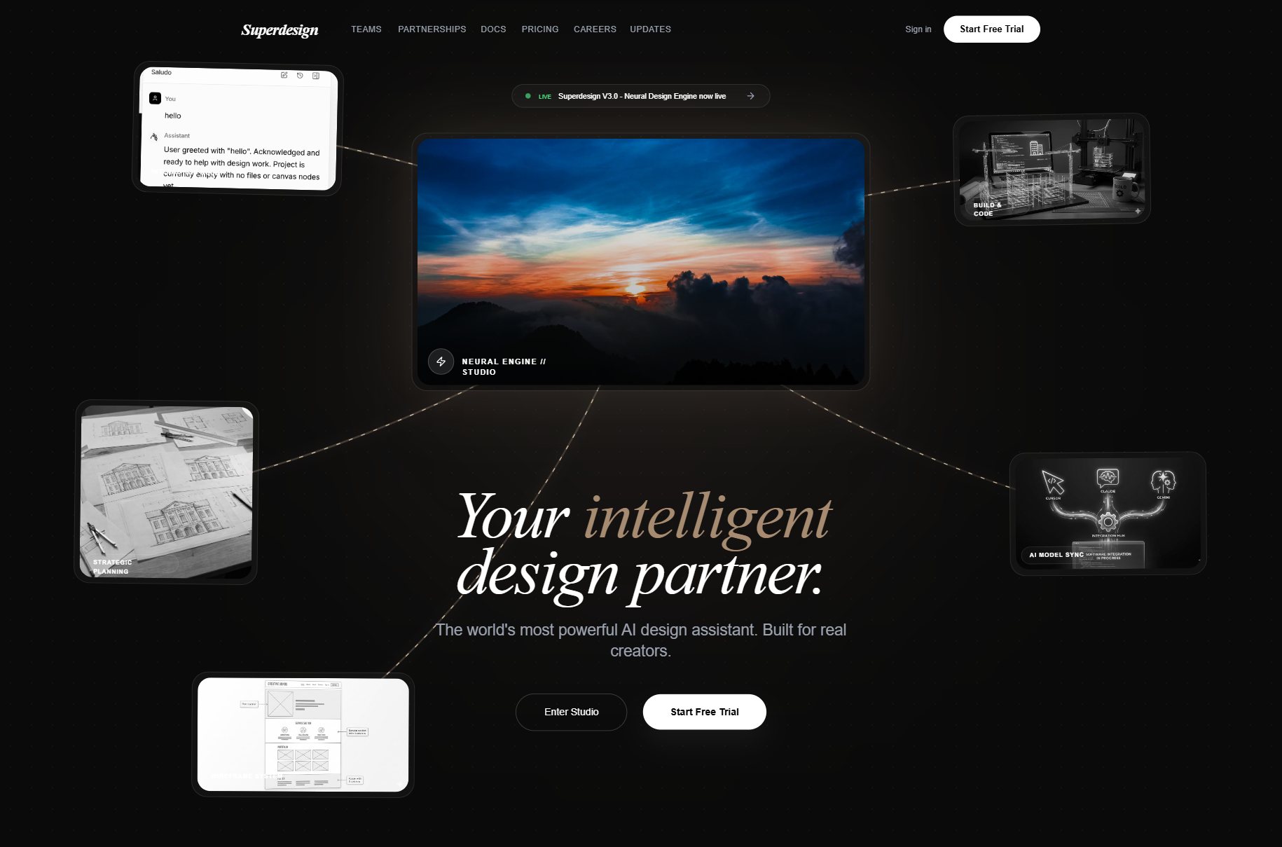
A landing page, where Claude is strongest and copy is the tell:
Build a landing page (hero, features, pricing teaser) for: [product, one sentence].
Anchor the visual language to this reference: [paste reference].

Match its type scale, whitespace, and how it uses a single accent color. Write real,
specific copy for MY product, not placeholder marketing lines. One deliberate
page-load animation, not scattered micro-interactions.

Use DESIGN.md fonts and colors. No purple gradient, no emoji feature cards.
Why it works: the skill already handles expressive pages well, so what is left to nail is a reference for the layout and real copy, which is what separates a specific page from a generic one.
A pricing section, where alignment and emphasis break:
Design a 3-tier pricing section. Reference: [paste a pricing page you admire].

Requirements: a clear "most popular" tier emphasized by scale and one accent (not a
loud colored box), a feature table with precisely aligned rows, a monthly/annual
toggle, and readable price typography (big number, small cadence).

Match the reference's spacing and restraint. Use DESIGN.md. Show desktop and mobile.
Why it works: "make a pricing page" returns the three-card default, so naming the failure points (alignment, emphasis without a loud box) plus a reference gets you a table that holds up.
A settings screen, which is pure state coverage and consistency:
Build a settings screen (account, billing, notifications, danger zone). Reference
for layout: [paste reference].

Design the unglamorous parts on purpose: form validation states, a saving/saved
indicator, disabled states, a destructive-action confirm, and how each section
looks with very long values. Group with section headers plus a left nav, match
DESIGN.md, and reuse my existing form components instead of new inputs.

Screenshot the billing section and the validation-error state.
Why it works: settings has almost no hero and almost all states, so the prompt makes Claude design the states and reuse your real components rather than ship one happy-path view with fresh one-off inputs.
4. The screenshot-compare-refine loop
This is the highest-leverage habit and it costs nothing. Claude cannot judge its own output, so you feed it the actual render and demand a concrete diff.
Here is a screenshot of what you just built: [attach image]. Compare it against the
reference: [attach reference].

Give me a specific diff, not a vibe check: list every place the spacing, hierarchy,
type size, or alignment differs from the reference. Fix only those, re-run, take a
new screenshot, and show me before and after side by side.

Do not tell me it "looks good". Show me the rendered result.
Why it works: Claude writes correct CSS but cannot see it, so pasting the real render and forcing a line-by-line diff is the only reliable bridge from technically correct to actually good.
5. The component-extraction prompts
Two related prompts that stop drift. The first makes Claude reuse what you have; the second turns a reference image into durable rules instead of one-time styling.
Before building this screen, inventory my existing components. List every reusable
UI primitive in my repo (buttons, inputs, cards, modals, tables) with import paths
and key props.

Then build the new screen using ONLY those where they exist, and flag anything
genuinely new. Do not hand-roll a second button style.
Why it works: without it, Claude reinvents a button every session and 50 screens drift apart, so making it inventory first keeps the whole app on one system.
Here is a screenshot of a UI whose style I want: [attach]. Do NOT copy it pixel for
pixel. Extract its design language into reusable rules: type scale and pairings,
spacing rhythm, color logic (dominant plus accent), border radius, shadow style,
and density.

Append those as a "Reference: [name]" section in DESIGN.md, then build [screen] in
that language using my own content.
Why it works: a picture beats prose, but Claude has to be told to convert the picture into rules in DESIGN.md, or the taste evaporates the moment you move to the next screen.
Where to get a real reference
Every prompt above has one variable that decides the outcome: the reference you paste in. Describing a vibe from memory puts you right back at the average. There are three fast ways to get a real one, all free to start.
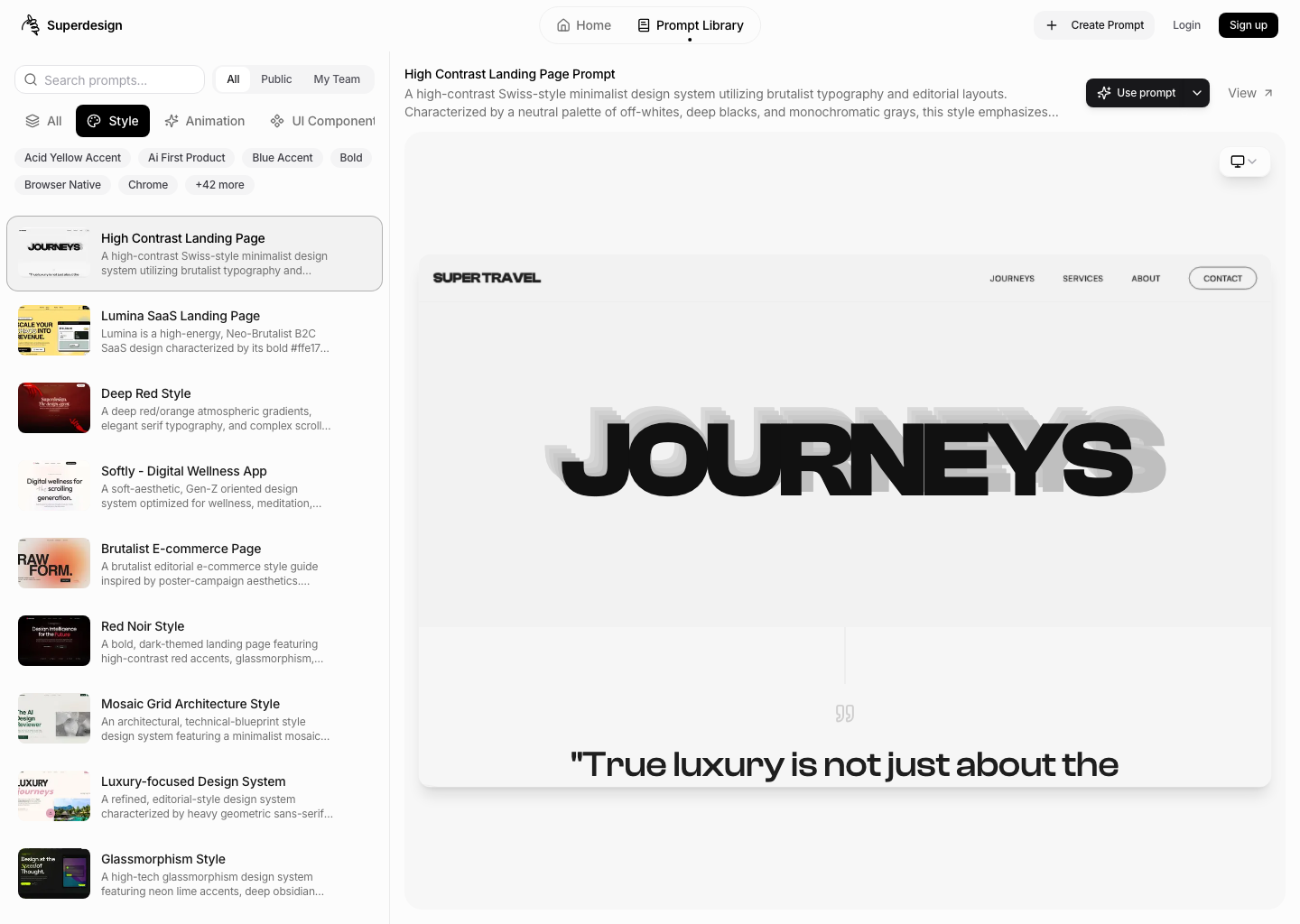
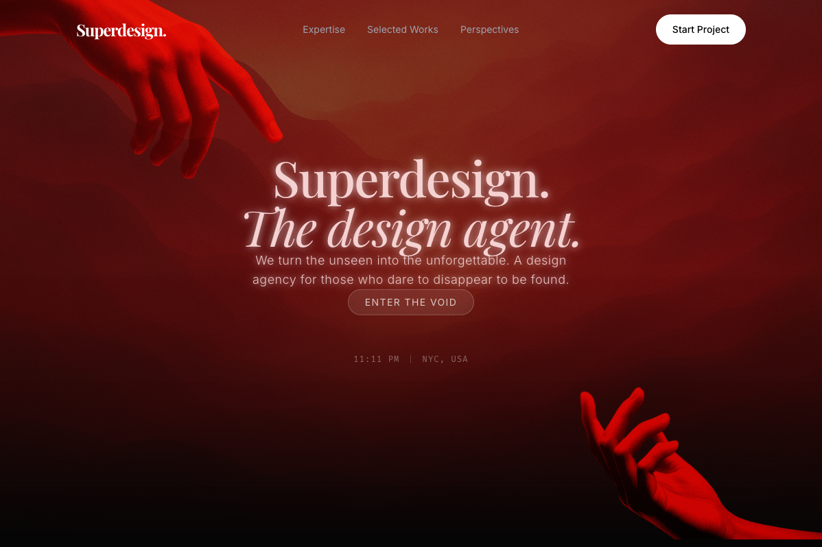
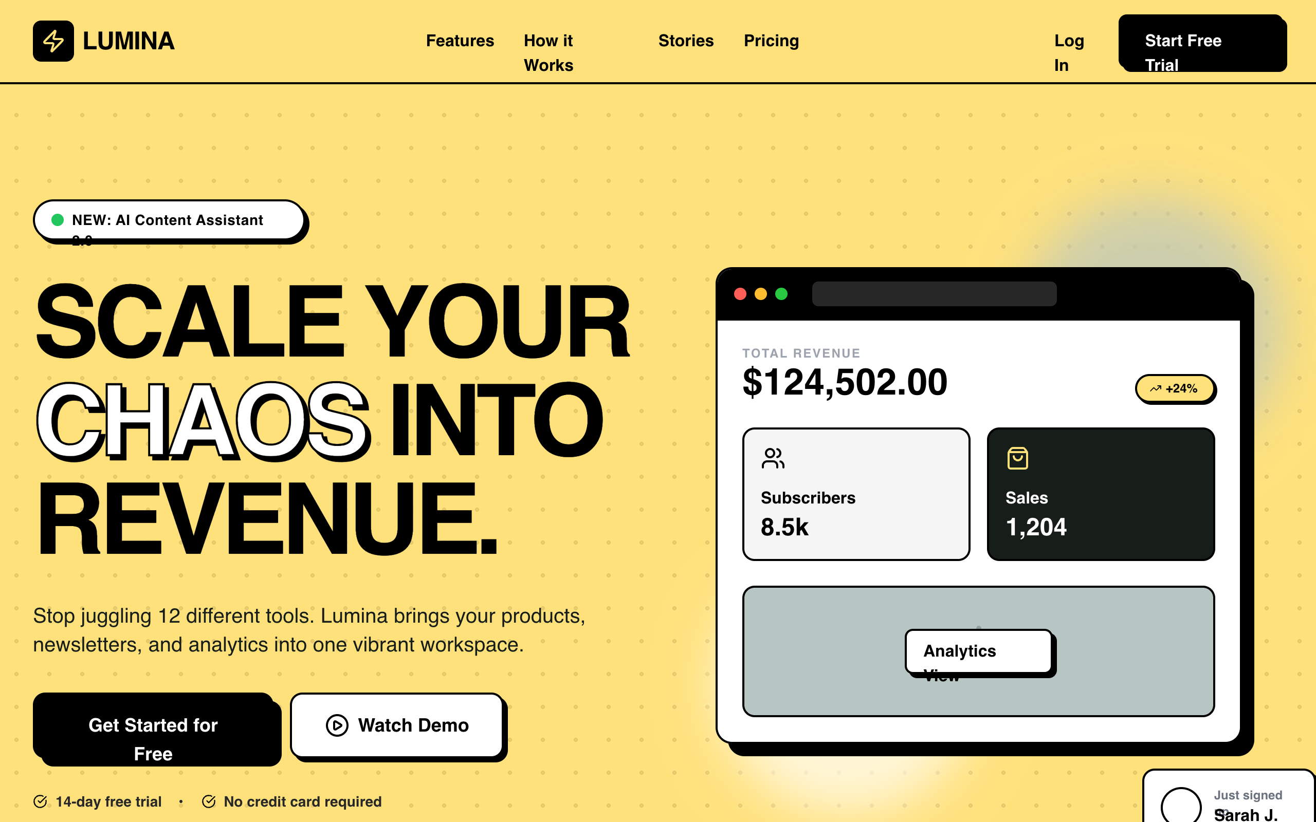
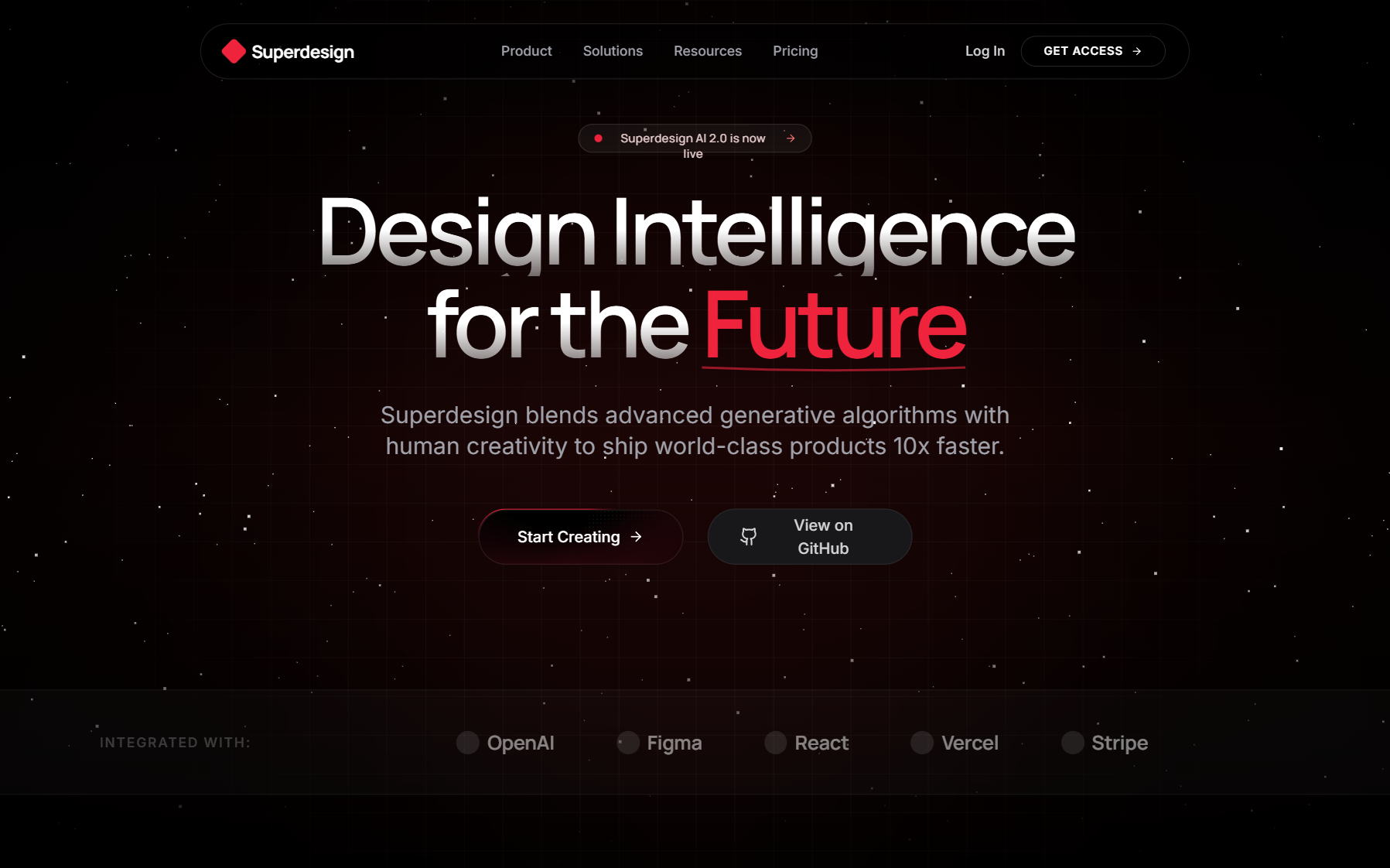
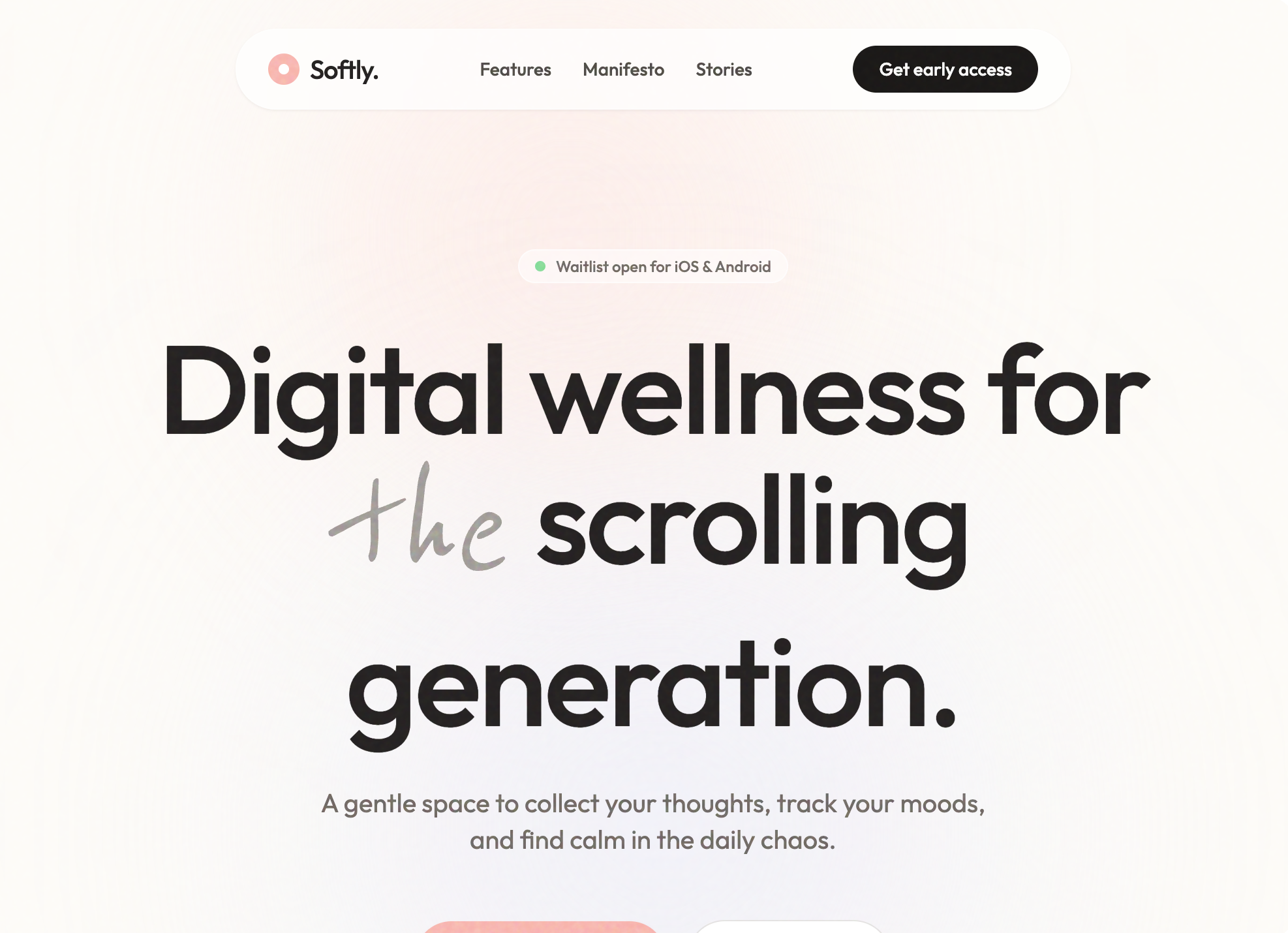
First, pull a proven pattern from the free Superdesign prompt library, a large set of styles, components, and full-page prompts with taste already baked in. Second, capture a live site you admire with the free Component Grab and feed Claude the clean Tailwind it returns. Third, generate and explore polished directions on a canvas, then hand the chosen one back as React and Tailwind.
That last path is the design layer Claude Code does not have on its own. Superdesign runs as a one-line skill inside Claude Code (or Cursor), explores several directions at once on a canvas, and writes the design-system file these prompts depend on:
npm install -g @superdesign/cli@latest
superdesign login
npx skills add superdesigndev/superdesign-skill
Trigger it with /superdesign and a plain-English request. It reads your repo first, opens a canvas to compare variations, and hands the winner back as code, so the reference and the design system in these prompts come from proven patterns instead of a text box. Free tier, then a flat $20/month with no credit meter. Stuck on a screen? Ping us and we will dial it in together.
For the deeper how-to, read the Claude Code UI design pillar, and if you want to round out your setup, see the best Claude Code skills.