The best UI design prompts are specific, not pretty-sounding. A prompt like "make a clean modern dashboard" returns the average of the internet, a purple gradient on a centered hero, because the model has nothing to anchor on. A prompt that names a reference, one accent color, an 8px grid, the exact regions, and every state (hover, loading, empty, error) returns something that actually looks designed. Below are 11 copy-paste UI design prompts, grouped by what people really build, written as constraint stacks you can paste into any AI design agent or coding agent and edit.
Steal them as-is, or swap the brackets for your product. Every one is standalone-useful even if you never touch Superdesign. At the end, there is a free library with 800+ more, sorted by style and component.
What makes a UI design prompt good?
Specificity beats adjectives. "Premium" and "clean" are vibes the model cannot measure, so it defaults to the safest look it knows. Constraints are decisions the model can execute: a named reference, one accent used sparingly, a spacing grid, real type, and the boring states most prompts forget. That is the whole lesson behind why AI design looks generic: the slop is what one vague prompt does when you ask it to pick taste, structure, and styling all at once.
So a good prompt does five things, every time:
- Names a reference and bans the defaults (no purple-to-indigo gradient, no Inter).
- Sets one accent color and a neutral base.
- Fixes spacing to an 8px grid.
- Describes the regions, not a feeling.
- Lists the states (hover, focus, disabled, loading, empty, error).
Here is the reusable skeleton. Fill the brackets and you have a strong prompt for anything.
Design a [SCREEN] for [PRODUCT / AUDIENCE].
Reference: feel like [Linear / Stripe / Notion], not a generic SaaS template.
Layout: [describe the regions, top to bottom].
Type: one sans with personality, not Inter or Roboto. Big confident headings, generous body line-height.
Color: neutral base, one accent used sparingly. No purple-to-indigo gradient, no glassmorphism.
Spacing: 8px grid, consistent padding, align numbers to a baseline.
States: include hover, focus, disabled, loading, empty, and error.
Output: responsive, real React and Tailwind.
Dashboard and analytics prompts
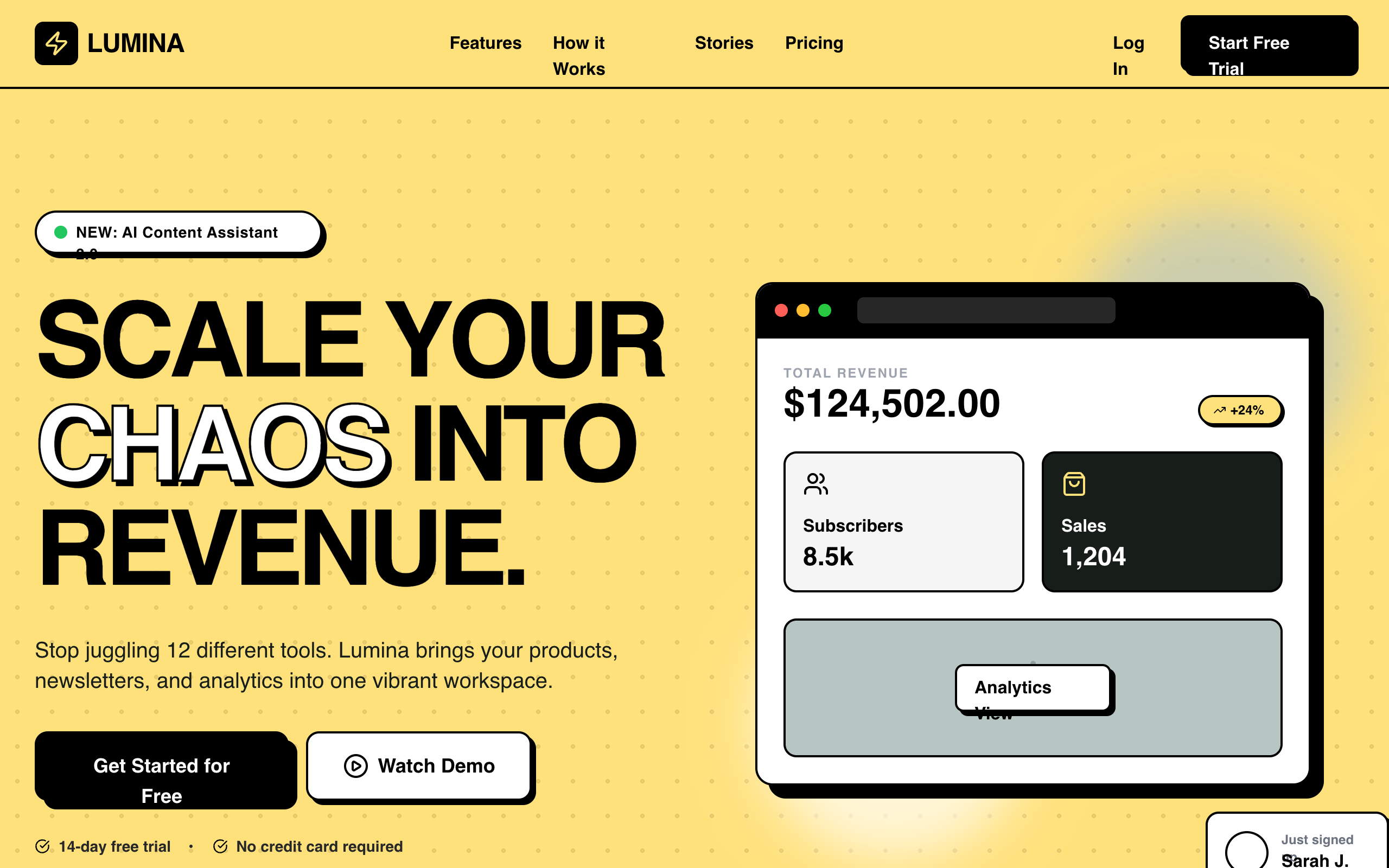
A dashboard fails on consistency and missing states, not on the hero. Name a calm reference, force tabular numerals so metrics line up, and demand the loading and empty states up front so they are not bolted on later.
Design an analytics dashboard for a B2B SaaS admin.
Reference: Linear's calm density, not a colorful template.
Layout: left sidebar nav, top bar with a workspace switcher and search, then a grid of 4 KPI cards above one primary line chart and a recent-activity table.
Type: one grotesque sans, tabular numerals for every metric.
Color: dark neutral base (#0E0E11), one cool accent for the active state and the chart line, green and red only for deltas. No purple gradient.
Spacing: 8px grid, 24px card padding, numbers aligned to a baseline.
States: loading skeletons for cards, an empty state for no data, row hover on the table.
Output: responsive React and Tailwind.
Data table prompts
Dense tables are where AI quietly cuts corners. Spell out the columns, the sort and selection behavior, hairline borders instead of heavy ones, and pill badges for status, or you get a marketing table pretending to be an admin tool.
Design a dense data table for managing users.
Reference: a real admin tool like the Stripe dashboard, not a marketing table.
Columns: avatar plus name, email, role, status, last active, and a row actions menu.
Behaviors: sortable headers, a sticky header, row hover, a checkbox column with a bulk-action bar that appears on selection, and pagination at the bottom.
Type: tabular numerals, 13px to 14px body.
Color: neutral rows with subtle zebra striping, status as small pill badges, one accent for selected rows. Hairline borders, no heavy lines.
States: empty, loading rows, and one error row.
Output: React and Tailwind, keyboard focus rings on every interactive cell.
Landing page prompts
Landing pages are the one thing AI does well, which is exactly why they all look the same. Break the pattern: left-aligned hero, a real product panel instead of an illustration, and benefit-first feature copy instead of icon-and-noun cards.
Design a SaaS landing page hero plus the first two sections for [product], which does [one outcome].
Reference: the confident restraint of Stripe or Linear, not a centered three-card template.
Hero: a left-aligned headline that states the outcome in one real sentence, one subhead, one primary CTA, and a real-looking product panel on the right (not an illustration).
Below: a logo strip, then a 3-up feature row written benefit-first, not icon-and-noun.
Type: a characterful sans or serif for headings, not Inter.
Color: light or dark neutral, one brand accent. No purple gradient, no glassmorphism.
Spacing: 8px grid, generous section padding.
Output: responsive React and Tailwind.
Pricing page prompts
Pricing pages get ruined by one move: the giant lifted purple "most popular" card. Mark the recommended tier with a quiet border and label instead, demand tabular numerals, and ask for the comparison table people actually scroll to.
Design a pricing page with 3 tiers for a self-serve SaaS.
Layout: a monthly / annual toggle, 3 cards (Starter, Pro, Team), Pro marked recommended with a quiet badge, and a per-feature comparison table below.
Make the recommended tier stand out with a border and a label, not a giant lifted purple card.
Each card: price, a one-line "who it is for", 4 to 6 features, one CTA.
Type: tabular numerals for prices, clear hierarchy.
Color: neutral base, one accent on the recommended tier and the CTAs only.
States: prices update when the annual toggle is on, hover on each CTA.
Output: responsive React and Tailwind, cards stack on mobile.
Login and auth prompts
Auth screens reveal taste fast. Ban the gradient blob, use a real brand panel or product screenshot, keep inputs at 16px so mobile does not zoom, and list the error and loading states because that is half the work.
Design a login screen for a developer tool.
Layout: a centered card on the left half, a muted brand panel on the right (a real texture or a product screenshot, not a gradient blob).
Card: email and password fields with top-aligned labels, a primary sign-in button, SSO buttons (Google, GitHub), a forgot-password link, and a sign-up link at the bottom.
Type: clear field labels, 16px inputs so mobile does not zoom.
Color: neutral, one accent on the primary button and the focus ring. No purple gradient.
States: default, focused field, an inline error under a field, button loading, and disabled.
Output: responsive React and Tailwind, single column on mobile.
Settings page prompts
Settings is a consistency test: many small forms that must agree. Ask for a sub-nav, grouped sections with helper text, a save bar that only appears on change, and a red danger zone with a confirm step.
Design an account settings page.
Layout: a left vertical sub-nav (Profile, Team, Billing, Notifications, Danger zone) and a content panel on the right.
Profile panel: avatar upload, name, email, and a save bar pinned to the bottom that only appears when something changed.
Patterns: grouped sections each with a title and helper text, toggles for notifications, and a destructive red Danger zone gated by a confirm dialog.
Type: readable 14px to 16px, clear section labels.
Color: neutral, one accent for primary actions, red only for destructive ones.
States: the unsaved-changes bar, toggle on and off, save loading, and a success toast.
Output: responsive React and Tailwind.
Mobile app screen prompts
Mobile prompts need a width and thumb ergonomics, or the model designs a shrunk desktop. Pin it to 390px, demand 44px tap targets, and put the primary action where a thumb reaches.
Design a mobile home screen for a habit-tracking app, 390px wide (iPhone).
Layout: a top greeting with the date, a primary progress ring or summary card, a scrollable list of today's items each with a checkbox and a streak count, and a bottom tab bar with 4 tabs plus a center add button.
Touch: 44px minimum tap targets, the primary action within thumb reach.
Type: large readable headings, 16px body.
Color: one accent for progress and the active tab, neutral surfaces. No gradient hero.
States: an item checked off, an empty day, and a pull-to-refresh hint.
Output: React and Tailwind, mobile-first, with safe-area padding.
Dark mode prompts
A real dark theme is not an inversion. Ask for a layered neutral scale, lowered accent saturation, borders instead of heavy shadows, and shared tokens so light and dark stay in sync.
Take this UI and design a proper dark theme, not an inverted one.
Rules: use a layered dark neutral scale (base #0B0B0F, raised surfaces #16161B, hairline borders), never pure black text on pure white or the reverse.
Lower accent saturation slightly for dark, keep AA contrast on all text and icons.
Shadows become subtle borders or glows, not heavy drop shadows.
Keep one accent, used for the same things it meant in light mode.
Deliver both themes sharing the same tokens (CSS variables), with a visible toggle.
Output: React and Tailwind with a tokenized theme.
Empty state and error prompts
Empty and error states are the states everyone skips and users hit first. Ask for all three at once, calm and helpful, each with one clear action.
Design 3 empty states for a project management app: no projects yet, no search results, and an error loading.
Each: a small piece of meaning (a simple line icon, not a giant graphic), a one-line plain explanation, and one primary action (or a retry on the error).
Keep them calm and helpful, not cute or apologetic.
Match the app shell type and color, one accent on the action.
Output: 3 React components with Tailwind, centered in the content area.
Onboarding and multi-step form prompts
Multi-step flows need a clear progress signal and one decision per step. Spell out the steps, inline validation on blur, and one primary action per screen.
Design a 3-step onboarding flow: account, workspace, invite team.
Layout: a slim progress indicator at the top ("Step 1 of 3"), one focused question set per step, a Back and Continue pair, and a skip link where allowed.
Form rules: top-aligned labels, helper text under inputs, inline validation on blur, 16px inputs, one primary action per step.
Color: neutral, one accent on Continue and the active step.
States: a validation error, Continue disabled until valid, and a loading state on the final submit.
Output: responsive React and Tailwind, single column on mobile.
Modal and dialog prompts
Dialogs are tiny but easy to get wrong: missing focus trap, no escape, vague titles. Ask for both a confirm dialog and a form modal with accessibility baked in.
Design a confirmation dialog and a form modal for a web app.
Confirm dialog: a title that states the consequence, one line of body, a cancel and a primary (or destructive red) action, focus trapped, Escape to close, and a dimmed backdrop.
Form modal: a header with title and close, a scrollable body with a short form, and a sticky footer with cancel and save.
Sizing: max-width around 480px for confirm and 560px for the form, centered, padding that never crowds the edges.
Color: neutral surface, one accent, red only for destructive actions.
States: open, save loading, and an inline error.
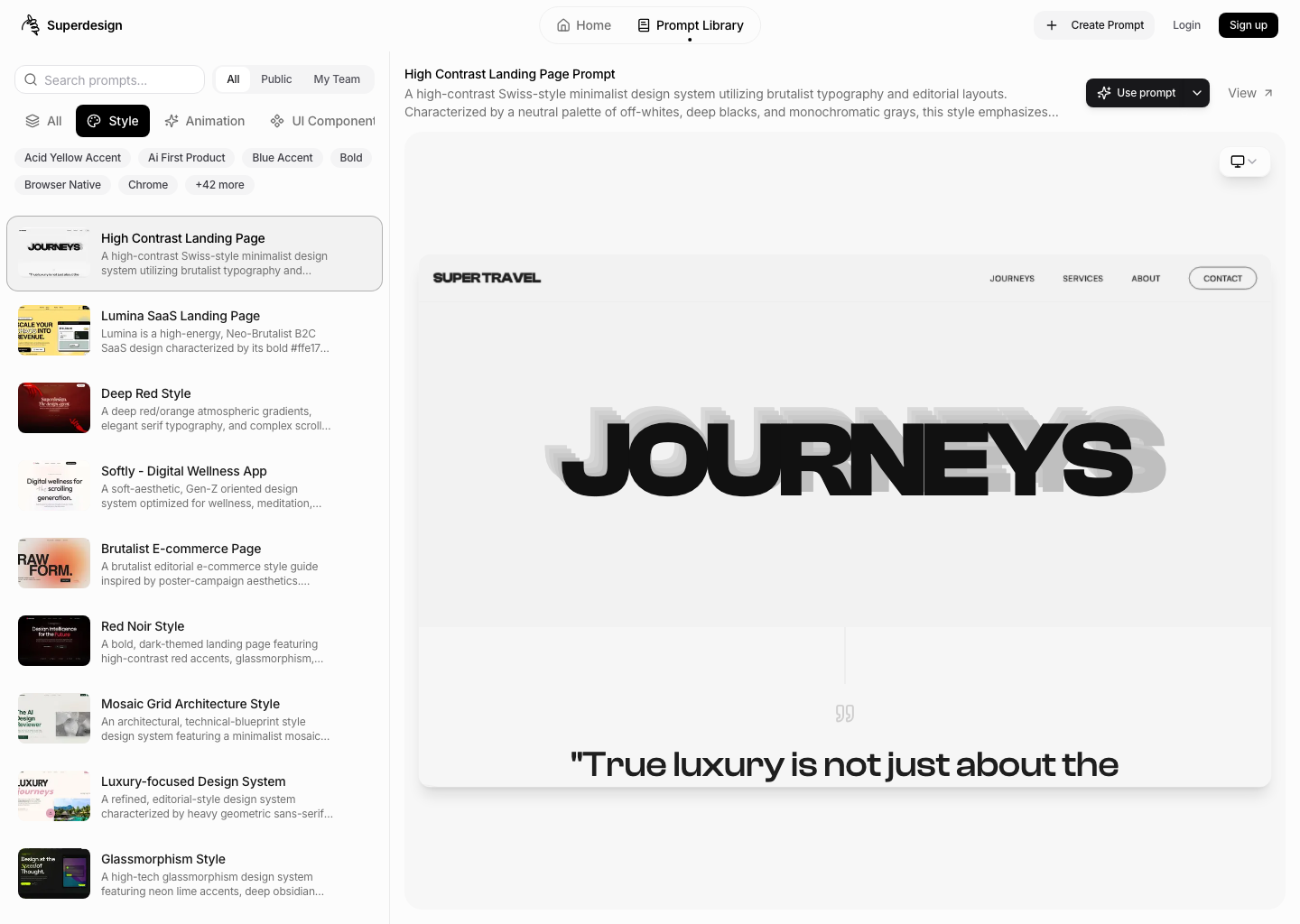
Output: accessible React and Tailwind with proper aria roles.Browse 800+ more UI design prompts
If you would rather start from a proven reference than write the constraint stack yourself, the free Superdesign prompt library has 800+ curated prompts you can filter by style and component. Preview each one, copy it, and paste it into your agent.
The same constraint thinking works whether you prompt on the web canvas or drive it from your coding agent. If you live in Claude Code, the patterns in how to design good UI with Claude Code pair with these prompts directly: feed a reference, generate, then iterate state by state.
Pick the prompt closest to what you are building, paste it, then iterate one state at a time. That is the whole trick. Specific in, designed out.