An AI app UI generator turns a plain-English prompt into mobile app screens, a home feed, a wallet, a settings page, in minutes instead of days. The catch is that most of them hand you a hosted mockup or a whole generated app you cannot drop into your own project. If you are a developer or designer building a real iOS or Android app, the useful endpoint is a screen that respects Apple's Human Interface Guidelines AND ships as real React and Tailwind you own. This guide covers what a good mobile app UI actually needs, the prompt patterns that produce it, and how to keep the code.
Build a mobile screen in the right order
The tool loop is the same for any UI: prompt, compare a few directions, take the code. (Here is how that loop works.) What is different about a phone is the order you make decisions in, and the one rule that matters at each step:
Build a mobile screen in the right order
Start with the navigation model
Decide tab bar (for 3 to 5 top destinations) versus a push-and-stack flow before you touch a pixel; it dictates every screen. Skip the hamburger that buries your whole app behind one icon.
Lay out for the thumb
Put the primary action in the bottom third where a thumb actually reaches, size every tap target to at least 44 points, and hang the layout on an 8 point grid.
Fit the hardware
Pad the safe areas around the Dynamic Island and the home indicator, and design the light and dark variants together, not as an afterthought.
Draw the unhappy states
Sketch the loading, empty, and error state for each screen. A screen that only has its happy path is half-built, and it is the half users notice.
What a good mobile app UI needs
A mobile app UI works when it feels native, not when it looks busy. The fastest way to see the gap is to put a generic AI screen next to one built to the platform rules: same data, completely different feel.
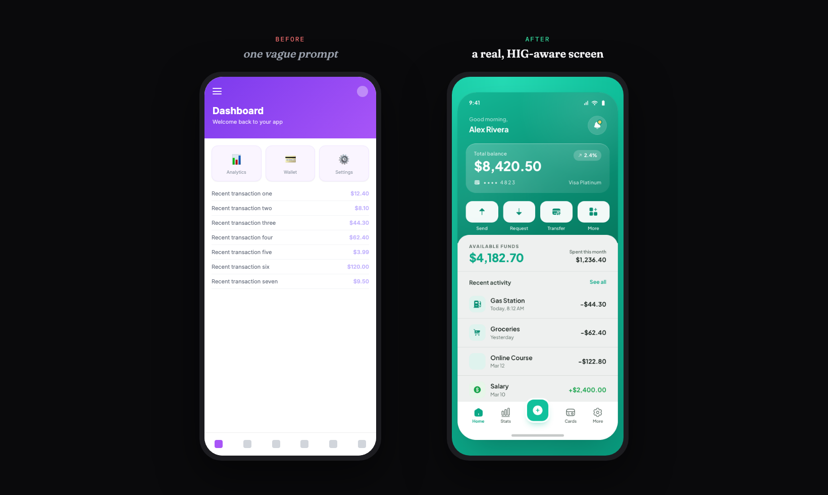
The rules that produce the screen on the right are not subjective. Apple's own design tips spell out the baseline: hit targets at least 44 by 44 points, text at least 11 points, ample contrast, and a layout that fits the screen without horizontal scrolling (Apple Developer). Mobile UI also leans comfortable rather than dense, the opposite instinct from a packed web dashboard (Apple HIG guide). Use this as the checklist to grade whatever the generator gives you back.
Your mobile app UI checklist
- ✓Touch targets at least 44 by 44 points (48 dp on Android)
- ✓All spacing on an 8 point grid, with generous whitespace
- ✓One accent color, used only on the primary action
- ✓A tab bar for 3 to 5 top-level sections, not a hamburger menu
- ✓A navigation stack for hierarchical drill-down, with working back-swipe
- ✓Safe areas respected around the Dynamic Island and home indicator
- ✓Dynamic Type support, tested at the smallest and largest sizes
- ✓Both light and dark mode designed, not just one
- ✓The empty, loading, and error states, not only the happy path
Verbatim from Apple Developer design tips
Native navigation beats a hamburger menu
The single biggest tell of a non-native app is its navigation. Copying the Android-era hamburger menu onto iOS hides your primary destinations behind a tap and reads as a web app in a wrapper (Apple HIG checklist). The native patterns are specific, and a good prompt should name the right one.
| Pattern | Use it for | Watch out for |
|---|---|---|
| Tab bar | 3 to 5 equivalent top-level sections | More than 5 tabs; put the overflow inside a tab |
| Navigation stack | Hierarchical drill-down (list to detail) | Custom back buttons that break system back-swipe |
| Modal sheet | A self-contained task the user finishes or cancels | Sheets with no clear way to dismiss |
Tab bars stay at the bottom where a thumb can reach them, which is also where you should place the actions people use most (CatDoes). Navigation bars at the top carry context and the back affordance. Sheets handle a focused task without leaving the screen. Name the pattern in your prompt and you skip a whole class of "this does not feel like an iPhone app" rework.
Prompt patterns that produce real app UI
The quality of the output tracks the quality of the prompt: a one-liner gives you the generic screen on the left above, while a prompt that names the platform, the navigation, the components, and the states gives you something native. Here is a copyable starting prompt that bakes the HIG checklist into the request.
Design an iOS [screen, e.g. "home screen for a budgeting app"].

Platform: iOS, iPhone, portrait. Follow Apple's Human Interface Guidelines.
Audience: [who uses it].
Primary action: [the one thing this screen is for].

Layout:
- Respect the safe area (status bar at top, home indicator at bottom).
- Bottom tab bar with [3 to 5] sections: [name them]. No hamburger menu.
- A clear header with the screen title and one primary action.
- The main content as [a card list / a feed / a grid], with real sample data, not lorem.

Rules:
- Every tappable control is at least 44x44 points.
- All spacing on an 8pt grid, comfortable whitespace, not dense.
- One accent color used only on the primary action; neutral grays elsewhere.
- Design the empty state and a loading state too.
- Mobile type scale with a clear hierarchy; support Dynamic Type.

Style: clean, native iOS, lots of whitespace. Avoid the default indigo-to-violet gradient and a row of emoji cards.
For a deeper library of prompts by screen and style, raid the free prompt library and adapt a mobile pattern to your app. It works with any coding agent and saves you guessing at the wording.
Iterate, do not settle for the first draft
The first generation is a draft, not the answer, so the real win is exploring directions fast and refining the one that fits. Most tools make you re-roll one screen at a time. Superdesign forks several directions in parallel on an infinite canvas, so you can compare a few navigation treatments or color systems side by side and carry the best one forward, instead of committing too early. Then you keep prompting in plain English to tighten it.
Take the current home screen and give me 3 variations:
1. A version with a large title that collapses into the nav bar on scroll.
2. A version that moves the primary action into a center tab-bar button.
3. A version with a quieter, monochrome palette and one accent.
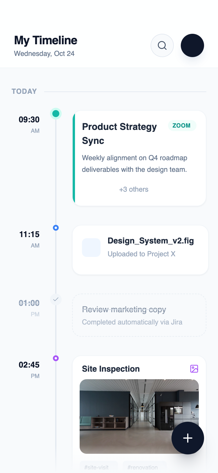
Keep the same spacing grid and type scale. Show each at iPhone width with a dark-mode variant.Here is a real mobile screen generated this way, straight from the Superdesign prompt library. Note the three-column timeline, the clear time labels, and the floating action button placed within thumb reach.
Get real React you own, not a hosted mockup
Here is the difference that matters once you actually want to ship: most app UI generators stop at an editable mockup or a whole generated app locked to their stack, while a code-output design agent hands you real React and Tailwind you drop into your repo. A mockup is a step you still have to implement, and a full-app builder is a dead end the moment you need the screen to live inside your existing app.
| Tool type | What you get | Best for |
|---|---|---|
| Mockup generators (Uizard, Figma AI) | Editable design mockups, limited or no code | Quick visualization, stakeholder review |
| Full-app builders (Rork, Lovable) | A whole generated app, often locked to their stack | Non-developers shipping a standalone MVP |
| Code-output design agents (Superdesign, v0) | Real React and Tailwind you own | Developers adding a screen to an existing app |
This split is not hypothetical. One hands-on review of the AI app builder RapidNative found its iOS output "sometimes feels slightly off," with button spacing, font rendering, and navigation animations subtly wrong, so the reviewer "needed to manually fix iOS layout issues that did not exist on Android" (Marc Andrews). When the tool owns the output, you inherit its blind spots. When you own the code, you fix them once.
Superdesign sits in the third row. It is an AI design agent that outputs production React and Tailwind, runs in the browser or as a skill inside Claude Code and Cursor, and when you point it at an existing project it reads your current UI first so a new screen speaks your tokens, spacing, and components instead of arriving as a stranger. You generate the screen, compare variations on the canvas, then have your coding agent fetch the design and implement it. No handoff, no re-skinning, no platform lock-in.
For the wider landscape of how the AI generators compare on output quality, pricing, and codebase fit, see the pillar guide on the best AI UI generator. It maps where each tool fits; this page is about the mobile-specific moves that get you a native-feeling screen.
Common app UI mistakes
The most expensive errors are about platform fit, not pixels. The recurring ones: a hamburger menu hiding primary navigation, touch targets under 44 points that cause mis-taps, a dense web-style layout instead of comfortable mobile spacing, custom back buttons that break the system back-swipe, and shipping only the happy path with fake data while the empty and error states go undesigned. Targets smaller than the 44 point minimum have measurably higher error rates (CatDoes), so this is usability, not taste.
AI will not save you from the wrong pattern. If you ask for "a modern app screen" you get the statistical average of every screen the model has seen. Name the platform, the navigation, and the states, then let the tool handle the layout.
Ship your app UI
You can have a real, native-feeling app screen in under 5 minutes: start with a prompt that names the platform and the navigation pattern, grade the result against the HIG checklist above, fork a couple of directions on a canvas, then export real React and Tailwind into your repo. The whole point is to skip the hosted-mockup trap and end with a screen you own and can keep optimizing.
Start in the browser with the AI UI generator, or if you live in Claude Code or Cursor, add the Superdesign skill and drive it from your agent. For the full tool landscape, the best AI UI generator pillar lays out where each option fits. Ping me anytime if you want a second set of eyes on a screen, and we'll sort it together. 🙂