An agency website generator turns a prompt into a full studio site, a brand hero, selected case studies, services, an about section, and a contact CTA, in minutes instead of a sprint. The catch is sharper for an agency than for anyone else: your site IS the portfolio of your craft, so a generic AI template quietly tells prospects you cannot do better. If you run a design or dev studio, the useful endpoint is a site that proves taste AND ships as real React and Tailwind you own, not a locked Webflow or Framer template every other agency already uses. This guide covers what an agency site actually needs, the prompt patterns that produce it, the template trap to dodge, and how to walk away with the code.
Build an agency site in the right order
The tool loop is the same for any site: prompt, compare a few directions, take the code. (Here is how that loop works.) What wins the client is the order you build it in, and the one rule that matters at each step:
Build an agency site in the right order
Lead with outcomes, not a logo wall
Selected work paired with the result it drove is the entire pitch. A wall of client logos proves you showed up, not that you are good.
Commit to one brand move
The site is your proof of craft, so do the one distinctive thing a template would never hand a competitor. Sameness reads as "we cannot do better."
Show how you work
Services plus a visible process answers the buyer's real question, which is what it is actually like to hire you, not just what you make.
Make contact effortless
A team with a voice and a CTA findable from any section. A prospect should never have to scroll back to the top to reach you.
What an agency website needs
An agency site works when a visitor understands what you are great at within a few seconds, then trusts it because the work and the craft of the site itself back it up. The fastest way to see the bar is to put a generic AI template next to a site with an actual point of view: same brief, completely different signal.
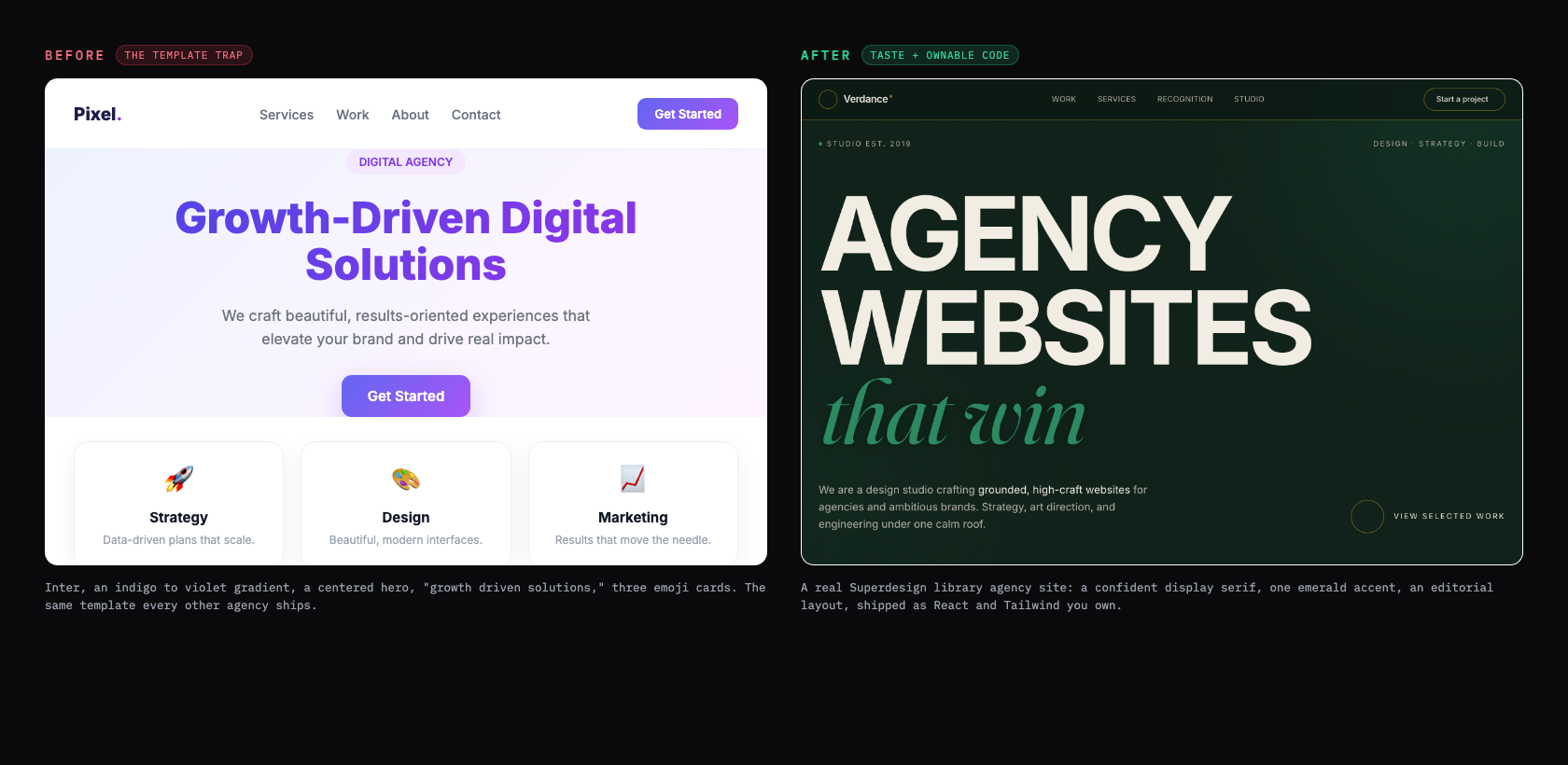
What separates the two is positioning and craft, not the gradient. The strongest agency homepages lead with who you help and how, in plain words, instead of creative fluff: "brand strategy and design for ambitious startups" beats "we create beautiful brands" (Studio Mesa). And you have less time than you think. Nielsen Norman Group found that 79 percent of test users scan a new page rather than read it, and most visits are short, so your value has to land fast and your layout has to be scannable (Nielsen Norman Group). Use this as the checklist to grade whatever the generator gives you back.
Your agency website checklist
- ✓A distinctive brand hero that states your positioning in plain words, not 'growth-driven solutions'
- ✓Three to five selected case studies, each with the problem, your work, and a measurable outcome
- ✓A services section that is specific to what you actually sell, not a generic three-icon row
- ✓A team or about section with a real point of view, not stock photos and adjectives
- ✓A contact CTA that is easy to find from any section, placed after the work, not only in the footer
- ✓Tasteful motion: scroll reveals and hover states with intent, not parallax on everything
- ✓A fast load (aim under two seconds) and a mobile-first layout
- ✓One type and color system that is unmistakably yours, used with restraint
Verbatim from Studio Mesa; Nielsen Norman Group
Case studies beat a pretty grid
The part of an agency site that actually closes work is the case study, not the hero. A grid of pretty thumbnails proves you can make things look nice; a case study proves you can solve a business problem. The structure that converts is a short arc per project: the client challenge in business terms, your process and the decisions you made, then the quantified result (Studio Mesa). Feature three to five of these on the homepage rather than dumping everything you have ever touched.
| Approach | What it signals | Verdict |
|---|---|---|
| A wall of 20+ project thumbnails | "We make things look nice" | Prospects skim and leave |
| 3 to 5 case studies with outcomes | "We solve business problems" | The sweet spot |
| One huge hero animation, no proof | "Great taste, unproven results" | Looks good, does not close |
Tell the generator to build a case-study layout, not just a thumbnail grid, and write the outcomes in real numbers. That is the difference between a site that wins the brief and one that just looks current.
Avoid the every-agency template trap
The single biggest risk for an agency site is looking like every other agency site. When you start from the same Framer or Webflow template marketplace everyone else browses, you draw from the same pool of references and converge on the same look. One studio put it bluntly: "many agency websites look remarkably similar because they draw from the same pool of design references, the result is a kind of aesthetic consensus" (TYPZA). The tells are specific and recognizable: purple gradients, an Inter headline, and a "growth-driven solutions" tagline that says nothing (Aella Creative).
AI generators make this worse by default, because the safest answer to a vague prompt is the statistical center of the training data. As one teardown put it, "Inter font, number 3B82F6 primary, three cards in a row, Cursor, Lovable, Bolt, and Framer AI all ship the same one" (Sailop). For most businesses that sameness is survivable. For an agency it is fatal, because the only thing left to compete on is price: "when your website looks like every other agency, the only thing separating you from the competition is price, and competing on price is a race to zero" (Mohd Saif).
The agency-template starter pack
- ✕An indigo-to-violet gradient hero on a centered layout
- ✕Inter everywhere, with no real type personality
- ✕A 'growth-driven solutions' or 'we craft beautiful experiences' tagline
- ✕Three rounded service cards with a rocket, a paintbrush, and a chart emoji
- ✕A stock-photo team grid and a wall of client logos with no story
- ✕The exact Framer or Webflow template three competitors in your city also bought
Verbatim from Aella Creative; Sailop
Prompt patterns that produce it
The quality of the output tracks the quality of the prompt: a one-liner gives you the generic template above, while a prompt that names your positioning, the work, the services, and the tone gives you something with a point of view. Here is a copyable starting prompt that bakes the checklist into the request.
Design a website for [studio name], a [type, e.g. "brand and product design studio"].

Positioning: [the one thing you want to be known for, e.g. "brand systems for ambitious fintech startups"].
Audience: [who you want to hire you].
Tone: [confident and editorial / warm and playful / minimal and technical]. Not generic "digital agency."

Sections, in order:
1. Hero: a headline that states your positioning (not "growth-driven solutions"), a one-line subhead, and ONE primary CTA ("See our work" or "Start a project").
2. Selected work: 3 case-study cards, each with a real client name, a one-line problem, your role, and a measurable result. Not a thumbnail grid.
3. Services: the 3 to 5 things you actually sell, described specifically, no rocket/paintbrush emoji cards.
4. A short about/team section with a real voice and your point of view.
5. Contact: a clear CTA and an inquiry form (name, company, budget, timeline), reachable from the nav.

Style: a distinctive type pairing (a characterful display face plus a clean body), one accent color used sparingly, generous whitespace, tasteful scroll-in motion only. Avoid the indigo-to-violet gradient, an Inter-only type system, and three emoji service cards.
For a deeper library of agency and studio prompts and styles, raid the free prompt library and adapt one to your positioning. It works with any coding agent and saves you guessing at the wording.
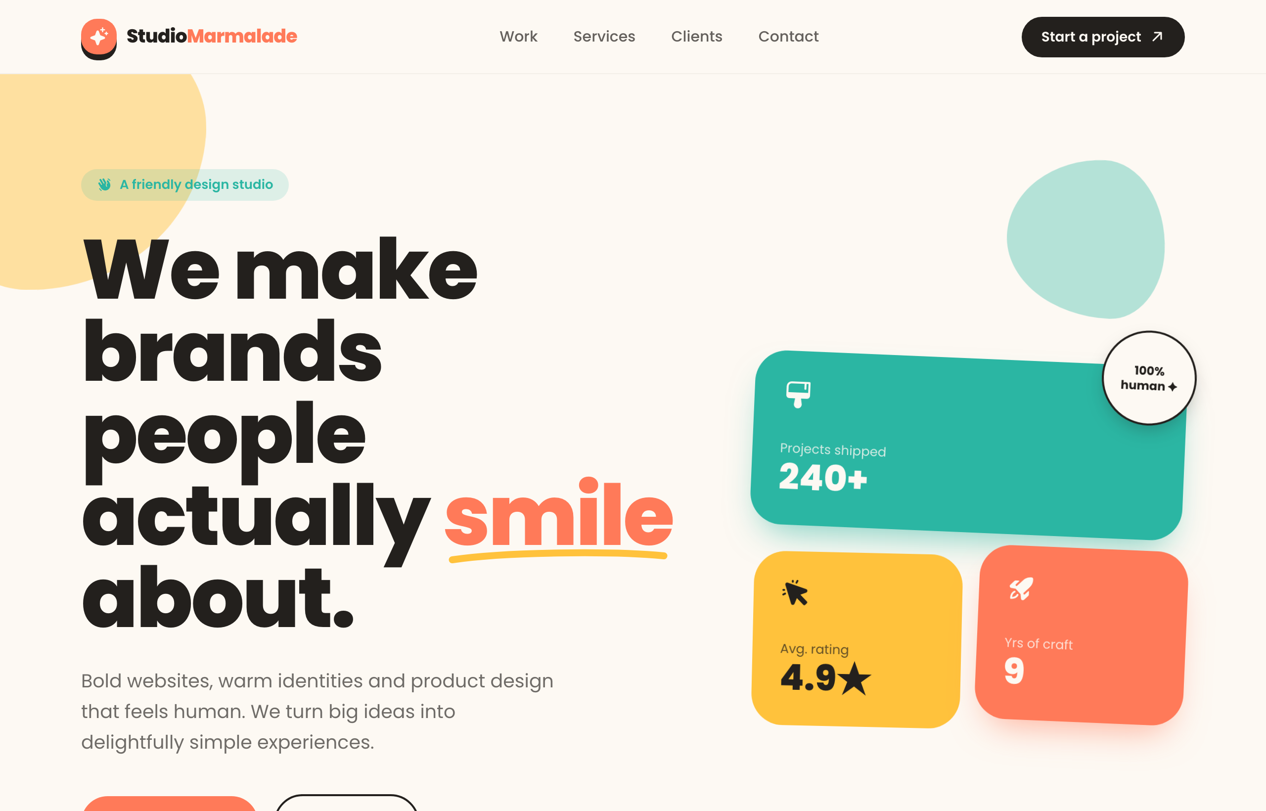
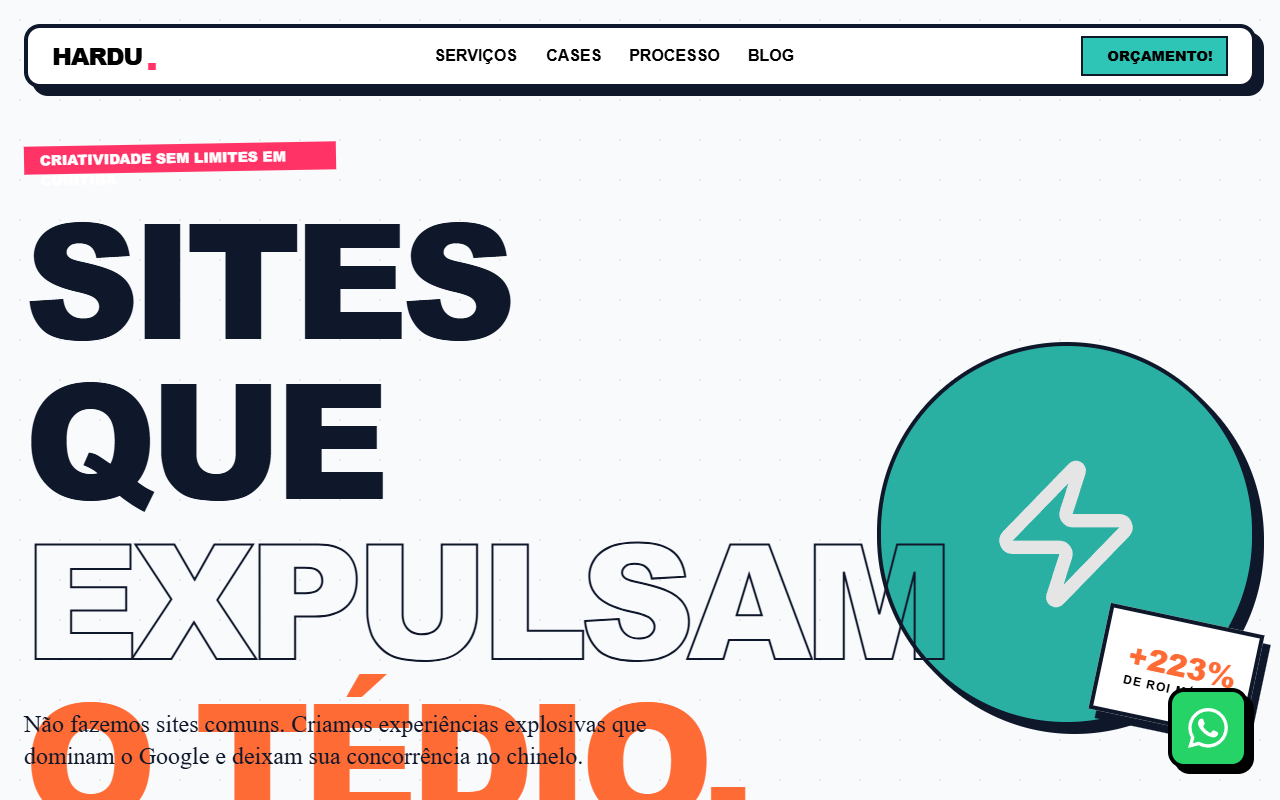
Real agency site examples
The strongest proof is the output itself. These are real agency and studio sites generated from the Superdesign prompt library, each with a distinct point of view, the opposite of the one template everyone ships.
Iterate, do not settle for the first draft
The first generation is a draft, not the answer, so the real win is exploring directions fast and refining the one that fits your brand. Most tools make you re-roll one variation at a time. Superdesign forks several directions in parallel on an infinite canvas, so you can compare a few hero treatments or case-study layouts side by side and carry the best one forward, instead of committing too early. Then you keep prompting in plain English to tighten it.
Take the current hero and give me 3 variations:
1. A bold editorial treatment with an oversized display serif and a single accent.
2. A version that leads with our best case study as a full-bleed feature.
3. A quieter, monochrome version with more whitespace and one decisive accent.

Keep the same type pairing and accent. Make all 3 mobile-first with tasteful scroll-in motion only.
If you already have a look you love, point Superdesign at a reference site or your own existing pages and it extracts the style first, so the new site is built on your real palette, type, and components instead of a blank-slate guess. A studio site is a kind of high-stakes portfolio, so the portfolio website generator guide is a useful companion on the hero and case-study patterns.
Get real React you own, not a locked template
Here is the difference that matters once you actually want to ship: most agency website generators stop at a hosted site tied to their platform, while a code-output design agent hands you real React and Tailwind you drop into your repo. This is not a small detail for a studio. Framer is genuinely strong for visual editing, but one detailed review found "there is no meaningful code export," the static HTML dump is "not a maintainable codebase, not a Next.js project," and your content stays locked to the platform (Sailop). Webflow export is static HTML, CSS, and JS only, so you lose the CMS, forms, and interactions the moment you leave (Memberstack). Agencies feel it directly: one Framer user complained the plans were "too expensive considering that our websites are vendor-locked, as no code export is possible" (r/framer).
The pure-AI generators have the opposite problem: speed without taste. A developer who tested the popular AI site builders reported a "generic template feel to all of the designs I saw" (r/webdev). For an agency, generic-but-fast and pretty-but-locked are both dead ends.
| Tool type | What you get | Best for |
|---|---|---|
| Hosted site builders (Framer, Webflow, Wix) | A hosted site tied to their platform, limited or no real code export | Studios that want a visual editor and never need to leave the platform |
| AI site generators (Durable, 10Web) | A fast generated site, often a generic template | A quick placeholder or a low-stakes microsite |
| Code-output design agents (Superdesign, v0) | Real React and Tailwind you own | Studios that want a distinctive site they deploy and keep editing |
Superdesign sits in the third row. It is an AI design agent that outputs production React and Tailwind, runs in the browser or as a skill inside Claude Code and Cursor, pulls real reference patterns mid-design so the output has taste instead of the default gradient, and when you point it at an existing project it reads your current UI first so the new site speaks your tokens and components instead of arriving as a stranger template. You generate the site, compare variations on the canvas, then have your coding agent fetch the design and implement it. No handoff, no re-skinning, no platform lock-in.
For the wider landscape of how the AI generators compare on output quality, pricing, and codebase fit, see the pillar guide on the best AI UI generator. It maps where each tool fits; this page is about the moves that get you an agency site worth sharing.
Common agency website mistakes
The most expensive errors are about positioning and sameness, not pixels. The recurring ones: a "growth-driven solutions" headline that says nothing, the exact template three competitors already bought, a thumbnail grid where case studies with outcomes should be, generic three-emoji service cards, a stock-photo team section with no point of view, and motion piled on everywhere instead of used with intent. Many studios also fall into the cobbler's-children trap, where the client work always comes first and their own site quietly goes stale (Terrostar). A generator helps there, because it collapses the build from a sprint to an afternoon, but only if you brief it like a client instead of typing "modern agency website."
AI will not save you from weak positioning. If you ask for "a modern agency website" you get the statistical average of every agency site the model has seen, which is exactly the look you are trying to escape. Name what you are known for, your best three projects, and the outcomes, then let the tool handle the layout.
Ship your agency site
You can have a real, distinctive agency site in an afternoon: start with a prompt that names your positioning and your best case studies, grade the result against the checklist above, fork a couple of hero directions on a canvas, then export real React and Tailwind into your repo and deploy it to your own domain. The whole point is to skip the every-agency template trap and end with a site you own, that proves your taste, and that you can keep evolving as the work grows.
Start in the browser with the AI UI generator, or if you live in Claude Code or Cursor, add the Superdesign skill and drive it from your agent. For the full tool landscape, the best AI UI generator pillar lays out where each option fits. Ping me anytime if you want a second set of eyes on your hero, and we'll sort it together. 🙂


