How do you make an aurora gradient in CSS?
This hero is the recipe, live
Dark #05010f base, four radial-gradient stops, one blurred conic layer, glass panel for the text.
/* via superdesign.dev/styles/aurora */

/* Static CSS aurora: a dark base, four radial-gradient color layers,
   and one heavily blurred conic-gradient ::before that drifts. Cheap,
   ships anywhere, no JavaScript. */
.aurora {
  position: relative;
  overflow: hidden;
  /* the dark base is mandatory: aurora over white dies */
  background-color: #05010f;
  /* four soft color blooms in aurora hues */
  background-image:
    radial-gradient(40% 50% at 20% 30%, rgba(99, 102, 241, 0.55) 0%, transparent 70%),
    radial-gradient(45% 55% at 75% 25%, rgba(45, 212, 191, 0.45) 0%, transparent 70%),
    radial-gradient(50% 60% at 60% 75%, rgba(236, 72, 153, 0.40) 0%, transparent 70%),
    radial-gradient(40% 50% at 30% 80%, rgba(139, 92, 246, 0.45) 0%, transparent 70%);
}

/* the blurred, saturated conic layer is what turns hard stops into
   soft northern-lights light. blur does the melting; saturate keeps
   the colors from going gray. */
.aurora::before {
  content: "";
  position: absolute;
  inset: -20%;
  background: conic-gradient(
    from 120deg at 50% 30%,
    #3a29ff, #2dd4bf, #ec4899, #8b5cf6, #3a29ff
  );
  filter: blur(80px) saturate(1.4);
  opacity: 0.55;
  animation: aurora-drift 18s ease-in-out infinite alternate;
}

@keyframes aurora-drift {
  from { transform: translate3d(-4%, -2%, 0) rotate(0deg); }
  to   { transform: translate3d(4%, 3%, 0) rotate(8deg); }
}

/* honor the user's motion preference: static fallback */
@media (prefers-reduced-motion: reduce) {
  .aurora::before { animation: none; }
}

/* put text on a panel, never on the raw drifting gradient */
.aurora-panel {
  position: relative;
  z-index: 1;
  background: rgba(10, 8, 20, 0.55);
  backdrop-filter: blur(14px);
  border: 1px solid rgba(255, 255, 255, 0.12);
  border-radius: 18px;
  color: #fff;
}
Why these values
- Heavy blur is what turns hard gradient stops into soft aurora light. The blur(80px) is doing the real work; without it you just see four colored blobs.
- saturate(1.4) keeps the blurred colors from washing out to gray, the same trick glassmorphism uses on backdrop-filter.
- The dark base is mandatory. Aurora over a light background has nothing to glow against and dies. Start from near-black.
- Cap it at three or four hues. More than that and the overlaps muddy to brown instead of reading as northern lights.
- Put text on a panel, never on the raw drifting gradient. The bands shift hue and luminance, so on-gradient text can swing below 4.5:1 contrast as the colors move.
Static CSS vs animated WebGL
- The CSS recipe above is static (or gently drifting via one keyframe): zero JavaScript, ships anywhere, near-zero cost. Great for most heroes.
- The fancy animated northern-lights motion on premium SaaS heroes usually runs a small WebGL shader. We ship that version too; see the next section.
- People describe this look in about 1,266 characters when they ask for it (median prompt length), so a couple of sentences naming the dark base, the three hues, the blur, and the glass panel is enough to brief an agent.
Browser support: Baseline widely available. radial-gradient and conic-gradient backgrounds, filter: blur()/saturate(), and ::before are universal in evergreen browsers (conic-gradient has been Baseline since 2022). prefers-reduced-motion is supported across all evergreen browsers since around 2020. The static recipe needs no fallback block; if you add the backdrop-filter glass panel, pair it with a more opaque fallback as on the glassmorphism page.
What are good aurora UI examples?
These lead with our own library items, real generated UIs we can point you straight at. Each carries an honest one-line taste note. The aurora backdrop and the sibling gradient backgrounds below are all public library items.
Aurora backgroundSuperdesign library
The flagship: an animated WebGL aurora. Three color stops is the whole trick; add more hues and the bands muddy into brown.
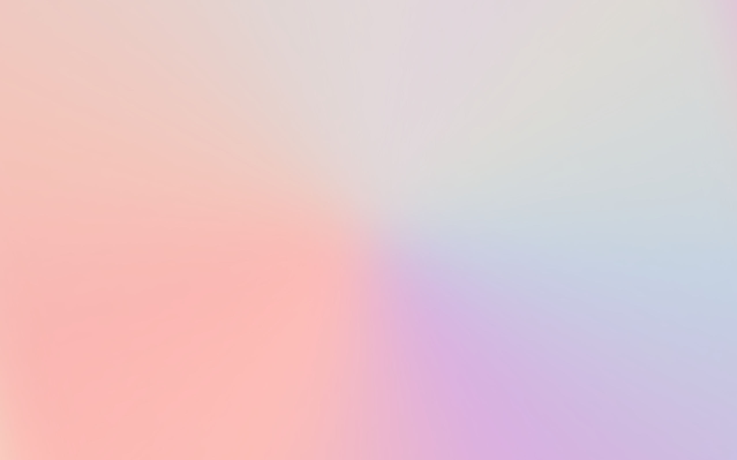
Pastel Gradient BackgroundSuperdesign library
The soft, light-mode cousin: the same blurred-gradient instinct in pastels. Proof the technique is not locked to dark mode, even if classic aurora is.
Gooey Gradient BackgroundSuperdesign library
Blobs that merge and separate: a more liquid take on the flowing-color idea, useful when you want motion without the full aurora ramp.
Gradient Blinds BackgroundSuperdesign library
Banded gradient slats instead of soft blooms: a structured cousin of aurora for when you want rhythm rather than a wash.
Want the animated version? Use the one we already built.
The static CSS above is great, but it does not really drift like the real thing. For genuine animated northern-lights motion, you do not need to write a shader from scratch. We already ship it as a public library item: Aurora background.
Here is what it actually is, so you can choose with eyes open. It is a high-performance WebGL aurora effect built on OGL (the React Bits Aurora component), configurable through a few props: a colorStops ramp (the default is ['#5227FF', '#7cff67', '#5227FF'], the demo uses ['#3A29FF', '#FF94B4', '#FF3232']), plus amplitude, blend, and speed.
The tradeoff is plain. CSS means zero JavaScript and it ships anywhere, but it is static. WebGL is animated and genuinely gorgeous, but it adds a canvas plus the ogl dependency and a GPU cost. For a hero on a capable device, WebGL is fine. For a low-end-device-heavy audience, the static CSS is the safer call. Pick your lane.
Is aurora UI actually trending, or just on Dribbble?
It is real but niche, and that honesty is the credibility. Across 208,000+ real generations on Superdesign, explicit aurora prompts peaked at 0.33 percent of generations in March 2026 then cooled. It is a real accent style people reach for, not a top-five request like minimalist or dark mode.
Aurora prompts peaked at 0.33 percent of generations in March 2026 then cooled, used in 252 projects (514 prompt mentions): a real but niche accent style, not a top-five request.
*June is month to date. Share of all Superdesign generations whose prompt mentions the style. 252 distinct projects, 514 prompt mentions total.
Methodology
How we count: numbers come from the prompts of 208,000+ real design generations on Superdesign, January to June 2026. A generation counts as mentioning a style when its prompt contains the style term or a close synonym as a whole word (for example glassmorphic or frosted glass for glassmorphism; the dark mode group counts explicit dark mode and dark theme requests, not every mention of the word dark). One generation counts once even if the term repeats. Distinct projects is the conservative figure: one project can produce many generations. June is month to date, so we show it but do not compare it against closed months. Counts are live and drift slightly day to day.
When should you NOT use an aurora background?
Text on the raw gradient
Unbounded motion
@media (prefers-reduced-motion: reduce) with a static fallback, and avoid fast, high-amplitude drift near text.Low-end devices
Content surfaces
Too many colors
Aurora and glass are a natural pair: the gradient is the canonical backdrop for glassmorphism panels. Want a full page in the style before you wire it up? Prompt-to-design renders the whole hero from a sentence.
Generate a aurora ui UI
Generate it on Superdesign
This prompt is tuned to the exact tokens in the recipe above. Copy it, paste it into the prompt box, and you get a full UI in this style on an infinite canvas. Free to start.
Design a dark aurora UI landing hero: a near-black #05010f base with soft flowing northern-lights gradient bands in indigo #6366f1, teal #2dd4bf, pink #ec4899 and violet #8b5cf6, built from layered radial gradients plus one heavily blurred conic gradient that drifts slowly. Keep it to three or four hues so it never muddies to brown. Place a frosted glass panel over it for the headline and CTA so text stays high-contrast and readable, and add a static fallback for prefers-reduced-motion.
Copies the prompt and opens Superdesign in a new tab.
Using the Superdesign skill from Claude Code or Cursor?
Paste this tuned style prompt into your coding agent. It carries the same tokens as the recipe, so what the agent builds matches what this page teaches.
Use an aurora design system with these tokens:
- Base: near-black #05010f. Aurora over a light background dies, the dark base
  is mandatory.
- Aurora layers: 3 to 4 radial-gradient blooms in indigo #6366f1, teal #2dd4bf,
  pink #ec4899, violet #8b5cf6. Cap at 3-4 hues or it muddies to brown.
- Motion (optional): one conic-gradient layer, filter blur(80px) saturate(1.4),
  drifting via a slow keyframe. blur melts the stops; saturate stops the gray.
- Text: never on the raw gradient. Put body text on an opaque or glass panel
  (rgba(10,8,20,0.55) + backdrop-filter blur) so worst-case contrast stays
  above 4.5:1 as the colors shift.
- Always ship an @media (prefers-reduced-motion: reduce) static fallback.
- Aurora is an accent backdrop, not a content surface: keep it behind heroes,
  never behind tables, forms, or long-form reading.

/* via superdesign.dev/styles/aurora */
Frequently asked questions
How do you make an aurora gradient in CSS?
What is aurora UI?
Is aurora the same as a mesh gradient?
How do I make the aurora move or animate?
Does aurora hurt accessibility?
Related styles
Glassmorphism →
The strongest pairing: aurora is the canonical colorful backdrop that glass panels sit on.
Dark mode UI →
Aurora is a dark-mode-native treatment: the near-black base is the whole reason the colors glow.
Minimalist web design →
The restraint that keeps aurora an accent backdrop instead of taking over the whole page.
Browse every style in the design styles encyclopedia, or steal a ready-made starting point from the prompt library.